STEPHEN H. BURUM INTV FROM 1996 'M-I' COVER STORY
AMERICAN CINEMATOGRAPHER POSTS ENTIRE ARTICLE ONLINE, WITH PICS
As we near the 25th anniversary of
Brian De Palma's
Mission: Impossible,
The American Society of Cinematographers has posted the entire cover story article about the film from the June 1996 issue of American Cinematographer. Featuring a lengthy interview with
Stephen H. Burum about making the film, here are some key excerpts:
On the process of color timing, etc., with the answer print
In a small darkened projection room, two men sit and watch fragments of an action movie with no soundtrack. Beaming forth from the wide-format anamorphic screen beam are powerful images of Tom Cruise, Emmanuelle Béart, Jon Voight, Kristen Scott Thomas, Emilio Esteves, Vanessa Redgrave and Jean Reno. As the actors converse, struggle, or embrace in silence, their exclusive audience exchanges a few sparse comments: “Tom’s face is a little red.” “Emmanuelle needs more blue.” The setting for this scene is Deluxe Laboratories in Los Angeles, where Stephen H. Burum, ASC is finalizing of the answer print for Mission: Impossible with timer Denny McNeill.
After months of preparation and the frenetic production itself, the answer-print stage is a time of closure for many directors of photography, a period when they can sit back and appreciate their work. Burum likens the cinematographic process to “conducting a symphony orchestra: you’re so busy bringing in the violins, doing this and doing that, that you don’t have the real joy of listening to the music, of really feeling the music. And when you're timing and you get down to the third answer print, it hits you all of a sudden: you have the time to enjoy what you did. Until then, you just don’t.”
When timing a film, the cinematographer scrutinizes the color, brightness and quality of each individual shot, gauging its coherence against the surrounding shots in the sequence. The answer print is stricken directly from the negative; its set of yellow, cyan and magenta corrections are the foundation of an interpositive from which release prints will be produced, via the internegative. By the second or third release print, the major timing adjustments have been made, so the rest is merely a matter of fine-tuning. According to Burum, skin color is the clearest indicator for refining image quality and tone at that final stage.
“When you’re timing, you want to get a reference that will serve as a standard, so that the lab can clip it out and put it next to their timing machines,” he explains. “When there are major adjustments needed, you tend to say, ‘Let’s make it a whole lot more yellow or a lot more blue.’ Later you talk about skin tone a lot because it’s harder to define; it’s a very finicky and subtle hue.”

"De Palma left and right" -- On the collaborative working relationship between Burum and De Palma:
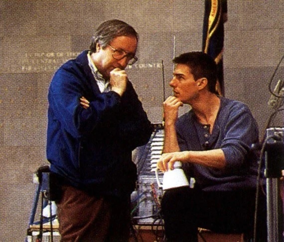
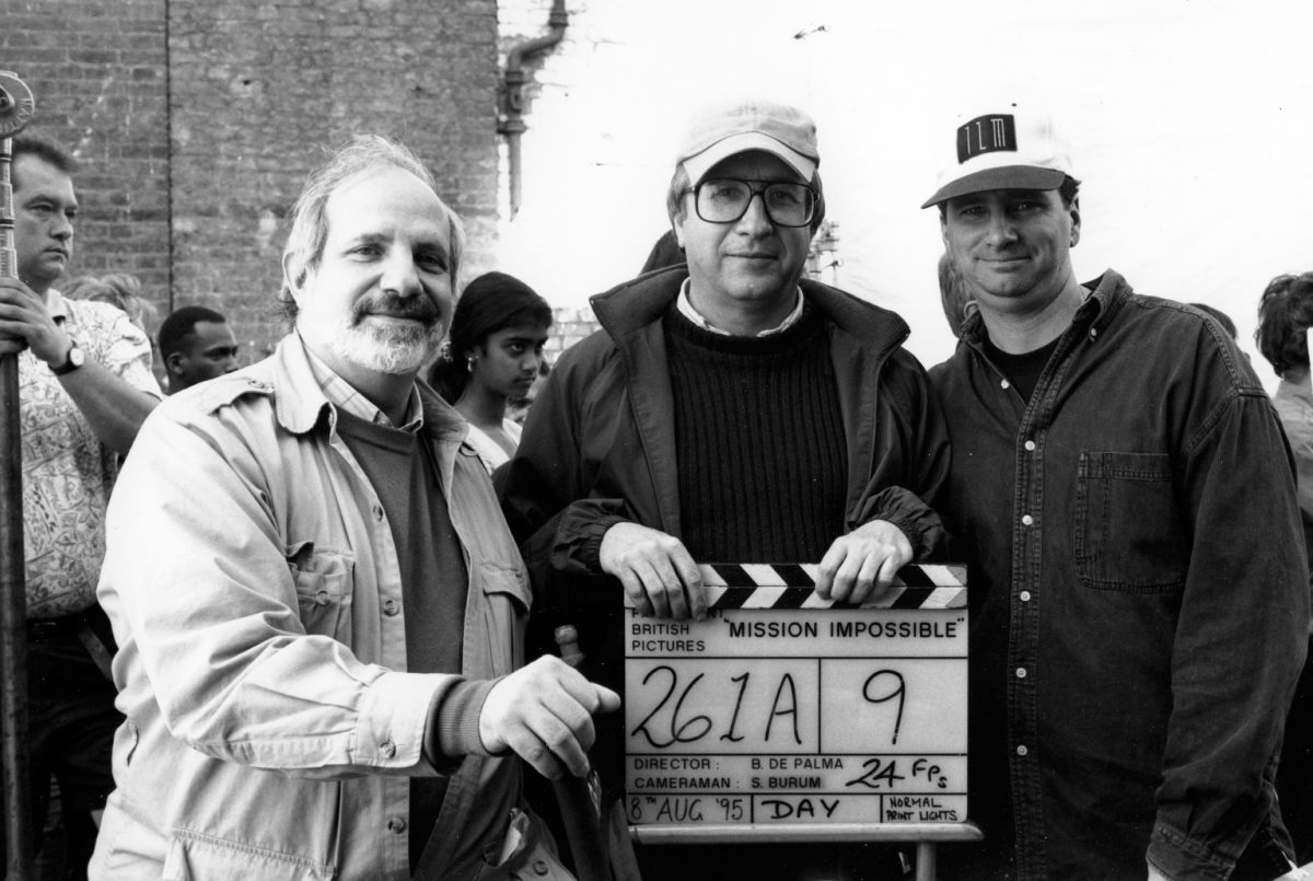
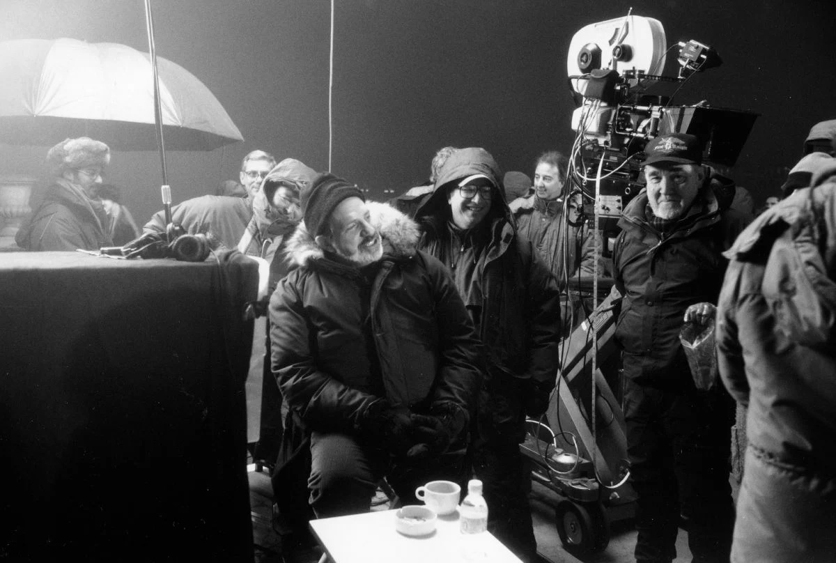
The feature film version is directed by Brian De Palma, whose relationship with Burum is well established. Over the past 12 years, the two filmmakers have collaborated on five previous features: Body Double, The Untouchables, Casualties of War, Raising Cain and Carlito’s Way. Both men share an encyclopedic knowledge of cinema and a passionate enthusiasm for filmmaking. The lengthy collaboration between the duo seems a natural one, as a keen appreciation of film history informs the work of both.
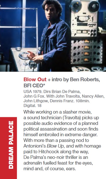
De Palma is best described as a postmodern director; his films are full of references to past directors such as Eisenstein, Hitchcock and Antonioni. He knows every storytelling trick in the book, and doesn't hesitate to use them. It is telling that Quentin Tarantino cites Blow Out (shot by Vilmos Zsigmond, ASC) as his favorite film, for in many ways, the young auteur is DePalma’s heir. Critics sometimes lambast the director as a mere maker of showy homages, yet, like Tarantino, he infuses his references to past films with a very contemporary irony that creates a personal vision.
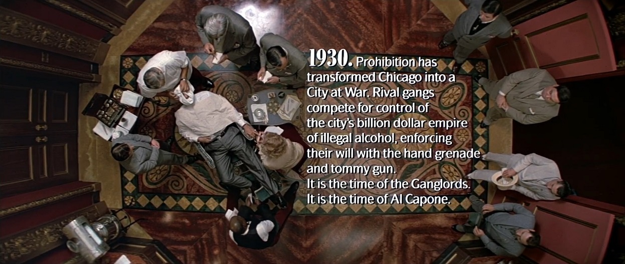
In a very different way, Burum has used his own love of the classic Hollywood tradition to enrich recent American cinematography. A master stylist, Burum has on several occasions assimilated the aesthetics of bygone genres and transformed them into original and modern imagery. Witness the highly stylized rendering of detective serials in The Shadow, or the brilliant melange of film noir and comedy in The War of the Roses. Burum's distinguished career spans from the stunning second-unit cinematography on Apocalypse Now to his masterful, Academy Award-nominated work on Hoffa. In addition, he has received ASC Award nominations for both The War of the Roses and The Untouchables, winning for Hoffa.
After working with De Palma on so many pictures, Burum says that he and the director speak in shorthand on the set. “I love working with Brian. He’s the greatest; he knows exactly what he’s doing. There’s not much dialogue between us on the set. [The collaboration] is not artsy at all, but very matter-of-fact. I have an expression that I use: ‘De Palma left and right.’ If Brian says the frame ends at a certain point, it’s going to end there. There is no reason to shoot anything past that point.” Burum also understands De Palma on a personal level. To an outsider, he says, “Brian may seem gruff, but he keeps all of his feelings inside.” The cameraman realized this during the shooting of Al Pacino’s death scene in Carlito’s Way, when he saw the director “with tears in his eyes.”

On working with production designer Norman Reynolds, and evoking three moods, "old Europe, America, and new Europe" --
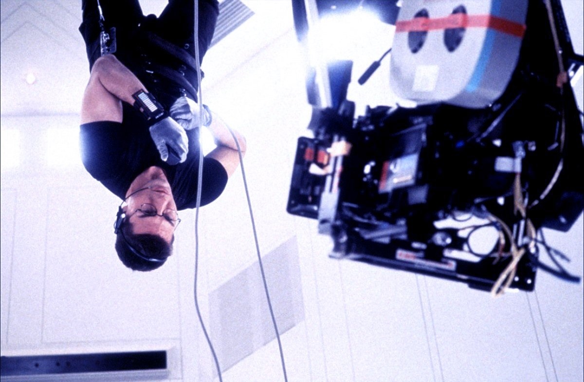
Like an IMF mission, the production of the film was a race against time, shooting on location in Prague and London, and on sets built within the vast Pinewood Studios soundstages. However, the film's British production designer, Norman Reynolds, notes that the film's European locales merely enhance its essential spirit. "Mission: Impossible is an American action film, in the best sense of the term," he says. Reynolds, who earned two Oscars for his memorable design work on Star Wars and Raiders of the Lost Ark, is well-positioned to comment on the relationship between the production designer and the cinematographer. “The designer [helps to set] the picture's tone in visual terms. Now that's apart from the cameraman, who obviously has the ultimate control in that area, because he can make it dark, light, colored or whatever. So what we designers do is very much in the hands of cameramen. I certainly stay in touch with the cameraman as much as I possibly can.
“While we were in Prague, Steve was obviously very involved in location scouting and preparing things, so there were times when he and I were separated. But when we moved to the studio, I involved Steve as much as possible in the set design. It was quite selfish really, because the easier I made Steve's job, the better the film was going to look. We liked working together, and that's really the name of the game."
In planning their visual design, Burum and Reynolds referred solely to the script and not at all to the television series. In fact, Burum confesses to having never really watched the TV show. "I remember a little from college, but I never got a chance to see an entire episode," he admits.
Following the natural divisions of the script, Burum created a different lighting approach for the missions in Prague, Virginia, and on the TGV train, producing a visual diversity and rhythm that enriches the film. The cinematographer summarizes the three moods he sought to evoke as "old Europe, America and new Europe."
In Prague, Burum sought to create an atmosphere that evoked "the old European spymaster stuff. You know, the spymaster slinking around, dining in chic restaurants, smoking cigars and drinking brandy, while some Eurasian woman is wearing a tight silk dress with a mink dropping off her shoulder, with a Twenties bob hairdo — the Mata Hari thing. Here you are in Prague, which has just been freed from the Communists and is still mysterious, almost Oriental. Anything can happen, and of course, all kinds of nefarious devious stuff is going on because everyone is grappling for power, and everything is up for grabs."
In lieu of Mata Hari, Mission: Impossible features French actress Emmanuelle Béart as Claire, an IMF member and romantic interest of Hunt’s. To give Béart a "more ethereal" appearance, Burum chose his customary black silk stocking diffusion when shooting her close-ups. Onscreen, the diffusion is subtle and Béart's face still looks sharp. The cinematographer explains that "women, even when heavily diffused, don't appear diffused on film because their makeup accents their eyebrows, eyelashes and lips, which gives you a false sense of sharpness. For example, normal lip color blends in with the face but, with lipstick and liner, the lips look a lot sharper than they really are."
Most of the "old Europe" sequences in Prague take place at night. From the look of the film, the crew had the run of the Czech capital. The venerable but run-down Natural History Museum posed as the embassy's reception hall. Key exteriors were shot in Prague's two prime tourist spots: the beautiful square at the center of the old town and the famous Charles Bridge. These picturesque nightscapes required an excessive amount of light, since Mission was shot in the anamorphic format. For Burum, the lens T-stop setting is an essential factor in the quality of widescreen images.
"Many people ask me why my anamorphic shows look so sharp. It's because I know which stop to put the lenses at. You can't get an anamorphic lens below T4 and keep it sharp. In desperate situations, I have shot scenes at T2.8. I've been able to get away with it because I light very hard and very contrasty, which gives the images a phony sharpness. But if you try to light an anamorphic image at T2.8 with a soft light, the image will have no snap." Rawdon Hayne, Burum's 1st camera assistant, was instrumental in this endeavor.
Burum used Panavision's C-series anamorphic lenses, which he prefers to the E series because of their small size. "There's something about the older lens design that gives the appearance of a bit more depth of field. In point of fact, the term depth of field is baloney; there is only one point of absolute focus. Everything in front and everything behind is not really in focus, but rather seems to be in focus to your eye. If you have a lens that is ultra-sharp or heavily contrasted, then you see that difference in focus immediately. Older lenses are not quite as sharp, so they only appear to have more depth of field."

Read Burum detail much more in the article regarding lenses, lighting, old-fashioned process shots, etc., at American Cinematographer. One curious image included there is this one:

Apparently taken from the original magazine article, the image above includes the following caption:
Luther (Ving Rhames) on the train, sharing a frame with an unfocused Max (Vanessa Redgrave). Here, Burum accentuates the space between the characters, as Luther is undercover, secretly trailing Max.
