
"LOOKS GREAT" UP UNTIL THE POINT WHERE ANGIE DICKINSON RUNS OUT OF THE MUSEUM
A review of Criterion's upcoming Dressed To Kill package posted a couple of days ago by Criterion Forum's Chris Galloway states that "the first 21-minutes look great," but that after that, the transfer gets very obviously "horizontally squished." With the early reviews all highlighting aspect ratio issues with the transfer, many are expecting some kind of forthcoming response from Criterion, prior to the August 18 release date. In the meantime, here is an excerpt from Galloway's review:
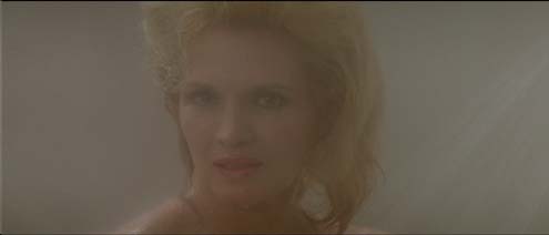
This may be one of the more frustrating presentations to come from Criterion because you can see how amazing it would have turned out if it wasn’t for one rather huge glaring issue. Touching on the good aspects first the image is razor sharp with stunning detail, improving over Arrow’s presentation which looks a little muddy and fuzzy in comparison. Textures are particularly superb, at times looking like you can reach out and touch them, and the sense of depth is also fairly strong (though this is hampered a bit by an issue I’ll touch on later). It’s incredibly crisp, and easily the sharpest I’ve ever seen the film.Colours do differ a bit in comparison to every release since MGM’s 2001 DVD. Here the colours are noticeably washed out a little more, though they aren’t overly dull. They can still look fairly vibrant and the reds (found in the blood particularly) are the strongest aspect. Black levels are also very good and crushing wasn’t an issue. I was more than fine with it and I wouldn’t be surprised if colours were closer to this when it was released and the look works for the film. Still, many will have their personal preference on this and will probably prefer the colours used for all of the other releases since the DVD.
So, to a certain extent I was very pleased with what we got, and the first 21-minutes look great. The transfer was clean and stable, presenting natural looking grain, no noticeable digital tinkering, and a wonderfully filmic quality. Even the clean-up job is impressive, wiping out just about all imperfections, the only real issue I noticed being some fading on the edges of the screen a few times. It looks great… Until roughly the 21-minute mark—when Angie Dickinson’s character runs out after the man she was tailing in the museum—where the transfer makes a questionable turn.
If the colours to the film are debatable this next aspect isn’t: for whatever reason the rest of the film, a little bit after that 21-minute mark (I’m guessing after a reel change) the image becomes horizontally squished. This of course creates the odd effect that causes everything and everyone to look unnaturally skinny with enlarged foreheads. And this isn’t some mild annoyance that only becomes obvious here and there: it’s right there in your face. True, there are a few scenes where the problem doesn’t stand out as much as others, but this probably has more to do with framing and positioning. I watched the film a second time to verify where the squishing occurs now that I was aware of it, and yes, a little bit after the 21-minute point the squeezing starts and never lets up.
It’s a bewildering issue more because of the fact no one seemed to notice this. It was supervised and approved by De Palma but he didn’t see? And it’s not like it’s a subtle problem: it’s pretty obvious and you don’t need any sort of side-by-side comparison to notice, especially when weird artifacts show up because of it. Take for example the scene where Michael Caine and Paul Margulies are conversing as they walk down a staircase, the camera circles them and creates all sorts of distortions in the frame as the geometry of the stairs change, becoming stretched or compressed with each turn of the camera. If no one noticed the problem is it intentional then? A VHS tape I had first seen the film on, cropped to 4x3 of course, actually did squish in the image at times throughout the film to aid in keeping some of the widescreen compositions (anybody who saw Die Hard on VHS will remember these effects). But this was done mostly for the diopter shots and the split screen sequence, along with a few other moments where pan-and-scan wasn’t going to cut it. That made sense then (though was no less annoying, and obviously widescreen would have been better) but doing the same thing here, when the image is actually presented in widescreen, makes no sense. Plus if it was intentional why are the first 21-minutes normal? I can only believe it’s a mistake but I am still stunned it wasn’t something that was noticed, and it’s a shame because this had the potential to be one hell of a presentation. Just an incredible disappointment.
And here are some of Galloway's thoughts on the supplements:
Criterion does top previous editions in one area: the supplements. Criterion ports over the old MGM supplements but also adds on a number of their own, starting with a new interview with Brian De Palma conducted by Noah Baumbach. Baumbach asks De Palma about how he came up with the story and asks the development process behind the film, from setting up the various long sequences, to filming the actors to project the desired emotional effect, and the use of music throughout. They also talk about the controversies surrounding the film’s release, along with the Hitchcock touches. Surprisingly it’s only 19-minutes but they’re an effective 19-minutes.Criterion also gets a new interview with Nancy Allen, running about 16-minutes, where the actress talks about that period of her life, first getting married to De Palma while taking a break during filming of 1941 and then watching him work on the script to Dressed to Kill. She recalls how visual the script was and how impressed she was with it, only to be thrilled when she found out he had written what was really the starring role for her. She then talks about developing the character, from the actual research to how the costumes even aided in the process. She also talks about the difficulty in shooting some of De Palma’s more elaborate sequences, where timing is everything, giving a play by play on a couple of scenes. Short, but again it manages to be wonderfully indepth.
Producer George Litto next talks about his films with De Palma: Obsession, Dressed to Kill, and Blow Out, obviously proud of the films that came out of the collaboration (he also feels that the museum sequence in Dressed to Kill is one of the best pieces of filmmaking he has ever seen). Composer Pino Donaggio next talks about the film’s score and his collaborations with De Palma over the years, and how De Palma uses his music. He’s most proud of the music he created for the museum sequence, and explains how he studied the scene extensively to get the right momentum and feel. Both interviews are insightful and entertaining, running 12-minutes and 16-minutes respectively.
The next supplement is a bit of a surprise but proves to be a rather great inclusion: an interview with Victoria Lynn Johnson, Angie Dickinson’s body double in the film. She talks about the casting process she went through and then what it was like working with De Palma, who surprised her with his attention to detail. She never felt uncomfortable with the scene or situation, was pleased it was a “legitimate” film (the cast helped her feel better about the project), and she talks about her brief moment of fame when it came out she was Dickinson’s double. It runs 9-minutes.
My favourite of the new features, though, may be an interview with Stephen Sayadian, who worked on the photograph used for the poster art for the film. This 10-minute interview is particularly fascinating because it looks at the marketing industry for low budget horror films at the time, which was actually built from work in the porn industry, from ads for Hustler to cover designs for VHS (Sayadian says he received complaints that his company’s video art made the films look way better than they actually were). From here he then talks about shooting the photo that would eventually be used for the poster art, from gathering together props (like the shoes) to getting the people to pose for it. He also talks about an alternate photo shoot and the finished product we see here is probably more appropriate for the film (Sayadian admits they hadn’t seen the film yet when they shot the first one), though De Palma apparently chose to use the other one. It’s a fairly funny feature giving some great insight into an industry that gets somewhat overlooked.
Criterion then includes the 2001 documentary included on MGM’s DVD (and has also appeared on MGM’s and Arrow’s respective Blu-rays) The Making of Dressed to Kill. The lengthy 45-minute documentary coves the film’s genesis, production, and release. It features interviews with Dickinson, Allen, Gordon, De Palma, Dennis Franz, and others. Like most documentary features that appeared on MGM DVDs back in the day it’s a solid, very informative doc, but unfortunately, similar to Arrow’s disc, most of the material is repeated in the other new features on the disc. Still, it’s worth watching to get De Palma’s insights into the film (primarily his annoyance at the cuts he had to make, which he doesn’t really get into in the new interview found here) and it also offers more in-depth analysis of key sequences in the film.
Criterion then sees fit to include a tribute to the film’s director of photography, Ralf Bode. Called Defying Categories: Ralf Bode it features his brother, experimental video artist Peer Bode, and director Michael Apted. Peer brings a more personal angle to the feature, talking about his brother’s work and his early experimentation with the camera. Apted, though, offers the most praise. Apted states he had absolutely nothing to do with Dressed to Kill but he wanted to come on here to talk about Bode and give him the recognition he feels he never got. He praises his work and how he was able to adapt to each film. It’s a loving tribute looking at the man’s work.