Hover Buttons
Hover buttons will change their appearance when the mouse
is moved over them. These buttons can be useful for making your hyperlinks
flashy and eye-catching
To add a hover button
Go to the menu. Choose "Insert" and then "Component" and
then "Hover Button." The Hover Button dialogue window opens.
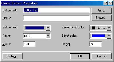
The Hover Button
Dialogue Window

Change your button text to something appropriate (the
name of your link, etc.).
The example button above uses the default properties, but
you can change the colour of the button, the colour of the effect, the type
of effect, the button size and height, and the background colour. Play with
some of the settings and look for something you like.
Add the hyperlink for the hover button. In the text box
labelled "Link To," type the address to link to. Or, click "Browse." This
will open the hyperlink dialogue window, where you can choose a file to link
to.
The Hyperlink Dialogue
Window
Click "OK" to close the open windows. Use the preview tab
to see if your hover button works.
If you don't like the hover button, return to the normal
view. Right-click on the hover button and choose "Hover Button Properties."
This will re-open the dialogue window. You can then change the properties.
|

