
Aspire - In defiance of fortune 2.5/5
Reviewed: 6-26-09
Tracklist:
1. In defiance of fortune
2. Masquerade
3. Caveat emptor
4. Bloodline
5. The las fall
6. Walk the earth
7. Vengeance (That day is mine)
8. Sunrise
9. Eternal sacrifice
|
With 3 years between 2006's 'Age of reckoning' and 2009's 'In defiance of fortune', I was expecting Aspire (which is essentially the Al Candello (all guitars plus midi sequencing) and Ryan Metzger (all vocals plus additional midi sequencing) project) to make big progress and come up with an impressive new CD of symphonic power metal, U.S. style (see bands like Armory and Theocracy). And while they deliver more than adequate songwriting, the CD is let down once again in the production department.
I can tolerate the midi drums, but the weak guitars, cheap sounding keyboards and the poorly produced vocals make for a frustrating listening experience. Clearly this duo has talent, but with 'In defiance of fortune' being their 3rd CD, they should have moved the quality up several notches. I realize Candello and Metzger probably lacked the funds to hire out a professional studio and a real producer, but why put all this hard work into writing and performing on a CD to only see it have limited sales appeal? It would have been better to release a properly produced EP or even a 2 song single versus 9 songs of dubious production quality. The production reminds me of what the Greek and Italian metal bands from 15-20 years ago would get saddled with.
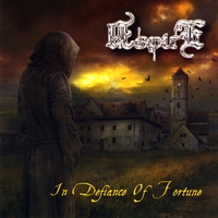
Like any product being marketed, great artwork can help sell a CD, but 'In defiance of fortune's cover art is a step backward in comparison to the excellent 'The age of reckoning' cover. Upon closer inspection, the new CD cover art, by Bartek Jurkowski, is not bad, but it may have been poorly prepped for printing by the designer. Indeed, I was able to locate the original piece at an online art gallery, and the clarity was noticeably superior in comparison to what was printed.
And a tip to Aspire regarding their logo: it is almost unreadable. Remove all the effects and go with a simple color scheme. Look at how bands like Iron Maiden, Judas Priest, Helloween, etc., utilize their logos. Adding a metallic finish, textures, etc., inside the font only creates confusion.
So what we have here is good songwriting, adequate performances (little things, like the strained vocals on track 4, should have been edited), below average production quality and a mediocre cover presentation. Overall, a letdown considering Aspire's true potential. After 2 similarly flawed independent full-length releases, the band should have delivered something stronger for their 3rd.
TOM
MORE REVIEWS... FULL REVIEWS
MORE REVIEWS BY TOM... TOM
MAIN -
A -
B -
C -
D -
E -
F -
G -
H -
I -
J -
K -
L -
M -
N -
O -
P -
Q -
R -
S -
T -
U -
V -
W -
X -
Y -
Z -
MISC

Email: metalcdratings@yahoo.com

