
ORANGE BLOSSOM RETREAT


 Project Requirements
Must create a logo for general use by the client, showing it at different percentages of reduction in order to prove that it is useable at smaller sizes. This logo must be four-color, but an alternate monochrome version must also be created and shown at reductions for use in newspapers. The color logo must then be used to create a business card format, an envelope design, and a letterhead with corresponding body page. Creating a more complex, die-cut envelope is encouraged.
Client Name and Description
Orange Blossom Retreat--an old Florida orange grove and farm house that has been converted into a kind of down-home resort. Available services include a bed-and-breakfast, regular art classes taught by local artists, tours of the historic orange grove, and kayaking classes at the nearby river.
Client's Objective
To aquire a set of unified materials to use for their business, so that they may present an image of a professional organization.
Target Audience
A widespread blend of tourists, artists, and athletes, male and female, most likely in their twenties on up. The design does not necessarily have to be conservative, but it must appeal to elderly individuals as well as young ones. The sense of classical Florida life must be maintained while still displaying the influence of the newer things that the orange grove is now being used for.
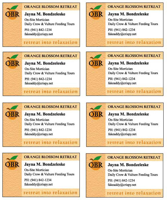
Because this logo design was made to appear both artistic and on the conservative side, I chose to continue its calm feeling throughout the office supplies by using long strips of the same texture used to build the logo. The orange color is a pale version of that used for the main body of the orange; it was reduced in intensity to allow the logo to stand out against it. Naturally, I chose orange because the business was based around a historic orange grove. It was decided that the motto of Orange Blossom Retreat would be "Retreat Into Relaxation;" these words were also built out of an orange texture, and were repeated on all the materials.
The business cards retain the long, pale texture down the left side that unifies the whole series, but also include two additional strips of texture on the top and bottom. These serve to state the full name of the business (since the abbreviated version of the logo was used here, due to the small scale of the cards), present the motto, and create an area of bright white space in the center of the card, where the necessary information can stand out better.
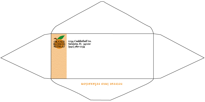
The envelope was built as a die line because postal regulations prohibited me from putting the motto in the lower right corner, which would have allowed it to match the design of the letterhead. I chose instead to put it on the back of the envelope, so that it would be visible below the flap as the recipient opened the letter.
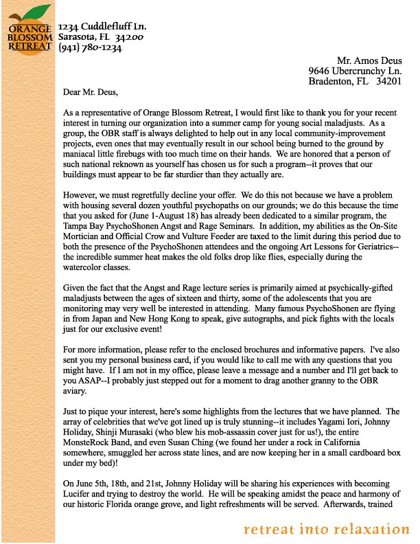
The letterhead simply contains the left-hand texture bar and the textured motto in the lower right, which served to asymetrically balance the logo in the upper left.
How My Solution Works
More details on the logo design may be found elsewhere.
Programs Used
Photoshop 6.0 (creating textures), Illustrator 9.0.
|
|
|
|
|
All site graphics and designs on these pages are copyright 2002 to J.M.Bondzeleske (ebondrake at hotmail-dot-com) and may not be reproduced or distributed without my consent. However, I do not claim ownership of photos or placed art used in parts of these designs, unless stated otherwise--they were collected via clip art and Internet searches.
