Like a special
education class playing Mad-libs, this is
The
Plan
9 From Outer Space of websites!
Yes. Now it really looks different. I have done this because the frame was quite bothersome, despite the amount of effort I put into making it work. You may have noticed that in almost direct contrast to what I just said, the frame is still here. That is because I have not yet arranged the proper "navigation table" on the other pages. Yes. I have sacrificed common decency in the name of my never-ending quest to have the most honest counter online.
Or something. I say "or something" a lot. It's not so evident now, (or is it?), but it should be in my next update, if I actually get around to it.
This is an odd segue. Thank you. This page still needs to be uhhh... fine tuned? I have always have trouble with musical jargon.
A word of advice (a few sentences, actually) to those who would more than one program for their HTML editing: Save a backup file for reference before changing anything in NETScape Composer. It will change the whole page to conform to it's own ideals of how HTML ought to be written, which are unusual and redundant, to say the least.

This
site is best viewed on a computer that is not a Macintosh, mainly because
I only know the names of about 4 Macintosh FONTs.
All
of the graphics that this page attempts to display exist. If they do not
load properly, consider yourself fortunate.

Look! I ripped
off "Person of the Week!"
If
you don't know what that is in reference to... then... it.... was... my
idea!
Yeah,
that's the ticket!
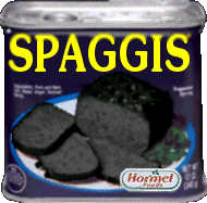
Yes,
SPAGGIS: Luncheon Innard Loaf Is still here. Much like herpes, it doesn't go away. That's not just a bad analogy. SPAGGIS' everpresence is by no means the only way that it's like herpes. Rather than go into detail, let me simply advise you to always wear proper protection whilst eating SPAGGIS. You'll be glad you did.
Recent Developments
(That sounds more intriguing than "news")
6/2/00
Well, it had to happen eventually. Angelfire has decided to be like XOOM and
block access to graphics stored on their servers (I think that's what they
are) from other domains. I now need to re-upload a bunch of my GIFs and
possibly a few JPGs to elsewhere to prevent Angelfire logos from appearing
in their place, along with the pages that try to display them. This
could be delayed because FTP clients are frequently unable to connect to
the AOL server-something-thingie.
Dadadadadadarn!
5/18/00
The newest page.
Well, that's what it is! I'm still engaged in the process of redesigning this dopish "site," so errr... don't be surprised if there's more than one link to the same page. Actually, I changed my mind. Be surprised. Be very surprised. And say that I didn't warn you, too. That always helps. 'Ey?
5/15/00
Update!
I'm too tired to update this today. Maybe later, mebbelayter.
5/3/00
I reckon (reckon? What?) that I've been spending a bit too much time reading The Onion, because I went ahead and made this stupid page. I don't have time to give a description right now. This one's in my AOL "space" because Angelfire's "new webshell" is really giving me a hard time.
In other "news," I'll have to redesign that frame-thingie. I don't like having to remove it to make other pages appear the way they should, because then someone needs to press the back button to make it appear again, and that activates the evil Angelfire counter, giving me two "hitz" for one visit, and I am against that.
5/something/00
Stupid new logo today. The letters weren't too hard to make, once I decided what I was doing, but it sure did take a long time, not just because I had to do the whole “sick individual” part twice. For my information (since I will see this more than anyone else, and only I will care) the first half's letters were made with Souvenir (SPAM FONT) outlined in blue and then “neon glowed” and inverted with Paint Shop Pro. The second part was made with the Mead Bold FONT and coloured with four shades of red (well, five, but there were only about four pixels of the fifth colour) and then “softened” to better match the background. I wouldn't be surprised if Adobe Photoshop could do that much more quickly with less effort. Well, P'fack them. Why? I don't know. “P'fack” doesn't even mean anything in that particular context. F'Op?
4/22/00
Zartan Moloch of Zeroes Unlimited (who uses his real name, I think), after a chain of events on the "ZerUn" message boards, asked me to "review" (If you'd seen the site you'd know what that means!) a certain computer game by the name of Dungeons of the Unforgiven. The horrendous results are here. Or, if you'd rather see the actual version I submitted, that's available here. The main differences are that the first one was slightly modified to more fit the Zeroes theme, and also includes possibly drug-induced comments inserted by the vehement Zartan. The second, on the other hand, retains the original bizarre formatting as well as my trademark (really, it's registered, and stuff) senseless colouration.
Another note to add is that the second one (original version, remember) has another almost-fixture of mine that the first lacks, namely alt-text. Yes, there is a name for those annoying messages that pop up if ever someone makes the unfortunate mistake of letting their mouse cursor hover over one of my images.
Oh, and it has an annoying XOOM frame too. Feh.
4/5/00
Finally, a "real" update. I made a new page, once again just text, but not so easy to read this time. No, after spending too much time looking at "OC Reviews" (if you don't know what those are you're probably best off not asking me about them) I once again experienced the uncontrollable urge to vary the text colour without regard to readability (if that's a real word) and I think it is more obvious there than on even this page, where I am at least content with one colour per paragraph (very long sentence!). Look at it here, or don't. I can't force you.
THE NEXT DAY...
Ahhh... haha... There was a uh... problem with the new page. I had apparently uploaded an older version of the page instead of the finished version. There was also the issue of the Angelfire advertisements, which I had forgotten about during the page's construction, which completely ruined the effect I was trying to achieve. The problem should be solved now, unless "the management" objects to my linking to graphics in my Angelfire account from my America OnLine "space." But they wouldn't know I was doing that unless I said so... on... the... main... page... fwah.

|

Orenthal
It's
a guestbook, you imbecile!

Mail?
Click
it, you fool!

Evil Angelfire counter
Yes.
This site is really popular.
Created
on:
8/9/99
Last modified on:
6/18/00
As if you gave a modicum.
|