
DANCING DRAGON LOGO


 Project Requirements
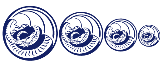
Create a logo that properly represents the client described. Show the logo at several reductions to demonstrate how it works effectively at a variety of sizes.
Client Name and Description
Dancing Dragon--a well-established company that sells all kinds of dragon-related items (T-shirts, posters, statues, masks, stickers, etc.) through the mail and Internet. For the purposes of this project, it was assumed that they had chosen to open an outlet store in a mall and therefore required themed packaging.
Client's Objective
To aquire a logo to represent their business, so that they may present the image of a professional organization. In the case of this company, it was assumed that their old logo no longer served their purposes and they had decided to create a fresh image with the opening of their new store.
Target Audience
Dragon fans of all ages, backgrounds, and descriptions; the company sells items that people of any tax bracket can buy, and their available dragons run the gamut from cute and cuddly to dark and bloodthirsty.
How My Solution Works
The main issue with this entire project was that the company that I'd chosen had such a huge target audience--it was similar to making a campaign for milk. It's possible for literally anyone to want to buy things from this place, so it was difficult to think up something generic enough that was still evocative of the feeling indicated by the subject matter (dragons, fantasy, etc.).
I finally hit on this concept when I was thinking of the traits that might be common among all the various kinds of dragons sold by the client--the list that I came up with was magic, wonder, and adventure. The great majority of dragons that I've personally seen seem to be designed to create different forms of these three impressions in onlookers. This particular design seemed to best express those ideas to the widest audience because of its illusion of motion, which is created by the spiralling posture and the repeating pattern of scales on the dragon's stomach. The idea of adventure is most easily seen here because of that motion, and because of the spreading wings and the dragon's gaze, which is aimed at the sky. The other concepts, magic and wonder, might also be suggested by the hypnotic patterns of the spiralling scales.
Due to the large areas of white on the face and wings, this image also remains identifiable at a decent reduction. The text chosen to accompany the logo (which can be seen on the actual packaging projects) is of a blocky, handwritten type, the better to create an image that is casual and slightly primitive (which is appropiate, as the dragon has been traced back to very ancient cultures). It was my intent to make the exact positioning of the type changeable according to how the company needed to use the logo; the circular text seen on the packaging is therefore not set in stone when the logo is applied to other company products. For that reason, no text is displayed here.
Programs Used
Illustrator 9.0.
|
|
|
|
|
All site graphics and designs on these pages are copyright 2002 to J.M.Bondzeleske (ebondrake at hotmail-dot-com) and may not be reproduced or distributed without my consent. However, I do not claim ownership of photos or placed art used in parts of these designs, unless stated otherwise--they were collected via clip art and Internet searches.
