
We will be using many graphs including Speed vs. Time, Distance vs. Time, and Speed vs. Distance. All of these graphs are used in conjunction with the ostrich experiment. There are explanations accompanying each graph as a means of direction and teaching, please enjoy!
The first graph we will show you is an average speed versus distance bar graph of the ostrich's run. Each bar on the graph represents a time interval. The key to which bar is which is on the right hand side of the graph. This graph is used to show the varying average speeds of the ostrich throughout the run. This graph coordinates with the first of the average speed tables on the speed page. Look below for the graph.
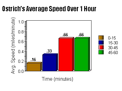
The graph above shows how fast, in miles per minute, the ostrich is going on average during each of the intervals. But to make it easier to really see the ostrich running that whole hour, we made a graph that shows the speed in miles per hour of the ostrich on average for each interval. See below for this "amazingly different" bar graph...
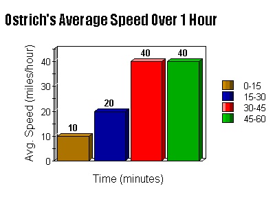
Different, isn't it? The graph above shows that the ostrich speeds up from 10 miles per hour in the first fifteen minutes to 40 miles per hour (the maximum speed of an ostrich) for the final half hour. There is just one problem to these bar graphs, however. These particular graphs fail to give a helpful visualization of the acceleration of the ostrich during the run. There is only one graph that will accomplish what we need...A LINE GRAPH!

Before we get to the real juicy graphs that show acceleration, we will exhibit a distance versus time graph that will have a slope showing speed. As you can probably ascertain, the distance versus time graph is over to the right...over there. Even though the graph isn't just scattered plots, but rather a line cutting through 4 points, it doesn't accurately show instantaneous speed, but rather average speed at the specified points. Once you have completed your analyzation of this graph, which coordinates with the average speed tables on the Speed Page, you may scroll down to the amazing Speed vs. Time Graphs!

The next graph we will show you is the graph which coordinates with the first of the acceleration tables on the Speed Page. Look to your left for the first of the much anticipated acceleration graphs. As you can see, this graph gives an approximate calculation of the ostrich's rate of acceleration between each interval. The ostrich lacks acceleration in the last fifteen minutes because it reaches its maximum speed. Also, as a point of reference, the ostrich can sustain that speed for only 30 minutes before slowing down. As you can probably infer, we will now transfer this relatively abstract information into a more understandable format by converting the speed into measures of miles per hour rather than miles per minute. Basically, that means that we'll make it miles per hour on the Y-Axis to make it easier to visualize, kind of like what we've been doing this whole time with the miles per minute into miles per hour thing...yeah, you got it, just look at the graph shown below.

The graph above's slope is the acceleration of the ostrich in miles per hour per hour I believe. obviously, one can imagine that the ostrich is going relatively quickly and swiftly over the expanse of the land provided by the Philadelphia Zoo. Now, sadly, the saga of the ostrich must come to a close. As we enter into the realm of projectile motion, we leave the confines of the fine ostrich. You may click on the links below to get anywhere on this site, or even somewhere else...
To get back to the main page on the site, click here.
To get back to the speed page, you can click here.
To get to the page on the projectile motion of a thrown baseball, click here.
To stay here, don't click anything, and if you want to go back to the top of the page, use the scroll bar!
If you would like to go to the homepage for the Philadelphia Zoo, click here.
