

My Web Site (WSL's Alcove) is: https://www.angelfire.com/nb/WSL/index.html
| Hello! Magazine | People Magazine |
| Date: October
10th, 2000;
Number 632 |
Date: October
16th, 2000;
Vol 53 No. 16 |
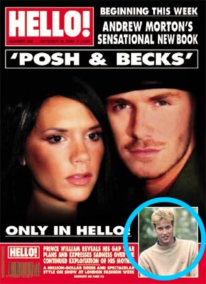
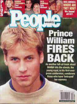
| Headline: It's an impact headline that just drags on instead of being straight to the point. "PRINCE WILLIAM REVEALS HIS GAP YEAR PLANS AND EXPRESSES SADNESS OVER THE CONTINUED EXPLOITATION OF HIS MOTHER" Note how his name is first , how he is not directly quoted and "exploitation" is meant to be a strong word on the cover in order to catch the attention of the consumer market. | Headline: "Prince William FIRES BACK -- As another tell-all book about DIANA hits the stands, the young royal, in his first-ever press conference, condemns those who have "betrayed" her memory" Note how his name is predominant. The subheadline has his mother's name in capitals, he is directly quoted, the first ever press conference point is meant to be a special reason to listen to what he has to say. All this combined helps sell the magazine. |
| Cost: £1.55 or $5.99Cdn | Cost: $2.99Us or $3.99Cdn |
| Author: A special report by BBC Royal Correspondent Jennie Bond. | Author: Michelle Tauber, Simon Perry at HighGrove and Nina Biddle in London. |
| Publisher: Polestar Hispànica | Publisher: Time Inc. |
| Format: Large (9.5 x 13) Glossy | Format: Medium (8 x 10.5) Glossy |
| Main Graphic Used on Cover: (See Picture) The cover had a small picture, from the day, in the lower corner. This was more than likely to the exclusive Hello! acquired that week about Posh Spice. | Main Graphic Used on Cover: (See Picture) The cover had a huge picture, from the day. Having Prince William on the cover attracts attention any day, so when magazines can, they do put him on as a full cover graphic. |
| Article's Rating: It was small, but, I expected it to be that way. Hello! is always more visual. | Article's Rating: It was a little bigger than Hello!'s, supplemented with a series of quotes from the book. |
| About the Font: It is narrow and reads up and down. | About the Font: It is chubbier and reads to the left. |
| White Space: Hello! Doesn't have white space, it fills it with pictures or text. | White Space: On the top and bottom of pages there are boxes of white space. |
| Colour Scheme: Same as rest of magazine. A unified look is achieved when each page of each issue has something in common. | Colour Scheme: Besides the background of the text being white, People Weekly doesn't have an established colour scheme. |
| Graphics Use: Heavy, with pages of the story being solely dedicated to one big picture. The photographs from the day were clear, not from the June release and looked superior. | Graphics Use: Medium, could have used a more appropriate set of pictures other than ones from the June release, maybe from the day itself. |
| Graphics Placement: The pictures used were mostly poster size. Captions are placed in accordance with how Hello! places captions -- Along sides or under the main body of text. It's neat and tidy. | Graphics Placement: Pictures as backgrounds, inset pictures and pictures over top of each other. Captions are speratic at best, some are in purple boxes while others have the caption right on top of the text. |
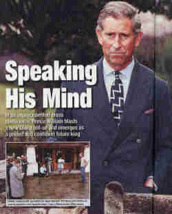
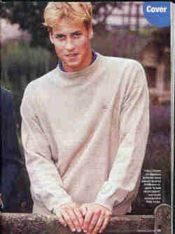
| The Eye Catcher Picture: (This picture) because of how it is so big, standing alone on the right side of the page with William leaning towards the reader drawing attention towards the left body of text. | The Eye Catcher Picture: The picture used as a background is the catch because it is the entire size of the Double Page Spread. Also, because of how Charles is standing the attention is drawn to the left. The tie is bright and I believe that's why the attention is drawn there. (Picture's 1st Half & 2nd) |
| The Worst Picture Used: The one of Prince William leaning forward on the first page. It would be okay if he was laughing, but, he isn't. He just looks as if he is playing with his feet and is trying to explain something difficult. | The Worst Pictures Used: The ones of Prince William obviously taken by a member of the paparazzi. There is one of him on a motorcycle, one of him playing sports (at school no less) and out in a boat covering his face from the photographer. |
| Final Rating: Hello! is the better magazine of the two. | Final Rating: Typical tabloid trash, all the time, not just in comparison. |
Final Note: You get what you pay for when it comes to magazines. Royal coverage is always badly done, no matter what you buy or where. If you want to pin up pictures, buy Hello! If you want the article, buy the Ottawa Citizen.
