

back to "Education" website
MATH 104 - Introduction to Statistics
WEEK 1 - Sept. 3
WEEK 1 - Sept. 4
WEEK 2 - Sept. 8
WEEK 2 - Sept. 10
WEEK 2 - Sept. 11
Summary: Today's class was a basic introduction to statistics. We discussed what we has a class though of when we heard the word statistics and the prof. went over the different types of stats and methods of achieving stats that we would be learning throughout the course.
Stats in Practice
For the last 10 years people are talking about statistical thinking. You look at the big picture. ¿What is stats all about? <-- DATA. You will be dealing with uncertainty, variation. You need to deal with a lot of variation, example: weight of 1 student = 120, get another student to measure the weight, they will be a different number, there will be a different variation. Dealing with different numbers... ¿How can we take this data and deal with it with all the uncertainty? <-- variation. Example: driving to U.C.F.V. one day may take 15m30s, the next day it may take 16m50s, the third day it may rain and it will take even longer. You want to find an average (mean) of how long it takes to drive. **you need to come up with the data and use it properly**
2. Data Production: ¿How can you produce it? Sampling and design of experiments are the main methods. Sampling: ex. get peoples opinions (opinion polls) Example: 2010 bid, yes or no? There is no control, you just get the data. Example 2: Take Aspirin vs. a new drug. You want to compare them, and when you give them to the patients, you have no control. However you DO need to control who gets which drug to test because you don't know if the results are true if they are given to a certain majority. If you give Aspirin to old people, mostly male, there may be a difference comparing it to the new drug you you may get it tested by young women. This is why you need to do a random sampling to ensure that there is a vast difference in your sample and the two drugs get compared equally.
3. Statistical Indifference: draws conclusions about the population from which a set of data is drawn. It should be accomplished with a statement of reliability. EX. 1: Working class in BC (pop. approx. 3m) p=proportion of people without jobs (true unemployment rate). You need to get information from each and every unit - this is called a census (which is costly and time consuming). In stats we think of shortcuts, so this is why we do sampling. From the sample we take of the population of BC, we ask the question ¿do you work, yes or no? Then we do the counting... lets say 16 people are unemployed out of the 200 people we sampled, so the sample proportion is 16/200 which = 8%. But how can we make that a reliable statement? Simple, we say that the 8% +/- (plus or minus) 2% meaning the true value is 6% - 10%
*end of day 1, back top of the page*
Terms
Population: is a set of units or individuals. example: people, objects, events, people in the working class, families in BC...
Variable of Interest: a characteristic of a population unit. example: is the person employed or unemployed? how much a family earns a year...
Sample: is a subset of the population units
Data
There are two types of variable data.
Categorical Variable: is one that can be classified into one or several categories. example: eye color (blue, brown, hazel, green...) Categorical variables are also known as qualitative variables. A categorical variable can be displayed in either a bar graph or pie chart.
Quantitative Variable: takes numerical values only. example: income, age... A quantitative variable can be displayed through histograms.
Histograms
If you are given 15 numbers (weight or 15 football players), 15 quantitative (numerical) observations: 210, 243, 227, 235, 274, 250, 242, 265, 245, 291, 243, 282, 276, 314, 245
![]()
The above is an example of a histogram. We need to know how the data points are distributed. We need to define class intervals to that each observation can be classified into one and only one class interval. MIN --> MAX = sample range (largest observation minus smallest observation) example: 314 (largest) minus 210 (smallest) = 104 therefore interval is between 5-12.
A relative frequency distribution table:
|
Class Interval |
Tally |
Frequency |
Relative Frequency |
|
200 - 220 |
I |
1 |
1/15 |
|
220 - 240 |
II |
2 |
2/15 |
|
240 - 260 |
VI |
6 |
6/15 |
|
260 - 280 |
III |
3 |
3/15 |
|
280 - 300 |
II |
2 |
2/15 |
|
300 - 320 |
I |
1 |
1/15 |
| Total= |
15 |
1, 100% |
Chart Types
Stem plots
| Stem | Leaf |
| 4 | 7 |
| 5 | 2 9 |
*end of Sept. 4, return to top*
This week's class was our Monday computer lab class. In the computer lab we went over a brief overview of how to use Excel and Minitab. Not many notes were taken for this class because most of the work is done on the computer. Each program has a help section where you can go if you do not know how to do something or cannot remember how to do it. Minitab is available at www.minitab.com for a free 30-day trial. Sometimes if you move the date back on your computers calendar clock, you can keep an indefinite 30-day trial period ;)
*end of Sept. 8, back top of the page*
Stem plots
The number of stems chosen should be between 5 and 12
You may need to do some rounding in order to achieve this. example: 3.57 = 3.6, 4.12 = 4.1, 4.78 = 4.8 You want to round for simplicity because if you left those numbers as is, then you would have to put data entries from 3.5 all the way to 4.8 (3.6, 3.7, 3.8...) which takes a long time, that is why we round. We may need to round (in Minitab it's called truncate) the date points so that the last digit is suitable for being a leaf.
Split Stems example:
Age 41, 44, 47, 49, 50, 55, 62, 66 <-- we can split these ages into early and later years (e.g.. early 40's, late 40's)
| Stem | Leaf |
| 4 | 1 4 |
| 4 | 7 9 |
| 5 | 0 |
| 5 | 5 |
| 6 | 2 |
| 6 | 6 |
Numerical Descriptive Stats
 |
These to the left are some math equations. E equals
the sum of many numbers. Whenever you see a letter 'i' beside an E
it represents the number that is shown next to the the X. n
represents the amount of data in the data set. example: {4,5,6,8,7}
<-- n would equal 5 because there are 5 numbers in that data set.
**whenever you read "X-bar" in these notes, it means the symbol with the X and a bar overtop of it ** |
There are two kinds of means:
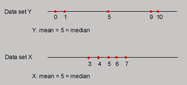
How a mean and median depict the form of a graph
A mode is a measurement that occurs most frequently in the data set. Example: (quiz scores) 8,9,6,7,8,7,8 the mode = 8 (because it was the most common quiz score). It is possible to have more than one mode. If a curve is bell shaped/normal, then that means that the mean=median=mode (they are all equal)
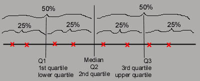
Quartiles : comes from quarter, four equal parts (data sets with 4 equal parts)
*end of Sept. 10, back top of the page*
Equations for finding M, Q1 and Q3: they basically all share the same equation (n+1)/2. Remember that the n in each of these equations represents the amount of data in each section. So for M the n represents ALL the data in the data set. for Q1 n represents the amount of data left of the median, and for Q3 n represents all the data right of the median.
Box Plots
Interpretation
Three Reasons of having an Outlier
They may be...
Measuring Speed (Variance Standard Deviation)
*end of Sept. 11, back top of the page*
