
|
Journal 2 |
|
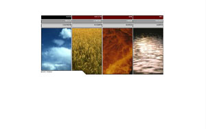
I like this page because of its simple nature. It starts off with a simple background only to have that broken up by 4 different elements. Neatly placed in the center of the page, Nick Finck creates a focal point on the page drawing the audience in. The theme is consistent throughout the web page and Nick Finck incorporates the images into the navigation bar very neatly. Once you enter the page, you'll be informed by good and clean information. He doesn't seem to throw any unneeded information at you and seems to get his point across clearly. He has a small, none distracting picture on his web page and some other interactive things for the audience. Nick Finck also has a journal entry on his web page so we can get to know his personality and daily activities. I really enjoyed Nick Finck's web page and learned a lot from him. It's not always the best to have too much on a web page. I believe that if you can convey a message with little or no words, is the best way.
|

 While
I was looking on the World Wide Web, I came across a lot of different web pages.
As I looked through them, I noticed there are a vast array of ideas, thoughts,
creativity, and just personality. I was looking through many of these web
pages to find one that stood out or made an impact on me. After many hours
of surfing the web, I came across a web page that i thought was great. Not
only was it my style, but it was very clean and insightful. The web page
belongs to a guy named Nick Finck. He's a professional and this is his
online portfolio. I was suppose to pick a instructor's web page, but I
didn't see anything that really caught my attention. Before giving up, I
came across a very simple, clean and visually stimulating piece of work.
While
I was looking on the World Wide Web, I came across a lot of different web pages.
As I looked through them, I noticed there are a vast array of ideas, thoughts,
creativity, and just personality. I was looking through many of these web
pages to find one that stood out or made an impact on me. After many hours
of surfing the web, I came across a web page that i thought was great. Not
only was it my style, but it was very clean and insightful. The web page
belongs to a guy named Nick Finck. He's a professional and this is his
online portfolio. I was suppose to pick a instructor's web page, but I
didn't see anything that really caught my attention. Before giving up, I
came across a very simple, clean and visually stimulating piece of work.