Step
1. Concept - Image #1
(all pre
coloring stage)
Before
I can
make a character come to life I have to decide on a few major factors.
a.
Pose/Attitude - What is the
attitude of the character? In Gen's case she is highly seductive
but she is also powerful and high browed. She knows that she is a tough
individual
who
will defeat whomever dares to challenge her. I want Gen to appear in a
position of power, her eyes are locked on the viewer daring them to
gaze at her
body.
As a
female, Gen knows she's attractive and her posture exudes her sexuality
but on the same notion she is not a cover girl. She will kick your butt
if you try to
fight
her, so
this pose I referenced
from Witchblade
#63
conveyed that feeling to me.
This
leads me to
a very pivotal point of the creative process, RESEARCH. It is exceptionally
difficult to work in a vacuum. It is ok to look at other's work and
draw inspiration from their efforts, all artists have referenced
someone else's work at one point or another. We all learn from each
other, the difference in the mediums is how we reference from then
change what we observe. At least this is MY views on the matter. My
highest level of advice for creating characters, writing stories,
making props is to do your RESEARCH.
The internet is a
very powerful tool as well as libraries. Try to keep a
clear focus on what you are trying to convey in your character art be
it power, vulnerability, weakness, villainy, seduction,
innocence, love, etc. Once you have the idea of what your character
will and will not do and decide upon the idea of the pose you are
looking for, research becomes much easier but STAY FOCUSED on it. I
have countless books of various artists and "making of" film books,
troves of pictures I have printed from the internet and so on. If you
have ever wondered who I have looked up to as inspiration for my work,
his name is Bruce Timm the inventor of the Batman the Animated Series
phenomenon. I also value the shading techniques of anime as well as the
gesture characterization of Disney films.
If
you want a
few leads to point you in the right direction for pose research, find
any artist that inspires you and search...
http://google.com - picture or web
page archives
http://altavista.com - same
http://theforce.net - Fan Art Museum
b.
Stance/Posture
- Gen's position
needs to convey sexuality and power. She stands fully, but she keeps
one of her legs extended outward so that her pelvis shifts upward,
which
gives the
viewer the idea of her curves. There are also very, very, few angles in
Gen's depiction. Notice also that her legs are not standing side by
side, which lends to an understanding of Gen's ability of grace and
balance, even when she's ready for combat. She doesn't make the first
move in battle, she prefers that her opponent make that
decision
and go
from there. That is Gen's position of power, a "Make your move."
posture. Her fingers are exposed and spread apart to signify the
strength and balance she possesses and her coat flows fluidically
towards the right while her hair follows the imaginary breeze which
lends a sense of femininity and theatric presentation.
Step
2. Sketch - Image #2
a.
Gesture - You can see
the build up of the gesture in this pose by the sweeping blue lines.
Note that since this is a seductive female pose the tilt of the pelvis
is opposite to the tilt of the shoulders. This is because the hip is
lifting higher upward to support the balance of the figure's stance.
Also note the sweeping center line that runs from about the neckline
down towards the lower pelvic region which sets up the general flow of
the eye through the figure's posture.
b. Proportions
- Keep
them accurate! (more on this later)
c. Anatomy - All
figures start out drawn nude, if that offends you get over it. It is
necessary to draw a figure nude (with only slight details) such as the
nipples on breasts so that the clothing will lie over the figure
accurately, if you don't pay attention to anatomy, your figure can turn
out looking blocky or warped, or appear off balance, keep a good eye on
the general muscle placements. In sketch #2 you can clearly see the
shapes that are more or less composing the structure of Gen's pose.
Marvel figures for instance are made of four central elements, cones,
cylinders, spheres, and
rectangles/cubes. (more on this later)
d. Layers/Overlaps
-
Layers in this case are anywhere in the picture that hair or elements
of a costume, anatomy, or foreground elements overlap one another. In
the initial sketch #2 you can see there are only traces of Gen's
costume placed in, mainly her boots and pants. Gen's hair tends
to overlap over each curl, likewise her coast overlaps portions of her
costume, so that depth is achieved in the image. Its obvious that in
the case of pants, they will not look right if the coat does not in
some manner shield them from view unless in the case of this
drawing, her coat is billowing in a manner where only a small fraction
of her pants are covered. Likewise with the arms. Gen is NOT wearing
one coat she is wearing two. The first covers her top and runs down her
arms, while Val's older sleeveless trench coat is wrapping along her
shoulders, notice the difference in textures and you'll understand this
more clearly in the final picture. Also pay close attention to how
fabric drapes and folds along the body. If you look at Gen's coat
covering her breasts, there is a overlap of fabric there to show how
the material is draped over them, this shows that the fabric is also
NOT just painted on, it has flexibility.
e.
Originality/Viewer
Perception - For my artwork I may reference another person's
work but as I stated in research, it is how you change
a starting idea and make it your own unique approach that makes
it become YOUR artwork (speaking originality here, not copyrighted
characters). You can see that between my first general "spark" for the
pose and the actual pose that I did not keep the same hands as the Witchblade cover conveys, I changed
the placement of the arms to match my needs and add more emphasis to
Gen's power and sensuality. The original reference doesn't give me a
whole body to work with, so I have to use my knowledge and research
anatomy books to figure out just how the figure is constructed at its
very base, without the clothes, color, or dramatic lighting. Gen's face
is highly stylized to show emotion. The eyes are the windows to the
soul and you can clearly see that her eyes undergo many changes in each
step of this process. The face of your character is very pivotal in
exciting the eye and your audience's attention. If you want to show
anger, your face needs to show this, if you want to show sadness then
your face must also convey this message.
In this post Gen is
showing you she is seductive but she is also
in control of your eye, she wants you to look at her but on the same
notion if you want a fight, she'll bring it to you as well. Gen's isn't
"posing for the camera" this is a moment captured in another world
where you are invading her space and she's not very pleased with it.
The viewer must decide for themselves what point of view they are
approaching this image in. Is it just a glance towards this woman on a
ship? Are you looking through a villain's eyes or a military
soldier's point of view? Are you Val? This is an image that does
not give you all the answers, by image #6 you know you're either on a
ship or some sort of space station with a planet in the background
through a view port and Gen has her lightsaber drawn in a position of
defense...you are a threat to her, but why is the mystery.
Step 3. Costume/Details - Image #3
a. Message
Conveyed
- Gen is a "bad girl" in the sense she has
triangular shaped eyes while most "good girls" have rounded off, wide
eyes. Her brows are slim and arches, and her lips full and
pursed. Her costume must reflect this
attitude she has in her stance. She knows she is attractive, so to
convey that
element without taking the easy road and dress her in as little clothes
as
possible, she teases the viewer with the slits cut into her pants,
exposing
part of her inner thighs and likewise, also her exposed midsection
and
regions of her outer hips. She is however,
tastefully seductive. She has breasts but notice she does not have one
ounce of
cleavage showing, her zipped form
fitting top is more then enough to exude that element of her sexuality
without
having to resort to a bikini, let alone a g-string or torn clothing as
many
comic book bad girls exhibit.
In this
particular case of Gen's costume, you are most likely aware that Gen's
former costume was fairly in between light and dark. She wore a two
piece gray jump suit, black knee high boots and had a long sleeved
trench coat. However, you must understand in this representation which
is designed to show Gen's look in a new chapter, that events have led
Gen to decide that she can no longer dress loose and casual.
Emotionally Gen is angered because she is no longer in a position of
power. Her attire has been shifted from her neutral look to a more
darker, ominous choice of clothing. She is however NOT evil in the
sense of dressing in morbid or gothic garments. Gen herself is
not evil but she is powerful and strong willed. To set off the the vile
appearance of her almost all black/dark gray attire I added light to
the darkness in the form of the gold highlights on her top and down
into portions of her pants. Gen's also Val's fiancee.
She shows her
place by Val's side by incorporating elements of his elegant Versai
Crest into her wardrobe as well as designed her own unique Crest to
compliment Val's insignia as a symbol of unity. What cannot be made out
clearly in the final picture of Gen's attire is that she not only wears
the same fingerless gloves as Val, but she has one of her crests on one
hand and Val's on the other and Valaryc has the same on his gloves so
that when Gen and he embrace, they both have a piece of each other
constantly viewed to those around them. This is yet another detail of
their unity. If you look close you will see while Gen has
primarily her own symbol on her belt buckle, she has the Versai Crest
in her boots.
I wanted Gen's
boots to also take a unique twist and not be the same old standard knee
high shiny black boots I have clothed so many other characters in. I
wanted Gen's costume to reveal she's a dark female but she's not a
dominatrix or a pin up girl. Gen is a powerful fighter who can hold her
own, she's intelligent and she's supremely confident in her abilities.
If you are not aware, Gen's race is what I have called "Seducyn" it
means exactly as it sounds. Gen is not human, she looks human but she
has the distinctive ability to seduce a male with her purple eyes. One
of the aspects of the Seducyn race is that they have matching eyes and
hair color, in Gen's case she has purple hair and purple eyes
NATURALLY, not dyed or contacts.
b. Character
Evolution
- Gen's secondary coat is an important aspect to her outfit design. It
was one of the coats that Val used before he changed his style to the
tri-fluted collar seen on his latter Deception pictures. Again I wanted
to convey that Val and Gen are unified with a very powerful love for
one another but they are also both fighters as well. Each of them holds
a piece of one another and I wanted this reflected through her
outfit. The belt is one element that has remained consistent in
Gen's character from her first drawing, it is a belt design that Val
has built for her long ago before her death, she has recreated the same
make as a tribute to that gift. It is one element that will never
change EXCEPT for the belt buckle which was changed to Gen's new crest
to show that she is adapting to the technology of the future.
One last
important detail to Gen's costume is her triangular "V" clasps that in
her old costume used to secure her shirt . In the new design of her
attire, she no longer needs them to cover her chest, so they were
incorporated into her wrist gatlents and boot cover attachments.
Why are they still here? They are as unique as Gen is and are a pivotal
element of keeping "Gen" consistent in whatever new outfit she is
placed in. Some people like to completely re-invent a costume, my
approach is more like evolution. You start with one idea then gradually
shift it to something new. This is best noticed in the change from Val
as a Bounty Hunter to the introduction of his first use of a sleeveless
trench coat. Why did he take on the coat? Because the services rendered
by his Bounty Hunting attire were no longer necessary. He was forced to
evolve and adapt.

(This is again my approach to coloring
with Photoshop, there are countless ways to color digital artwork.)
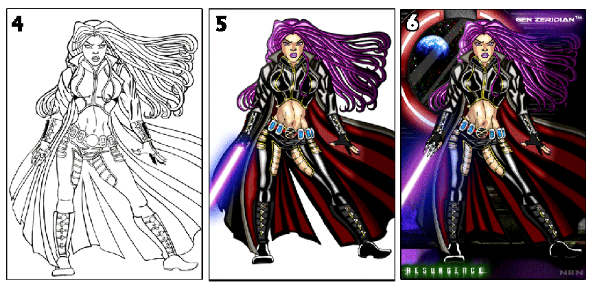
Step 4. Inking -
Image #4
a. Vary Line Weight.
- Varying
the line weight as you can see from the pencil sketch of #3 to the
inked final in #4 allows you to add depth to your character. Notice
also that objects that protrude into the foreground are given a heavier
line weight to emphasis the proximity of depth in the picture. This
also helps you add form to the figure and elements of clothing, by
making sure to thicken your lines in shadow regions, and apply a
"thick/thin" approach to areas of the figure that protrude and recede
as well as define sweeping curves.
b. Close Gaps - If you
do not close gaps, when you select a region you will wind up selecting
entire patches, rather then single regions or shape elements which will
greatly increase the time it takes to color a picture. I tend to
make sure hair and clothing gaps are closed up so I have less
frustration with them later.
c. Keep it clean! - It's ok to
have some liberty in the gesture of your
pencil drawings, but when it comes to the ink final you want the image
strictly BLACK and WHITE, or you will be unable to easily remove the
white background in the scanned picture, making it more difficult to
split up regions of the image to lay down flats.
Step
5. Prepare Art for Digital
Coloring - Image #5
a. Scan in lineart.
- 300 DPI
- Open in Photoshop
b. Select
White Color Range.
- Delete White - Create New Layer - Fill with White
c. Name
art layer
"Lineart" drag to top of palette window.
d. Create
and Color in
Layers Under Lineart Layer if Possible. - Sometimes you might actually
accidentally start coloring on the lineart itself, if so don't panic,
just make another later under the lineart and continue, when you are
completely finished you will flatten your coloring anyway.

(For light and shadow section, refer to these pictures unless otherwise
instructed)
Step
5B. - Consider Light and Shadow
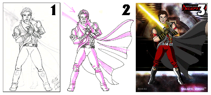
a.
Determine Light and Shadow - Anything that is not shaded should
represent the lightest part of your figure, I use a pink highlighter or
a marker to determine first off where is the light coming from? In Val
#2 you can clearly see a arrow pointing where I want the light to come
from, you can also determine that there will be a lightsaber digitally
added to Val's hands and it makes sense that the light from the saber
would illuminate portions of Val's attire. In the final product for
this image, you can plainly see that the light and shadows match the
final work. My process for coloring will be explained further down.
b. Light
Direction - Expanding upon the information presented above, it
is important to take into account where the light source is when you
color your artwork and remain consistent in it. Its fairly simple if
you are accurate in your initial shadow template, in this case Val #2
is the template for the coloring in Val #3. Just keep in mind to remain
consistent in the direction of your light, so if you have a hand with
fingers and you determine that the shadow is on the bottom of each
finger, color accordingly. Also make sure to pay careful attention as
to how light spills along the figure, especially in folds. If you look
at Val's knees #2 and #3, there is shadow in the bunched fabric of his
pants. The light is coming from the upper left corner and shining
downward so anything on the right side is thus, put into shadow and
remains constant throughout the entire picture. Take into consideration
the effect that your background also may have on the character as well.
Notice that Gen's hair in #6 shows that the ends of her hair fade to a
dark, almost flat purple because they are in complete darkness, same
with the inner details of her coat.

Step
5C, - Duo tone Coloring/Hard Edge Shading
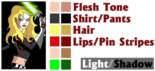
a. Determine your
Color Palette - You might notice that in many of my pictures,
the colors of outfits, hair, and some eyes constantly match from one
version to the other. This is because I create my own custom color
palette for my characters. In the case of Isis Surul (above) I have
broken down for you the general colors used in her picture (excluding
lightsaber). You will notice a pattern that I only usually use a two
tone or "duo tone" coloring process. I don't mean in the sense of a
picture that is only in two colors, in this use of the word I mean each
individual color is "duo tone". One color is the flat, base color and
the other is a slightly darker hue for the shadows. Examine the picture
of Isis and you will begin to notice the pattern. Light source is still
a VERY important aspect of adding a solid feel to the picture, if the
colors did not follow the rules of light and shadow, it would look a
mess and not make much sense visually, the two tone color effect would
fail.
I have broken down the image above into the light being represented on
the left and the shadow on the right. I have also broken down where
this two tone color process is used on Isis's individual sections from
her hair, to her clothing, to her eyes. The two swatches of color after
Lips/Pin Stripes are the gold, and her eye colors. Visually speaking
the image wouldn't look balanced with those labeled along the main
"Light/Shadow" title.
b. Why a
two color process? I use this process because its first and
foremost very easy to do when you get the hand of it and two, I don't
go for realism in this sort of drawing, I admire the techniques
invented by Walt Disney and Anime that use this method to push the
solidity of form and function in animated features. Remember that the
older animated movies were all hand painted cels. To achieve the
realism of reality into the motion pictured while preserving uniformity
in the animated sequences, opaque paints allowed animators and cel
painters to make sure every frame was constant with as little color as
possible. It breaks down very simply, the more colors you have in a
palette one ONE cell the longer its going to take to make 1000 of them.
Anime loves to use expanded formulas of three, four, and sometimes even
five levels of light and shadow. My approach however is that I use two
to three max for all my work so that I can maintain that "cartoon" feel
to my images,
Rest assured I can draw realistically if I intend to do so. It is my
choice to keep a level of animated splendor to my work that makes my
work look "animated".
c. What
styles should I use? Well depending upon the amount of time you
have to invest in a drawing you can use my process or if you are really
good with an airbrush use those, or if you really love Image Comics and
Top Cow art apply a process known as "frisking" which is making a
series of selections and through lowered opacities build up airbrushed
edges, which leaves some hard and some soft. Personally I would love to
frisk my pictures and I'll start experimenting with it in the future as
I have time to practice the techniques, my advice is color your artwork
in whatever style you feel comfortable with.
d. Choosing
Colors - All of my artwork that is hand drawn and colored in
this manner is usually composed of bright, vibrant colors and dull,
dark backgrounds to pop the character forward. I use this vibrancy
because I know that the eye is attracted to light and the better used
it is, the more visually enticing my artwork is (added to the strength
of the drawing) which sets the mood of the piece and adds a wonderful
level of drama and suspense people enjoy watching,
My advice on choosing colors is to consider the mood you are trying to
convey to the audience. If it is a action packed scene you will often
see that warm colors are used to show the intensity of the moment (red,
orange, yellow) while if the scene is mysterious or sad and moody you
will often see lots of cool colors (deep blue, purples, maroon). For my
scenes it all depends on the point of the image, if you look at
Insurrection Val he is ready to fight and he is inside a very dark
place but his intensity in his eyes commands your attention, you know
what he's thinking and the fire added to the background on the metal
doors only adds to the excitement of his next perceived action. Gen's
pic in #6 follows this format as well but this one doesn't depend on
the location like Val's pics do. In this picture the focus is on Gen
and what she intends to do, the details of her costume, etc. The
background only tells you that this picture is sci-fi/Star Wars themed
and gives you a location to place yourself within, the background gives
a good sense of location but it does not distract from the character.
Step
6. Finishing Touches
a. Coloring
Finals - (info soon)
b. Setting/Background
- (info soon)
c. Adding
Text - (info soon)
d. Signature
- Protect your work! I use my initials to show the art is mine with
"NRN" ghosted somewhere in the picture. If you really want to protect
your
work pay 30.00 and register for a copyright with the US copyright
office.
-
RETURN
TO MAIN -
All information, character names, images NOT owned by Lucasfilms, Disney
or Top Cow, are copyright and
TM 2004 Nick Nugent. All rights reserved.


