DISCLAIMER - The information here has been gathered from various sources, but
mostly from fellow enthusiasts. I have included pictures of original decals provided to me.
I obviously cannot make claim to all this information being absolutely correct.
Where avaiable I have also included pictures of current reproductions available.
Looking at the originals in comparison to these reproductions, if you can't find well
in excess of 30 mistakes in the repros then I think you need new glasses.
Numerous errors including fonts, sizing, alignments and spacing.
To the occasional viewer these probably don't make much of a difference.
However, if you're going to buy one anyway, why not get one that is correct.
Most of the credit here needs to go to my software guru buddy Shaun.
Hard to imagine the process and time involved in getting these to where they are.
These are priced at $7 each including shipping.
67 Camaro
All (including Z/28), except RS350 Convertible and RS 396 - Late Version G #3917572
If anyone has been following our progression of getting some of these completed you will
realize the numerous inaccuracies of current reproductions. This one is no different.
Take a look at the side by side comparison of an original and the current reproduction.
Look at each line to see the discrepancies between the two. The big fault on
the reproduction is the White border on the outside. Now take a look at ours. I think we
have addressed most of those issues. Some of these differences are quite noticeable,
while others are subtle. It all comes down to being “correct” or just “so-so”.
Thanks to fellow enthusiast Keith for providing pictures of originals.


68 Camaro
SS 350 and SS 396 AH #3934883
We were approached by a frustrated enthusiast who was not happy with a lot of the reproduction
decals, including this one. If you can't find well over 30 mistakes in the repro below then
you probably need new glasses. Thanks to fellow hobbyist Keith for the original picture.

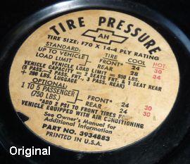

The errors that really jump out are the overall misalignment of words and lines.
Font styles are not as they should be either. Look at the bowtie in the original,
it is not symmetrical between the left and right ears. Our product replicates this.
Look at the Red "HOT" numbers on the original and see how misaligned they are
horizontially to the numbers on the left. Our product replicates this.
Take a close look at the lines and brackets as well.
My Email For Order Enquiries
If a security window shows up just click "allow"
HOME