Stage
One: Conceptualization 
The process begins with brainstorming ideas.
Or, in my case, a lot of brooding.
Actually, inspiration can come from anywhere. Something you see, something
you read, even personal experiences. Some of my best works have sprung
from dwelling on my emotions, re-living a particularly happy or sad experience
and channeling that feeling into my artwork (I find this technique especially
effective when working on my more realistic illustrations). I'm not sure
if all artists work this way, but I've found it to be a useful, if not
always pleasant, experience.
"A Phantom Valentine" came about when I wanted to send a Valentine's
Day greeting to the friends I'd made on an online Phantom message board.
As we all shared a love for The Phantom of the Opera, it seemed that a
Phantom-themed picture would be appropriate.
Three concepts came to mind: a romantic scene with The Phantom and Christine
sitting together in front of a fireplace, The Phantom presenting Christine
with a giant heart-shaped Valentine's Day card, and The Phantom and Raoul
both offering gifts and flowers to Christine at the same time (this last
concept would resurface the following year as my second Valentine-themed
work: "Two Suitors").
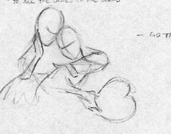
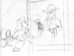
Concept #2 had the most potential, but the look of the piece hadn't been
chosen. The only other illustration I had done was "Erik in Repose,"
a very realistic and moody drawing, so my initial sketches were in that
vein. The image above is the first sketch of the idea, taking the classic
pose from "Music of the Night" and altering it slightly to include
The Phantom holding a giant heart-shaped card.
The more I thought about it, however, the less it seemed that a realistic
style would fit the more lyrical feel of the idea. Therefore, I chose
to go in the opposite direction. Having just come off a major animation
project, I was very accustomed to drawing in a cartoony style. But first,
I had to design the characters.
It took a bit of time to come up with a look that I was pleased with.
I wanted something simple and streamlined that could later, if the need
arose, be applied to all of the characters from the show. The final design
was a combination of the Bruce Timm / "Batman: The Animated Series"
look and a touch of Disney, filtered through my own personal artistic
style.
Stage
Two: Illustration
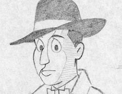
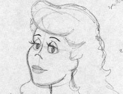
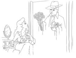
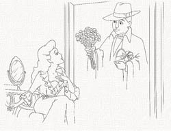
Having designed the characters, I then went about refining the composition.
Instead of using the "Music of the Night" pose, I decided to
place the scene in Christine's dressing room.
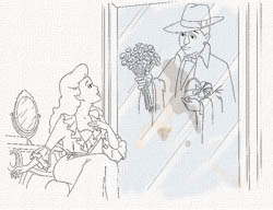
Using photographs from George Perry's "The Complete Phantom of the
Opera" text as reference; I set the stage, as it were, with familiar
props from the ALW musical. This first sketch (above, left) has The Phantom
simply standing in the room with his gifts of affection. Rather dull,
don't you think? So did I. So in the next sketch (above, right), I placed
him behind the mirror, much more appropriate for the character while at
the same time allowing me to play with the image software when I scanned
the final drawings into the computer. I wasn't happy with the original's
vertical format either as it didn't give the characters much room, so
I converted it to a horizontal layout and fleshed out the drawing from
there.
Planning on making The Phantom's image "fade into view" from
behind the mirror, I finalized and inked the illustrations on two separate
pieces of paper (one for The Phantom and another for Christine, the mirror
and her table) and scanned them into Photoshop.
Stage
Three: Painting
Once the drawings were scanned into the computer, I used
a process I learned in an old Photoshop book to transform the flat drawings
into a faux-watercolor painting.
With each drawing, I adjusted the levels and erased all extraneous marks
left over from the scanning process such as dust or paper imperfections.
Then, I selected the black linework and copied it onto its own layer,
setting the blending mode to "multiply." After deleting the
original artwork beneath, I essentially had the equivalent of an inked
animation cel: a transparent sheet of acetate with black line art on the
top surface. I then copied the Phantom line art and pasted it into the
Christine file. Because of the blending mode, both line art layers could
be seen at the same time.
I applied a texture filter to the background layer and filled it with
a beige color set at an extremely low opacity. Adding a new blank layer
between the line art and the "canvas" background, I could now
begin painting.
I use a minimum of tools when I do these illustrations. The Paintbrush,
Eraser, Smudge and Blur are all I really require to do what I need to.
That's not to say that it's a quick, simple task, however. I tend to be
rather meticulous when I work and this was the first time I had ever tried
to create a watercolor in the computer. To make it more complicated, I
hadn't yet bought my art tablet and stylus and had to make do with a standard
mouse.
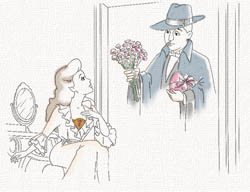
I used the Paintbrush tool (configuring it with one of the smaller soft-edged
brushes, turning on the "wet edges," and setting the opacity
rather low) to lay in the flat colors. Again, in keeping with the playful
tone of the drawing, I departed from the acutal lighting design of the
stage show and chose a pallette that wasn't as rich and dark .
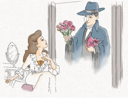
Creating a new layer above the flat colors, I began painting in the tones.
Painting on separate layers served as a form of insurance. Should I make
a mistake (which happened frequently on this initial painting), I could
simply clear that layer and start again without destroying the work done
on the layer beneath.
It's at this point that I use the paintbrush to "sculpt" more
dimension to the characters and background (The tones level alone is shown
above, right). The tones are the same as the flat colors, only at an even
lower opacity. Traditionally, a gray or blue would be used to create the
tones and shadows, but I liked how the use of self-color made things "pop"
a bit more.
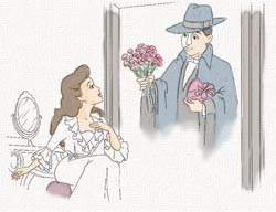
Now there came a problem. I had all the elements painted to my satisfaction
and all I had left to do was combine the separate illustrations, having
the image of The Phantom appear in the mirror. I tried various masks and
filters, but nothing seemed to replicate the effect I was going for. Finally,
I decided to simply merge both line art layers and re-paint The Phantom,
smudging and blurring the colors so that his image would appear to fade
into the surface of the mirror. This worked out better and was more logical,
as if one was doing a painted interpretation of the stage effect.
This change preciptated an alteration in how to make it look as if a
sheet of glass was between the two characters. I quickly drew some lines
on a third sheet of paper, scanned them in and laid them over the line
art. I then painted the mirror surface with a light shade of blue and
erased some color along the newly added lines. As a finishing touch, I
took Christine's flat color layer and copied it. I lowered the opacity
even more, flipped it and positioned it over the mirror. I then selected
that layer alone, skewed it so that it matched the perspective of the
mirror, and voilà! Instant reflection.
Finally, the completed work. And finished with only a few hours to spare
before Valentine's Day!

|

