

The need for the standards
for web design is very essential as the number of browsers have increased
and growing for the past few years keeping pace with the phenomenal growth
of internet around the globe. With the explosion of the web came an avalanche
of new technologies, Even for some one who is immersed in the terminology
and environment on a professional basis, it can be truly over whelming.
The purpose of the guidelines
is to direct the designer with the general web technology policies followed
by Citibank along with specific attention to the EMGLS project.
EMGLS is Emerging Market
Global Lending System. The system is set to replace the existing manual
system of lending business with the futuristic web based system. The latest
web technology will be used for the development of the system that will
serve the online customer for registration, making transactions and verifying
his account details from anywhere.
Here we throw light on the
fundamental concepts about the way web works, which should orient designers
to the peculiarities of the medium like designing for variety of browsers,
for variety of displays and principles which gives a brief idea on how
web deals with color, graphics and fonts.
For any global web based
project as the system is going to be web based the biggest task ahead is
to strike a balance between the different browsers and platforms. Now there
are at least 12 browsers around but the statistics from the browser watch
site should give an idea of the usage.
Netscape - 47.08% MSIE -
51.80% All others - 1.12%
Bearing these statistics
in mind the web designer may focus only on the so called the "Big Two"
Netscape & MSIE Compatibility in his code. It is tough to satisfy one
and all. So concentrating on the majority is wise. In this view, a few
guidelines are recommended on which the designers of the project should
focus upon.
A well thought out web site
will go online quickly and painlessly, where as a poor thought out site
will be a management nightmare from day one. For example if you were to
decide to change your directory structure after establishing your site,
You would have to change all the links that contained any of the affected
URLs.
As part of your planning
think about your mission. Figure below is a feature map of a sample web
site. As you can see, this site includes several links between pages, usage
of the Netscape mail to feature, and a few CGI programs.

Home.html
This is the start page of
the web site, which contains links to all the information available in
the web site and also have mail-id of the company. It is the most important
page and should be designed very well to please the user as it is the first
impression customers will get, and it should give them an opportunity to
quickly find what they are looking for. It should contain the LOGO of the
organization.
Product.html
This page should contain
further information about all the services offered by the company. Demo
of the Services can be given with download option. For EMGLS it is a demo
of part of the service.
Intro.html
This page should give brief
information about the web site contents. For EMGLS it is about the introduction
on the project in case of intranet and an introduction of the service.
Order.html
This page can have order
forms through which the online users can place orders for the services
that the company provides. Submit button at the end of the form should
activate the process.
Release.html
This page may give the latest
press releases of the company and it should be updated regularly.
Feedback.html
This page can provide a feedback
form to be filled in by the users. Submit button at the end of the form
should activate the process. For intranet it is about the feedback of the
project.
Consult.html
This page can give the contact
addresses, phone numbers and email ids of the people of the organization
whom the user can contact for any clarifications.
Train.html
This page may provide menu
driven user friendly help for easy navigation of the site. It can be named
as help.html.
Registration.html
This page can contain registration
form for the users to register with the organization for joining the co
mail list. It is for online sign up of the customer.
Mail
to
This feature should pop up
a browser defined dialog box already filled in with the email id of the
organization.
logo
for EMGLS
Keep the page simple:
Simplicity is the final art
of showmanship. Anything you do in a page, logo or text keep it very simple,
keeping the end user in mind. The logo should be very clear and should
be relevant to the project. If the user does not understand the logo, thereby
you get your first big negative response. If you cannot create any visual
design for the logo just put the text. The logo is the start.
Write
good HTML
The key to success on any browser
is writing the HTML code correctly. There are a number of online resources
that check the web site for various quality issues including browser compatibility
of your HTML code. There are also HTML validation services that check the
code for errors. All will do a certain number of tests for free. However
to get the really good stuff you pay for individual service or a years
subscription for full access to site.
WebSiteGarage is a company
(http://www.websitegarage.com)
that provides fee-based feature called "Browser Snapshot" that will provide
up to screenshots of your page on a variety of browsers including all past
versions. This can be a good way to run tests if you don't have access
to all these browsers on your own.
Knowing your audience
If you are designing web site for a controlled environment such as
corporate intranet knowing exactly what browser and platform your viewers
are using means you can take full advantage of the features appropriate
to that browser.
Considering your site's purpose is an important factor for meeting
web design decisions knows how your site is going to be used. Site users
tend to fall into two broad categories, those who are on a mission for
information and those who are surfing the web for entertainment.
The sites for entertainment have more opportunity to try out cutting
edge or plug-in technologies that improve overall user experience of the
site. For informational sites you would not want to base the availability
of the information on a client side technology.
Web monkey is an informational site (www.webmonkey.com)
that uses a DHTML based interface. Based on assumption that the audience
uses the latest browsers. It also detects the browser to serve alternative
versions for those with out DHTML capabilities.
As a unique case if the site is about the technology being used such
as VRML environment, the developer has every right to expect the user to
use the appropriate browser or plug-in to catch up with the content. It
is advisable to provide some screenshots to show others what they are missing.
Test It
The final word in the dilemma of designing for a variety of browsers
is always TEST!. Test your site on as many browsers, browser versions and
platform configurations you have.
Professional web design firms run their sites through a vigorous
quality assurance phase before going live. They generally keep a bank of
computers of varying platforms and processing powers that run as many versions
of browsers as possible.
Before designing a site be sure to load plenty of time up front regarding
the likely platforms, browsers, technical survey and connection speeds
of the users you are targeting. If you are redesigning an existing site
spend time with the server logs to analyze past site usage.
Although your pages will certainly look different in different environments
the idea is to make sure that nothing is outright broken and that your
content is being communicated clearly.
Dealing with unknown monitor resolutions
One of the most vexing aspects of web design is knowing that your
page is at the mercy of the software and hardware configuration of each
individual user. A page that looks great on your machine may look radically
different when viewed on another user setup. This is partly due to the
browser functionality but the display device itself plays a large part
in the success of the page's design.
For the majority of your audience, the variation in display is a
function of the monitor's size ( to be precise its resolution) and color capabilities
Its important to keep in mind the diversity does not end there. Some
users may be watching your web page on TV, others maybe viewing it in their
palm of their hand on a PDA (personal digital Assistant) or even on a cell
phone. Sight impaired users may be listening to your page not viewing it.
However the knowledge of your target audience and the purpose of your site
should always guide your decision.
Browser windows can be resized to any dimension limited only by the
maximum size of the monitor.
Live space in the browser window
Knowing the size of the monitor is just the beginning. The operating
system and the browser itself occupy a fair amount of this space. The amount
of space that is actually available with in the browser window is called
as live space which is dependant on the computers operating system, the
browser being used and the individual user's preference settings.
Here are the snapshots of the two popular browsers Internet Explorer5
and Netscape communicator 4.6 which are supposed to be the latest versions
available.
LIVE
AREA in Internet Explorer 5 on Windows 95 in resolution 800*600
Maximum
Minimum


795 * 500
783 * 398
LIVE AREA in
Netscape Navigator 4.6 on Windows 95 in resolution 800*600
Maximum Minimum
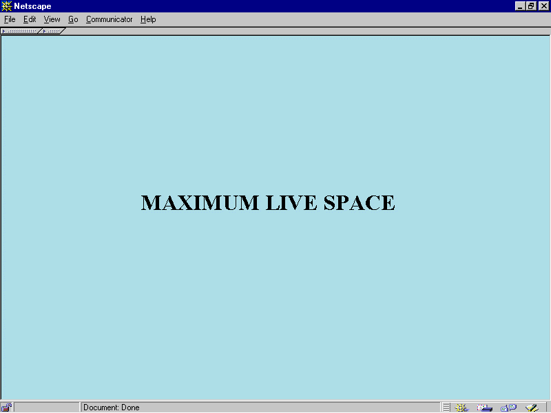
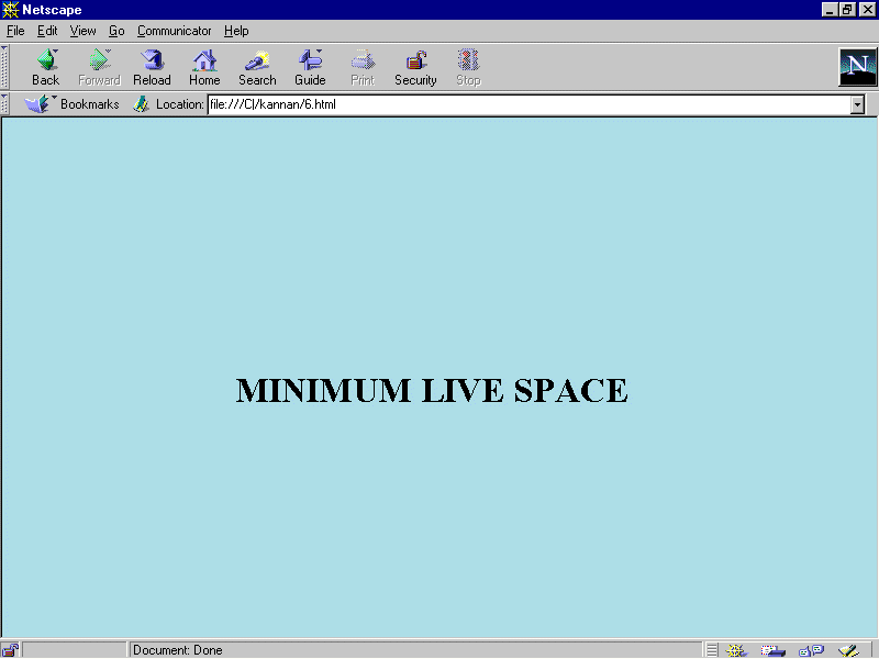
795 * 500
783 * 430
Based on the above snap shots and the pixels size the developer can
get an idea on to choose the height and width of the tables or frames they
create to fit in to a single page if possible to avoid unnecessary scrolling.
As of now IE5 is leading the pack with its innovative features like
saving the whole page as a web page with all the graphical content by creating
a separate folder with the index page name that copies all the image files
with in the folder and the index page with .html extension, separately
out side the folder placed next to it when viewed in the windows explorer
. This helps the online user to view the page offline also with all the
image files on it and not as blank squares.
Netscape Navigators Latest release 4.6 is found to have bugs as it
struggles to open up some of the pages. Efforts are made by Netscape in
the forth coming version 5 which is getting delayed from the schedule of
release as it is coming up with the very latest features like XUL (extensible
user language) support.
Flexible Design
Web pages are flexible by default. The text and elements in a straightforward
html file flow in to the browser window filling all available space regardless
of the monitor size. When the browser window is resized the elements re
flow to adapt to the new dimensions. This is the inherent nature of the
web. Giving structure to a flexible design can be made using tables and
frames.
Fixed Design
This is often crucial for companies interested in presenting a consistent
corporate image for every visitor. To have more control over the layout
of the page designing a web page with a fixed width that will stay the
same for all users, regardless of their monitor size or how the window
is resized.
This approach to a web design is based on design principles learned
in print such as maintaining constant grid, the relationship of elements
on the page and comfortable line lengths. Fixed width pages are created
by putting all the contents of the page in a structural table with absolute
measurements specified in pixels.
Some virtual html authoring tools make it easy to create fixed web
designs most notably GoLive Cyber Studio is one such tool.(www.golive.com)
Choosing a page size
It is necessary to make a decision about which screen size you want
it to fit. Design common sense dictates that the page should be accessible
to the greatest number of people. The idea is to find the most common monitor
resolution and design pages that safely fill its live space. 800 * 600
is the most common resolution in use, as growing number of designers declare
it to be the standard.
The First Page
The First screen of the web site is the most important real estate
of the whole Site. It should contain the following
· The
name of the site
· Primary
marketing message
· Indication
of what the site is about
· Logo
· Navigation
to other parts of the site
· Any
crucial information to the visitors
Designing accessibility pages
Providing alternative text for all pages (via the <img> tag attribute>
make the alternative text meaningful. Adding alt text should be standard
procedure for all web page creation. In fact in the
HTML 4.0 specification, the alt attribute is a required part of the
<img> tag.
When linking a graphic provide a caption under that also serves as
a text link.
Provide alternative mechanisms for online forms such as text based
order form or a phone no for personal assistance. Avoid <Blink tag>
as it irritates the viewer.
Graphics
Designers have the sure way to have absolute control over font display
is to set the text in graphics .It is common to see headings and sub heads
rendered as GIF files. Many web pages are made up exclusively of graphics
that contain all the text for the page.
The advantage of using graphics instead of HTML text is fairly obvious
Control! You can specify text font, size, leading letter spacing ,color
and alignment all attributes that are problematic in HTML alone. Every
one with a graphical browser will see your page the same way.
The disadvantages are graphics takes longer to download than text
and so will result in slower downloads which will affect in the speed of
the browsing. Content is lost on non-graphical browsers. Information in
graphics cannot be indexed or searched.
The graphics needs to be either GIF or JPEG format to be displayed
as an inline image by the vast majority of browsers. Further more, the
files need to be names with proper suffixes .gif for GIF files; .jpeg for
JPEG in order to be recognized by the browser. There is third format PNG
pronounced "ping" which was designed specifically with web distribution
in mind; however only the very latest browser versions support PNG files
suffix .png as inline graphics, and they dont support all of PNGs most
attractive features. Until PNG gains support it is wise to stick to GIF
and JPEG.
Animated Gifs
Avoid animation or restrict to one animation on a page. GIF animation
has not made a larger impact except in banner advertising. Many users complain
that animation is too distracting, making it difficult to concentrate on
the content of the page.
Avoid animation on text heavy pages that require concentration to
read. Consider whether the spin graphic is actually adding value to your
page. Use animation to communicate in a clever way. Browsers that do not
support GIF animation will display a static image. So its essential to
make the last and first frames meaningful.
Colors
Browsers do the best they can to render the image using colors in
their own built in web palette. The web palette consists of the 216 colors
capable of being displayed by both macintosh and windows systems. The web
palette is known as netscape palette and 6 * 6 * 6 cube. The web palette
recognizes six shades of red, green, blue resulting in 216 possible color
values (6 * 6 * 6 = 216).
It is important to keep graphic file sizes as small as possible.
One way to reduce the file size is to reduce the number of colors the graphic
contains. Stripping away the unused colors can reduce file size significantly
without affecting the appearance of the image. Bmp (Bit map) files of large
size can be converted to GIF files using tools like Paint shop pro thus
reducing the file size of the image drastically.
GIF
Graphic Interchange format was the first graphic file type to be
displayed by early web browsers and it remains the most popular and versatile
formats for web. It is also the only graphic file format that is universally
supported by all graphical browsers regardless of version. GIF files are
indexed color images that can contain a max of 8-bit color formation i.e.
256 colors( 28 ).
No image information is lost in the compression process as it is
a loss less compression and the decompressed image will be identical and
original. GIF format is particularly well suited for any image with areas
of flat color such as logo, line art, cartoons, icons etc. It will compress
them clearly and efficiently.
JPEG
Joint Photographic Experts Group created JPEG format. Like
any graphics file format JPEG is platform independent. JPEG contains 24bit
RGB color, which means they are comprised from the true color space of
millions of colors. Unlike GIF files JPEG files do not use palettes so
the file size of the image is comparatively large.
JPEG uses lossy compression scheme, i.e., Some color information
is actually thrown out in the compression process. JPEG files are ideal
for photographic and other images such as paintings,
watercolor illustrations and gray scale images with the 256 shades of gray.
PNG
Portable Network Graphics format is a versatile full featured graphics
file format promised to make a big wave on the web, but its taking its
time to doing so. PNG was designed to replace GIF by Compgrahics newsgroup.
The impressive features are
· It
has 8-bit palette( GIF), 16-bit gray scale up to 48-bit true color( RGB
support)
· A
loss less compression scheme and better compression than GIF
· Several methods
for checking site integrity and corruption.
· Text
storage capabilities for key word information such as copyright.
· Non
patented compression free from licensing restrictions.
The disadvantages
are
· It
does not enjoy universal support by browsers
· Some
lower level browsers do not show PNG in all its glory or do not show them
at all
PNGs can be used when a higher percentage of browsers in use support
all the features. It has state of the art features like color balance correction,
automatic image correction that may be the future for web.
· Make
the Web Site End User Friendly.
· Avoid
using high system terminology or vocabulary when it can be replaced with
simple and easily understandable words.
· Be
sure content in tables make sense when read sequentially on the screen
and also in the HTML Source.
· Always
provide text link alternatives for image maps.
· Offer
text only version of the whole web site from the home page.
· Stick
to the industry standards and other methods that are followed in the co
web sites.
· Send
for testing with a part of the site to the end user while you continue
to work on the site.
· Avoid
the maximum network traffic to the server by making most of the validations
in the front end itself.
· Follow
the file naming conventions like avoiding special characters and using
proper suffixes.
· Make
the file size smaller wherever possible for enhancing the browsing speed.
· Choose
colors that will please the users. Avoid dithering of colors.
· Make
scrolling minimum as users consider scrolling a painful experience.
From
the above guidelines the designer should get an idea about how the screen
format should be. An example is shown below.
Important
note:
For
clear vision of all the images given above and below, please view the files
in the directory in any image viewer software like photo editor.
As
per the Citibank guidelines,
Citibank
logo
The
top frame should contain the Logo of Citibank in wave.gif background.

It
should cover the entire length of the top of the screen from right to left.
Please view the sample screen to get a clear view of the dimensions in
the screen. (The code for that is given below)
The
dimensions of the logo are exactly the same as given above.
The
top frame occupies 70 pixels, if the above wave logo is used.
The
HTML code is
<body
background="wave.gif">
<img
align=right src="logo.gif " alt="citilogo">
</body>
An
alternative, if the logo occupies more space, to save space in the top
frame use the given below gif.
It
should cover the entire length of the top of the screen from right to left.
(The code for that is given below.) please view the example screen to get
a clear view of the real dimensions.
The
dimensions of the logo are exactly the same as given above.
The
top frame occupies 15 pixels, if the above logo is used. For this logo,
the background color may be black or gray.
The
HTML code is
<table
border="0" cellpadding="0" cellspacing="0"
width
"100%"background="top.gif"><tr><td><br></td>
<td><img
src="citilogo.gif" align="right" hspace="0" width="61" height="15">
</td></tr></table>
Title
An
appropriate title should be shown in the right top of the browser for each
screen, it helps in distinguishing the right screen to choose when more
screens are opened up at a time and are in the minimized state.
Back
ground colors
As
citibank logo colors are blue based the main screen (right screen have
white back ground as it blends fine with white color, but to in an attempt
to stay unique from most of the web sites which are using white as the
main background color,
The
main right frame can use the background color "corn silk" (<body bgcolor="#FEFFF4">).Blue
may not be used as the other frames are also in blue color.
The
left frame can use the lighter shade of the blue color (<body bgcolor="
"#0080FF"">) with links with white color which should not change after
the click (<body link="white" vlink="white">) as white color of the
link is well suited for the blue background,or the attribute alink="yellow"
can be given.
Link
= color of the hyperlink, alink= color of a link while the mouse pointer
is over it, vlink = color of a link that have been already visited.
For
all the frames in the first screen, border should not be there as the distinction
between the screens are made with their different background colors as
frame borders are not recommended by expert web designers.
The
Left frame occupies 140 pixels. The background color may be light blue
("#0080FF")
Citibank
uses netscape color palette of 216 colors.
The
HTML code for the complete screen is given below
<frameset
rows ="70,*" frameborder=0 border=0 scrolling ="no">
<frame
src = "1.html" scrolling ="no">
<frameset
cols = "140,*" frameborder=0 border=0>
<frame
src = "2.html">
<frame
src = "main.htm" name="main">
</frameset>
</frameset>
Sample
First screen

Logo
The logo should be
very clear and should blend with the back ground color used. Here the name
of the project "EMGLS" (Emerging Market Global Lending system) is used
as eMGLS.
The reason is the small
letter "e" is universally accepted as the
symbol of e-commerce and so EMGLS is changed as "eMGLS".
When it is used in banners the letter "e"
can be given blue color as blue color is used universally for showing web
links. The other letters can be given in caps as "MGLS"
in any contrast color to blue.
The letter "e"
is intelligently used to show the customer the product is web based.
The given below is
a sample logo

Font
format
Citibank has given
the fonts "arial" and "gill sans" as the fonts format to be used , which
can be followed
Example
code
<font
face ="gill sans, arial" size=2>
<h1>
and <h2> tags are not encouraged as they are too big.
Buttons
Graphical buttons can
be used, if needed or the normal button dimensions are used as created
by front- page express or visual Interdev. The dimensions are shown in
the sample screen.
3 - 4 blank spaces
can be given between each button. The buttons should not be hidden in the
right corner to make the user scroll. If there are more buttons to be used,
it can be given in two lines.
Customizable buttons
have no specific behavior, but can be used to trigger functions created
by java script controls.
Scrolling
Scrolling is not encouraged,
as it's not a good designing practice. The users should not strain by scrolling
to read the information hidden from the first screen.
If at all scrolling
is needed it can be vertical scrolling and so the designer has to plan
well before starting the design. Horizontal scrolling should be avoided,
but if the content is more its better to give the screen with vertical
scrolling rather than compressing them in a single screen as the content
is more important.
Navigation
The Left frame will
contain the main menu of the first screen, it can be a tree view as it
is universally accepted and the menu links are targeted to the right main
screen,
A tag with target =
top is used to open up in the top framep, target=blank opens up the new
window, target=_self opens up in the same frame
At bottom of the screen
the buttons "previous" and "next" may be given apart from the functional
buttons.When the functional screens are shown, the left frame can be hidden
(taken off) to get more pace and avoid scrolling.
The standard tool bar
of the browser which contains the buttons "back","forward","Stop" and "Home"
can also be hidden to create more space using HTML code, but in that case
the functional screen should be guiding the navigation with the appropriate
buttons.
Citibank uses a technology
called direct access window strategy for making use of the most of the
space available, with the above said technology the live screen size can
be made to 788*551 in the normal 800*600 resolution.
A message in the status
bar can be given using java script during the process.
Sample
HTML code
<a
href = "introduction.html" onMouseOver ="window.status='introduction of
eMGLS', return true"></a>
Messages
When the user submits
a form there must be a message popping up to confirm that it was sent.
If there was an error in the form filled by the user, error must be quoted
along with the clear solution. It can be given as pop up screens using
Java script. when the process takes time, messages like "wysiwyg" " please
wait " can be shown.
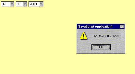
Date
validations
Date plays a vital
role in the forms. A single empty text box for date should not be given
for the user to fill in as that leads to major confusion to the user. He
may not know which format to use whether "mm/dd/yy" or "mm/dd/yyyy" or
"dd/mm/yyyy" or "dd/mm/yy" or "dd-mon-yy". An unnecessary front end validation
should be avoided after the user enters in wrong format.
The best and the most
followed format in all the leading websites (includes "hotmail" and "yahoo")
is the multiple selection list box with the valid values already filled
up for the user to choose, rather than left for him to guess.
After the user selects
the year, the format in which the date gets stored in the database is also
shown on the screen (the message box not to be shown in the real time situation),
the size of the message box and the title of the message box can be altered
using the javascript.(unlike the customary alert error box which is the
default with the netscape or microsoft internet explorer title which may
not be suitable for the project error messages).
The suitable format
is shown below
The HTML code is given below
<html>
<head>
<title></title>
<script language="javascript">
function abc()
{
var a1=document.forms[0].dd.selectedIndex;
var a2=document.forms[0].mm.selectedIndex;
var a3=document.forms[0].yyyy.selectedIndex;
var a4=document.forms[0].mm.options[a2].text+"/"+
document.forms[0].dd.options[a1].text+"/"+
document.forms[0].yyyy.options[a3].text;
alert("The Date is "+a4);
}
</script>
</head>
<body>
<form>
<select name="mm">
<option value="0">mm
<option value="1">01
<option value="2">02
<option value="3">03
<option value="4">04
<option value="5">05
<option value="6">06
<option value="7">07
<option value="8">08
<option value="9">09
<option value="10">10
<option value="11">11
<option value="12">12
</select>
<select name="dd">
<option value="0">dd
<option value="1">01
<option value="2">02
<option value="3">03
<option value="4">04
<option value="5">05
<option value="6">06
<option value="7">07
<option value="8">08
<option value="9">09
<option value="10">10
<option value="11">11
<option value="12">12
<option value="13">13
<option value="14">14
<option value="15">15
<option value="16">16
<option value="17">17
<option value="18">18
<option value="19">19
<option value="20">20
<option value="21">21
<option value="22">22
<option value="23">23
<option value="24">24
<option value="25">25
<option value="26">26
<option value="27">27
<option value="28">28
<option value="29">29
<option value="30">30
<option value="31">31
</select>
<select name="yyyy" onChange="abc()">
<option value="0">yyyy
<option value="1">1981
<option value="2">1982
<option value="3">1983
<option value="4">1984
<option value="5">1985
<option value="6">1986
<option value="7">1987
<option value="8">1988
<option value="9">1989
<option value="10">1990
<option value="11">1991
<option value="12">1992
<option value="13">1993
<option value="14">1994
<option value="15">1995
<option value="16">1996
<option value="17">1997
<option value="18">1998
<option value="19">1999
<option value="20">2000
<option value="21">2001
<option value="22">2002
<option value="23">2003
<option value="24">2004
<option value="25">2005
<option value="26">2006
<option value="27">2007
<option value="28">2008
<option value="29">2009
<option value="30">2010
<option value="31">2011
<option value="32">2012
<option value="33">2013
<option value="34">2014
<option value="35">2015
<option value="36">2016
<option value="37">2017
<option value="38">2018
<option value="39">2019
<option value="40">2020
</select>
</form>
</body>
</html>
On the contrary if
a single text box is shown for date for the user to fill in, and if the
user enters wrong format a small message box with the title as "EMGLS error
message alert" can be shown as below

The HTML code is given below
<html>
<head>
<script language="javascript">
<!--
function abc()
{
window.open("1.html","emgls","WIDTH=240,HEIGHT=120,screenX=140,screenY=140");
}
//-->
</script>
</head>
<body>
<form>
<input type="button" value="submit" onClick="abc()">
</form>
</body>
</html>
A
sample screen with the above-recommended suggestions is shown below
Functional
screen

Important
Note:
For clear vision
of all the images given above, please view the files in the directory in
any image viewer software like photo editor.