

Webpage Negative Space
The proper use of negative space is a vital element to good web design. Negative space is considered the space between content, be it solid, color or pattern background. When used correctly it can serve as a useful backdrop to you webpage and make the content on the page easier to read. The following are ways to effectively utilize negative space on different types of web site designs.
Negative Space: Why It Matters
The design of a successful web page involves many different variables that all have to come together to form a great looking site. The basics of design include taking different objects and arranging them to be aesthetically pleasing and functional at the same time. The use of negative space can create a new dimension to your page by making it look uncluttered and helping it achieve a smooth flow. Incorporating negative space is a simple method that can help complex sites easier to understand and comprehend.
Using Negative Space in Logos
Some of the most recognizable logos in history have amazing use of negative space. The most recognizable is the arrow in the FedEx logo. By training your eyes and mind to use negative space in creative ways, it will make your designs much more noticeable, as well as appealing. However in most web designs the use of negative space in never as clever as what is seen in various examples of logo design.
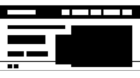
Using Basic Shapes
A great way to see and use negative space is by reducing all of your web content to basic shapes. By doing this you will be able to see spaces and lulls in your page. Arranging the shapes will give you a better understanding of negative space and how to utilize it. Maximizing all of the space on your website will make it a pleasurable experience for the consumer. The use of negative space takes a while to master just ask the experts at a web design Watford outfit if you are unsure how to fully implement the concept of negative space.
How to Fix Your Site
Adjusting your content after you have broken it down into basic shapes can be tricky but with practice you will arrive at a great design. Make sure you pay attention to any gaps along the page and be sure to fix them to create a smooth looking design. Also, you should connect all of your distinct content so that your page has a flow to it. In some cases more negative space is better when you are trying to create a more basic and simple design.
Negative space is an element that must be present in any web site design. Without the presence of this feature, your site will likely appear cluttered and unreadable. This is a sure way to turn off visitors and have them seek their content elsewhere. This will not only hurt your website ranking, but also the conversions and profits that you can achieve. Using the tips here you can easily implement negative space into your site to make it more user friendly.