
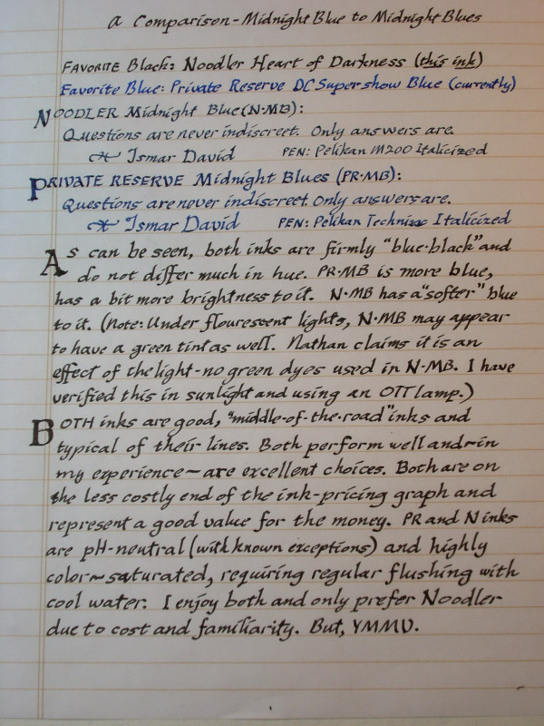
The blueish cast to the paper is due to using an OTT lamp for lighting on the left side of the paper. So your actual ink hues may be a bit off (perhaps less blue?) than is shown here. Decided to use this image as it shows what to expect in an office environment and shows the greenish tint quite satisfactorily. Also shows the effect of daylight on the right-hand side of the page.
I wanted to compare the two inks for FPN for a while now, was reading some ink reviews and two correspondents were bemoaning the fact that no comparison for the two inks was posted. Nudged me into getting the camera out and pens and going to work. The pens are as close to identical as I can get, the paper is Staples Eco-Friendly. That is my common working paper these days.
Enjoy,
