|
... tutorialz ... |
|
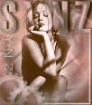
- sYnz - |
![]()
|
 |
 |
|
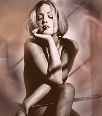
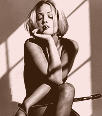
... before ... |
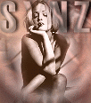
... after ... |
![]()
 |
|
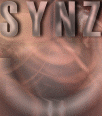
... bg image 1... |
|
... toolz, filters and fontz you will need ... photo impact 6 fonts: haettenschweiler , square unique filters: eye candy , graphics plus to dl the fonts, or filters click on the |
|
1. copy the avie and background, and have them open in pi. convert them to 'true color' format by clicking on: file >format > data type > rgb true color {24 bit} as shown in the picture below { this setting is equivalent to 16 million from the colors on the menu bar in psp} copy your avie, and the bg image and paste as a new images. { you should end up with 2 of each image open in your work area } 2. click on one of your female avie images, and copy it as an object onto one of the bg images. 3. activate your erase tool by clicking on it's icon in the task bar { on the left side of your screen }, your settings should be :
b) erase around the womans image, leaving a small area in tact around her, and merge all. 4. right click on your unedited female avie, and select copy...paste it as an object onto the image you were just working with b) activate your erase tool once again with your settings at :
c) adjust the transparency { as we've done in the previous tutorials , by right clicking on the active selection ....selecting properties, and putting the % into the transparency box } to 20%. d) randomly click over the outer edges of the image, to give a sort of framed or halo effect repeat this process, alternating the bg image and the av as the image being merged { clicking on the outer , or inner portion of the avie surrounding the female image accordingly } until you're satisfied with the result.
4. click on your blank bg image, and activate your text tool in your task bar. your settings should be : font : haettenschweiler, size : 50, mode : 3d-trim, color : rgb : 187, 149, 140 when you click on the image to enter your text ...in the text box make the following setting adjustments: kerning : box should be checked, and the numerical value set at 18 note: anti-aliasing should always be checked b) in the text entry box, type in all caps ' SYNZ ' { place it where you see it in the finished avie } c) in the tool bar, click on : format > brightness & contrast and apply the following adjustments by clicking on the specified boxes in order. click 1 time on : center row right box, then click one time on : top row middle box, & top row right box. then click one time again on : center row right box apply your adjustment but leave the selection floating ( unmerged ) d) in the tool bar, click on : effect > eyecandy > carve apply the effect using the following settings : bevel width : 5, bevel shape : rounded, smoothness : 10, shadow depth : 80, darken depth : 15 apply effect leaving selection unmerged e) in the tool bar, click on : effect > magic > light apply the effect using the following settings : exposure : 90%, ambience : 60%, light : 70%, skew : 0, spread : 75, distance : 289%, elevation : 90 apply effect leaving selection unmerged f) in the tool bar, click on : effect > eyecandy > inner bevel apply the effect using the following settings : bevel width : 5, smoothness : 10, shadow depth : 60, highlight brightness : 42, highlight sharpness : 77, lighting direction : 94, inclination : 52 apply effect leaving selection unmerged g) in the tool bar, click on : effect > eyecandy > cut out apply the effect using the following settings : direction : 310, distance : 4, blur : 3, opacity : 50 apply effect leaving selection unmerged h) in the tool bar, click on : effect > eyecandy > drop shadow apply the effect using the following settings : direction : 30, distance : 6, blur : 3, opacity : 60% apply effect leaving selection unmerged i ) in the tool bar, click on : format > brightness & contrast apply the following adjustments in order : click one time on : top row center image, middle row left image, top row right image, bottom row left image, and then middle row left image once again. apply effect leaving selection unmerged j ) in the tool bar, click on : format > style > light > shadow apply the adjustment leaving the selection un merged : k) in the tool bar, click on : effect > eyecandy > outer bevel apply the effect using the following settings : bevel width : 3, bevel shape : rounded, smoothness : 10, shadow depth : 11, highlight brightness : 82, highlight sharpness : 80, lighting direction : 94, inclination : 55 apply adjustment , right click on the image, select merge all
5. right click on your new bg image and copy, then paste as a new image. 6. copy your female image { already merged with the bg } as an object onto one of your new bg images { that has the name on it } b) using your erase tool set at : shape : 20, trans : 0, soft edge: 50 c) erase around the top of her so that the letters 'frame' her head d) alter your erase settings to : shape : 35, trans : 55, soft edge: 50 and tap ... selectively at the edges of her hair...to make it appear as if it were highlighted by the color from the text
6. now we'll add the 'gear images'. in your task bar click on : path tool > path drawing tool b) in the lower level of your tool bar where the path tool attributes have just opened, click on the icon for ' shape ' , in the drop down list select ' custom shape '. scroll down and select :
c) next ... click on : options > galleries > material > metallic > copper 5 d) right click on the box for the copper 5 setting and make the following color adjustment: color : RGB : 187, 145, 131, mode : 3d trim e) using the same settings you did earlier on the text on the bg image...except where noted...apply the following eyecandy effects : carve, inner bevel, cut out { rgb color : 227, 222, 219 } repeat 2 times f) in your tool bar click on : format > brightness & contrast apply the following adjustments : click one time on : top row left image, top row center image, bottom row left image, middle row left image, middle row right image apply effect leaving selection unmerged g) right click on the gear selection....and select duplicate....place your images as shown below h) one gear at a time...apply the eyecandy drop shadow effect using the following setting : direction : 45, distance : 5, blur : 3, opacity : 50% and then the outer bevel effect...reduce your transparency to 25...and then right click on THAT gear...and merge repeat the process for the other gear...only merge all when you've finished. { this will give them an over lapping effect }
7. next ... in the task bar, click on the path tool icon, and select the line / arrow tool. b) apply the lines to your image placed as you see them in the finished avie. c) setting your line size at 1, style is a solid single line, mode is 3d round, and using the same color as you did for the gear shapes... and using the same same effects ...only changing the drop shadow properties to : direction : 315, distance : 2, blur : 3, opacity : 75 apply effects...after you've applied the drop shadow { described above}, and the outer bevel effect { as used earlier}, right click on the image and merge all. 8. now...activate your text tool one more time, with the following settings : color will be the same, font : square unique, size 15, bold, kerning 50, hopefully I need not mention the anti-aliasing box...and where these settings are at by this point...lol b) apply your ' standard ' eyecandy effects...the only adjustment is in the cut out effect....you'll want the solid fill TO BE checked this time, and the rgb color for both boxes is : 235, 234, 233 other than that you should be well familiarized with the next few clicks of the mouse. 9. the only other adjustment I've made other than possibly altering the brightness, that we haven't walked through step by step is to apply the whiteout effect in graphics plus. to do this I copied my finished image...applied the effect with the intensity set at : 15 and then copied it onto my original image.....adjusting the transparency to 80....and clicking on the areas I thought needed to be less intense. guess what....you're done again.......lol
|
|
|
|
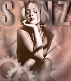
... finished avie ... |
![]()