
B. Base Tones- ALways, always, always have base tones. A base tone is the unaltered original shade of a specific hue. It's best to create a base tone layer, and then duplicate it if you want to do the shading simply by burn and dodge tools. Thus, if you make a mistake on the shading you can simply delete the layer, re-duplicate the base tone and start over. Or, you make seperate layers for each shade of a hue (base, highlight, shade) and name them all in a similar way. (I.E. 'blue base' 'blue highlight' 'blue shade')
C. For Glossy Surfaces Four Layers Per Color- base, shade, highlight, and shine. This creates a glossy effect which looks extremely professional although it's not overly difficult to achieve.
D. Save Often. Sometimes your program may close, or you might step away from it for a while and someone takes the liberty of closing it for you. Save once every half hour or so.
E. Save two final copies, one the PSD 'in progress' piece with all layers present, and then a final .jpg piece which will be sent to me for evaluation.
F. (I'm sure I don't need to mention this.. but...) ORGANIZE!! Create Folders... 'Works in Progress' 'Refrence pictures' 'Completed work' etc.
G. Finally- this is Easy. Don't get stressed out, really it's all quite simple. Your best friends in photoshop are paint tool, dodge tool, burn tool, and smudge tool. I will show you how to use them all in this tutorial.
-yaaayyyy now we begin.-
Step 1. The basics.
A.Line drawing.
- open up your original line drawing by selecting 'file, open' (I'm sure I don't need to explain that to ya.)
- Occasionally, the art supplied to you will have a slight coloring to it because of the paper. If this is the
case, select 'Image' at the top of the screen. Scroll down to 'Mode' and select "Grayscale" An option
box may appear asking you to flatten the layers- do not.
- do the following commands in this order- CTRL+A, CTRL+C, CRTL+N, This will open up a dialouge box for a new
piece. Hit enter. CRTL+V. you will now have a new canvas with the line drawing labled as 'layer 1'.
- Go to 'Image' slected 'Mode' and be sure the setting is on RGB Color.
- close the original work. do not save changes.
-*Note: If the drawing has a slight greyish tone to it, you can correct this by adjusting the brightness and contrast. (Image > Adjustments > Brightness/Contrast) However, by doing so you may lighten up the lines to the point that it's difficult to see them well. Be careful in your actions.
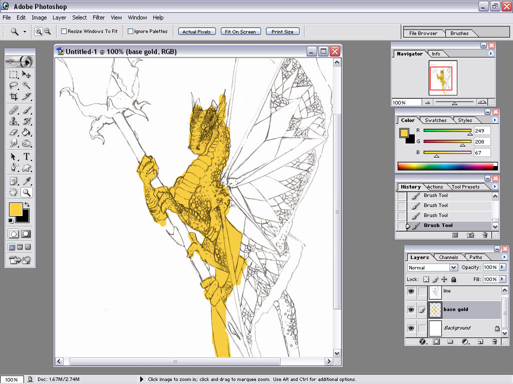
A.2. Label 'layer 1' "Line Drawing". To do this, right click Layer 1, and scroll up to 'layer properties'.
change the name.
A.3. Change the blending options. (see screen shot) with layer one still selected, press and hold the arrow
key on the menu which says (originally) 'normal'. Scroll to 'overlay', release. Don't panic, I know the
drawing disappeared. It's meant to that. Select the same menu again, this time scroll up to 'multiply',
release. The drawing is now transparent.

B. Layers.
- Select the Background layer. (btw, the eye that appears mean's it's visible, the paintbrush signifies that you are working on it. Different symbols may appear which I will go over in a different section.) On the base of the Layer
Toolbar, there are several buttons at the bottom. Select the 'new layer' button, doing so will create a new
layer for you to color on. BE SURE TO LABEL THIS LAYER. (by hovering your mouse of the other ones, you will
see what each one does.)

B.1. (a side note) the background of the picture is not what you do first, even though it might appear so by the order of layers. I'll go over that later. The first layer in this example is 'base gold'.
C. Coloring!!
- For the coloring on the scales we'll be using at least four different layers- one base, one dark, one light, and one for a gloss effect. Occassionally you will need more layers dependant upon the base color some colors can be shaded using just the dodge and burn tools others, such as reds, require more work. (for reds, especially, you will need between four and eight layers to achieve a nice shading effect.) This particular piece, one could achieve the goal by using the burn and dodge tools- however, for the sake of teaching, we will use the multi-layer technique. (no, I don't try to stay in the lines. it's pointless.)
- Create another layer. I've labeled this one 'dark golds'. For this step we will be using the paint brush tool to line the scales of the dragon and depict shadows. To get a darker gold color, double click the hue block, and then select a darker shade. (somewhere within the circle)

- Select the paint brush tool (red arrow) and then select the brush size by pressing the downward arrow at the top of the work window and scrolling down to your required brush. For this piece, I recommend a 5 feathered brush.
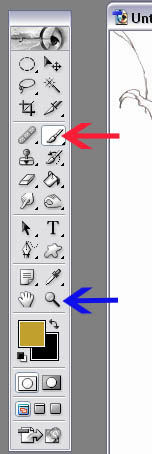
-*Note- At any point during coloring, if you wish to change your brush it is not necessary to go to the top of the screen and slect from the drop down menu. Instead, you can simply right click and alter your brush. Also, notice that you can change the pixels of each individual brush manually by highlighting their pre-designated size and changing it. (This comes in really handy sometimes.)

- Next, use the magnify tool(blue arrow) to zoom in on the piece. (This can also be achieved by sliding the zoom
control on the navigator window) Zoom in until you can clearly see the detail and you are comforatable that you
will be able to color it.
*Note- at the top of the screen you will see different zoom options. One is the zoom out tool- to decrease
the image size in your window you can either select this tool or hold ALT while using the magnify.

Color in where you believe the shaded areas of the scales should be.
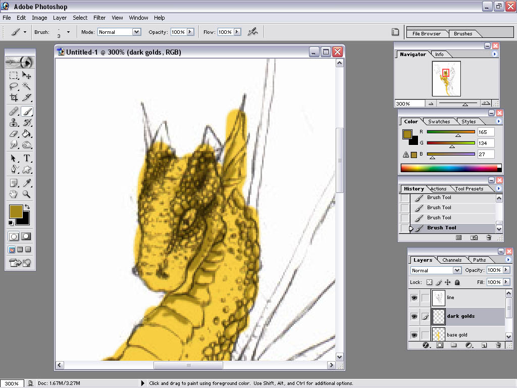
C.2 Create Another Layer. I've labeled this one 'light golds'.
- Use the eye dropper tool to select your base tone. (Notice the small arrows between your two hue boxes-clicking
this will switch their places, which ever color is on top is the one your paintbrush will use. I suggest you
switch and make the black box into your base hue so it will be easier to select different shades throughout the
project.)
- Color in where you believe the light areas should be. (make SURE you're on the correct layer, it's easy to get confused at times!!)

C.3 Smudging. -select the 'Smudge tool'. The smudge tool may be under the 'blur' tool, to access it, click and hold the blur tool untill the window pops up. Then select the smudge tool. Notice the settings at the top of the window. Be sure that 'Mode' is set to 'Normal'. The Strength detirmines how much the image will be distorted while using this tool I generally leave it set to 50%, however each artist will undoubtebly develope their own likings. Make sure that neither "Use All Layers" or "Finger Painting" are checked.
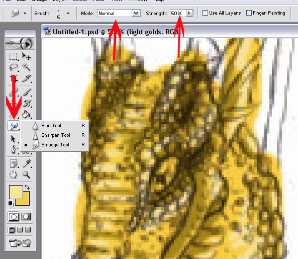
- As with the paint brush, the smudge tool's size can be adjusted by either using the menu at the top of the screen or by simply right clicking. The feathered brushes make it so that a smooth edge and nice fade are easily accomplished. Start with the light areas, and then switch layers- and smooth out the darks.

