|
|
▪
Home ▪ Links ▪ LDS Stuff ▪ Iconic Alphabet ▪ The Legend of Zelda |
My Iconic Alphabet » 2 Iconic Alphabet » Rationale To understand the system I've made, it's necessary to understand a little bit about linguistics. Instead of typing my own brief survey of linguistics, I'll refer you to a better-prepared page: . From here on, I'll assume you have a basic working knowledge of linguistics (I myself have only had one class: English 223, from David Bowie, at Brigham Young University).
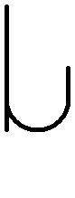
Vowels In my alphabet, every vowel has the same basic U shape, with a line extending from the point at which that vowel is found on the vowel curve (see graphic below).
Consonants
State of the Glottis
To justify the readability of this choice, I had to ask, "Is a dot ever used to distinguish between two sounds in writing?" In English, the answer is no, but in some languages, such as Hebrew, a single dot can change the meaning of a letter. Therefore, I feel using a dot as a distinctive mark is a safe choice. Interestingly, adding dots under every letter could be a way of representing whispering, in this alphabet.
Manner of Articulation
Liquids (laterals and retroflexes) are indicated by the basic shape: < for lateral and > for retroflex. They can be written with or without a short leg (as some people write 'u' without a leg). I did this because I couldn't think of a practical way to represent two more manners of articulation that didn't clutter the characters or render them indistinguishable.
Place of Articulation
The specific choices of basic shape for the linguals and labials are not arbitrary. If you'll notice, the bilabial and palatal basic shapes are the 'u': the same basic shape as the vowels. That is because both semi-vowels occur in these two places of articulation. If you look back at the vowel graphic, you'll see how the vowel characters progress upward to appear very similar to the semi-vowels. I find this to be a charming strength of this iconic alphabet, because it provides a link between the vowel characters and the consonant characters. The choice of basic shape for alveolar versus velar was made on less logical grounds. I just thought that of the three basic places of articulation (velar, alveolar, and bilabial), the circle should be the middle one.
| |||||||||||||||||||||||||||||||||||||||||||||||||||||||