 Hello and welcome to the unofficial Brian De Palma website. Here is the latest news: |
|---|
E-mail
Geoffsongs@aol.com
-------------
Recent Headlines
a la Mod:
Listen to
Donaggio's full score
for Domino online
De Palma/Lehman
rapport at work
in Snakes
De Palma/Lehman
next novel is Terry
De Palma developing
Catch And Kill,
"a horror movie
based on real things
that have happened
in the news"
Supercut video
of De Palma's films
edited by Carl Rodrigue
Washington Post
review of Keesey book
-------------
Exclusive Passion
Interviews:
Brian De Palma
Karoline Herfurth
Leila Rozario
------------

------------
| « | February 2017 | » | ||||
| S | M | T | W | T | F | S |
| 1 | 2 | 3 | 4 | |||
| 5 | 6 | 7 | 8 | 9 | 10 | 11 |
| 12 | 13 | 14 | 15 | 16 | 17 | 18 |
| 19 | 20 | 21 | 22 | 23 | 24 | 25 |
| 26 | 27 | 28 | ||||
De Palma interviewed
in Paris 2002
De Palma discusses
The Black Dahlia 2006

Enthusiasms...
Alfred Hitchcock
The Master Of Suspense
Sergio Leone
and the Infield
Fly Rule
The Filmmaker Who
Came In From The Cold
Jim Emerson on
Greetings & Hi, Mom!
Scarface: Make Way
For The Bad Guy
Deborah Shelton
Official Web Site
Welcome to the
Offices of Death Records
 This is a couple of months old, but you'll recall (surely) that this past December, The Film Society of Lincoln Center presented a film series titled, "Going Steadi: 40 Years of Steadicam." Brian De Palma's Carlito's Way and Raising Cain were both included in the series.
Brian De Palma first used the Steadicam, with Mr. Brown as an operator, in “Blow Out” (1981) for the opening sequence, an elaborate horror movie parody in which a slasher attacks coeds. “Choreographing the shot, getting the psychopath to hold his knife up in front of the mirror at the right time — it was a kind of joyful evening,” Mr. De Palma said by telephone. He went on to use the Steadicam in many films, including “Raising Cain” and “Carlito’s Way,” showing in the Film Society series.For Mr. Brown, who taught himself filmmaking, movies came after a folk-singing career (as part of the duo Brown & Dana) and a stint selling Volkswagens. He found himself working in commercials at a time when the only way to create smooth camera motion was to put the camera on a dolly, in a camera car or on a crane. He was pained by the unwieldy setup of a 12-pound camera on an 800-pound dolly.
“The sight of that pinheaded little camera on that huge dolly and the attendant difficulties of schlepping it around on pickup trucks and laying my paltry rails here and there outdoors really was so absurd,” Mr. Brown said. He wanted to isolate the camera from the motions of the person controlling it — the kind that cause hand-held shots to appear shaky.
The key ingredients were a gimbal, which came from Mr. Brown’s sailing experience; counterweights, to give the camera stability; an articulated arm — an idea he got from a motel desk lamp — attached to a harness that a camera operator could wear; and a way to see through the lens. He originally used a fiber-optic viewer intended for medical examinations.
In a sense, Mr. Brown had realized a dream of filmmakers and theorists who treasured camera motion; it’s hard not to wonder what Max Ophuls or André Bazin would have made of the Steadicam. “Abel Gance — he was fabulous at moving the camera,” Mr. Brown said, referring to the director of “Napoleon,” the 1927 silent classic. “He did extraordinary things, but he didn’t have this tool for stabilizing. I would have loved to have shown up on his set.”
In the earliest Steadicam movies, Mr. Brown operated the apparatus himself, and he continued to do so for three decades. Now, he said, Steadicam operators make expert shots for TV news broadcasts and from the sidelines of sports like football and soccer.
Robert Elswit, the cinematographer on two Paul Thomas Anderson movies in the Film Society series, “Boogie Nights” and “Magnolia,” considers the Steadicam essential. “To me, it’s not a specialty item,” he said. “It’s usually there all the time.” The results, he added, are sometimes “not even necessarily recognizable as a Steadicam shot. You just use it to get something done in a simple way.”
Mr. De Palma cautioned that the Steadicam is only a tool, a way of showing the viewer an environment. “You need a lot of sophisticated technicians to pull off a really good Steadicam shot, and that sort of comes with making movies in the studio system in Hollywood,” he said.
Digital cameras make it less complicated to light scenes, he noted, and the equipment weighs less, leading to what he sees as the Steadicam’s overuse. “You see an abundance of Steadicam shots that are completely ridiculous,” Mr. De Palma said. “God knows, in television, they do it all the time. People are always walking and talking and going around corners.”
 Joseph McCabe at Nerdist thinks that Winslow, the name of the walker on this week's episode of AMC's The Walking Dead, is "an obvious reference to the title character in Brian De Palma’s Phantom of the Paradise, a disfigured musician who wears a similar chrome dome." While the "obvious" here may in fact be coincidence, it is worth remembering that The Walking Dead is produced by De Palma's ex-wife, Gale Anne Hurd.
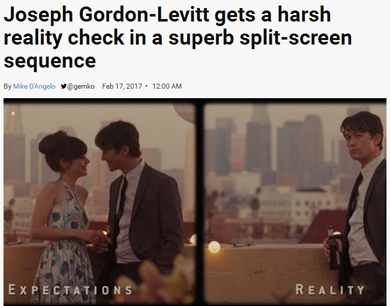 A.V. Club's Mike D'Angelo analyzes the split screen sequence in today's "Scenic Routes" column:
Resolved: Split screen is an underutilized cinematic device.That’s how I would have phrased it back in my high-school debating days. Which seems appropriate, because—as was often the case with debate resolutions—I’m not 100 percent certain that I believe it, even though coming up with arguments that support it isn’t terribly difficult. For one thing, split screen is employed so infrequently that I associate it almost exclusively with Brian De Palma, who loves to construct elaborate, suspenseful set pieces that show two or more events unfolding simultaneously. And it’s easy to wonder, after being thrilled by one of De Palma’s dual orchestrations, why he’s long enjoyed a near-monopoly on this approach, which takes such striking advantage of the medium’s intrinsic qualities—that is, of the ability to manipulate time and/or space. I still haven’t seen Andy Warhol’s Chelsea Girls, which I believe is split screen from start to finish… but I have seen Forty Deuce, a 1982 drama directed by Warhol associate Paul Morrissey, in which, throughout the film’s very stagy second half, the frame constantly offers two separate angles of the same action, side by side. It’s mostly a distraction—as I said, I’m not entirely convinced of my own thesis here—but I’ve always sensed untapped potential in the idea.
My favorite recent use of split screen, though, involves the manipulation not of time or space, exactly, but of the protagonist’s consciousness. (500) Days Of Summer is a gimmicky movie in a lot of ways, starting with the parenthesis in its title; it has an omniscient narrator, jumps all over the place chronologically, and at one point sees its hero, played by Joseph Gordon-Levitt, perform an impromptu musical number, accompanied by dancing extras and animated birds. Most of this quirkiness can be filed under “cutesy,” and will either delight or irritate, according to taste. But the movie does have a more downbeat side, which comes most strongly to the fore during a brief sequence toward the end, when Gordon-Levitt’s Tom shows up at a party being thrown by ex-girlfriend Summer (Zooey Deschanel). Screenwriters Scott Neustadter and Michael H. Weber want to show us how what happens at the party deviates from what Tom imagined would happen, and either they or director Marc Webb decided to do so by splitting the frame down the middle, with “Expectations” on the left and “Reality” on the right...
...What finally makes this sequence so effective, though, is how credibly mundane both Expectation(s) and Reality are—a choice that the use of split screen enables. Had the two versions of the party been presented one after the other, it probably would have been necessary to exaggerate them slightly, in order to highlight the differences (especially since that almost surely would have meant discovering that the initial version is Tom’s fantasy only after the fact). Showing them simultaneously lets the viewer’s darting eyes, rather than memory, do all the work, allowing each side of the frame to be unremarkable in and of itself. Tom’s romantic expectation(s) of Summer on the left are entirely consistent with what we’ve seen of their relationship earlier in the movie, and real-life Summer on the right doesn’t ignore or belittle him. What we get is a vision of bland sweetness opposite the sort of friendly awkwardness and moderate avoidance that you’d expect of two people not long out of a failed relationship. Only when Tom sees that Summer has gotten engaged to someone else does the hammer truly fall… at which point the Reality half of the frame pushes the Expectation(s) half (in which Tom and Summer are making out) entirely offscreen. And only one Tom descends the stairs.
 Alice Lowe discusses her directorial debut, the horror comedy Prevenge, with iNews' Alex Watson, mentioning several of her horror influences:
The perpetually hard-working Lowe is no stranger to either the small or silver screens (you may remember her from Garth Marenghi’s Darkplace and Hot Fuzz) and has many writing credits in both TV comedy and film, but Prevenge is her directorial debut.Part of Lowe’s accomplished start in this field comes from her strong grasp of what inspires her, both visually and atmospherically.
“I think there’s a mixture of lots of different influences in Prevenge. There’s a lot of Giallo horror, which is like Dario Argento’s work, and even Brian De Palma was quite inspired by that sort of Italian horror as well, with all the bright colours. Also, Kubrick.
“I wanted to use really bright colours, I didn’t want it to be pastel.”
Lowe is a huge horror movie fan, who is drawn to family-oriented terror tales with female protagonists, like Rosemary’s Baby or Brian De Palma’s 1976 Stephen King adaptation, Carrie, which stars Sissy Spacek as an unpopular high school student who develops telekinetic powers.“I think everyone identifies with her character,” says the actress. “I really like the idea of an underdog character going through this transformation where they take power. I also think the reason it’s so rewatchable is, every time you watch it, you are hoping there’s a different ending, you’re really hoping that she just kisses the boy, and is the pageant queen, or whatever. It just doesn’t work that way. I think it’s unique. She is the killer but she has our sympathy. She is also a victim to her mother’s insanity. It’s like a female Psycho in some ways. I love Brian De Palma, I love color in film. That was one of the things that I really wanted to do with Prevenge, was make sure it was an assault of the sense, that it’s about color and vividness — rather than the passion at the moment for sort of grey-blue-black horror. That was, for me, the experience of pregnancy, that it’s kind of a vivid experience. It’s not at all about pastel pinks. It’s all about bright, intense experiences, and revulsions, and strange shifts in your emotions.”
 Universal really is ramping up its new Scarface remake. According to Deadline's Anthony D'Alessandro, the studio announced today that it has set a release date for the film: August 10, 2018. "The studio already had RSVP’ed the date under untitled event film," D'Alessandro states. "The Coen brothers are rewriting the script, the studio said. The siblings won’t direct. Several filmmakers are up for the job, notably Hell or High Water‘s David Mackenzie and Patriots’ Day’s Peter Berg."
Previously:
Fuqua drops out of Scarface remake; Diego Luna will play lead
Terence Winter to tackle Scarface script
The Scarface remake just got a lot less interesting
Scarface remake is Larraín's dream project
The Scarface remake just got a lot more interesting
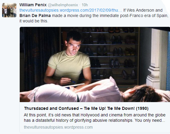
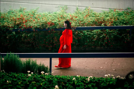
For younger viewers previously unfamiliar with Almodóvar – it should be noted this is the first film of his I’ve seen – you’ll find that his visual sense is strongly akin to Wes Anderson in his use of garish color palettes to make the mise-en-scène pop and purposefully call attention to the focal points of the frame. But while most cases of Anderson’s use of color bears some semblance of uniformity, Almodóvar’s in Tie Me Up! Tie Me Down goes all over the map with light and vibrant hues of blue, green, red and orange. It’s a purposeful clash that draws our attention, tells us where to look and exists as a visual rebellion, of sorts.It may bear the mark of the decade it left behind, but so does Ennio Morricone’s curious score. In what can only be described as electronic camp, Morricone’s compositions bounce in and out between the romantic and the sinister, often to the confusion of audience members as the film is in the early stages of labeling Banderas’s Ricky as an amorous man or unbalanced sociopath. But, the amalgamation of production design and score is key here, and in fact is reminiscent of Brian De Palma’s work, particularly 1984’s Body Double.
Almodóvar uses both similarly in their respective conflicts with the film’s tone, and derives most of the film’s humor from those contradictions. There are a few instances when Almodóvar’s irreverently pitch black humor is made explicit in the language, but he’d much rather emotionally unsettle his viewers by, for instance, having Banderas’s Ricky carry a bound and gagged Marina (Abril) across the threshold amidst the most dazzling array of reds and blues. It isn’t just the context of the scene that’s uncomfortable, but arguably, it’s the choice of color that makes this feeling even more pronounced.
That sort of responsibility is what speaks to Almodóvar’s cunningly sensitive direction, as well as José Luis Alcaine’s cinematography. The aesthetics never make the premise any less disturbing, but rather heighten our discomfort at their deliberate opposition.
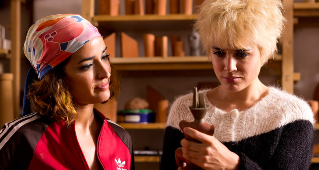
Adapted from three short stories by Alice Munro, Julieta has a nimble structure, one that spans multiple time periods, family drama, cultural and religious conflict, the bonds of fidelity, and even a sexy train-based mystery with a very specific tribute to the fashions and hair of Brian DePalma’s Body Double. But its spine (and heart) is the chasm at the center of the titular character’s life left by the 12-year absence of her daughter Antía, and it’s a mystery we unravel one brightly colored thread at a time. The performances are stellar, with Emma Suárez and Adriana Ugarte bringing Julieta (as her older and younger selves, respectively) to tangible life. These women are the emotional foundation upon which Almodóvar builds another of his magnificent houses of catharsis, with the added bonus of an iconic return for Rossy DePalma.