
You should use watermarking when you design a background that you don't want being lifted and used as someone else's creation. You can also use it to emphasize your authorship of a page. Another use for the technique is to display a logo (for a company page) or favorite text, like a child's name to sign his personal page.
A watermarked background is one that includes a logo or name as part of the web page background. There are several ways to do this, depending on whether you have a premade graphic you want to use, and whether or not you want to use plain or textured backgrounds.
When following the tutorial, please note that most of the tools in Paint Shop Pro are labeled; when you hold the mouse over an icon, you will see the name of the tool. Each text entry across the top has a dropdown box with various options. If you can't figure out which one to use, drop me a line; I have screenshots of the whole page and I'll upload a graphic to you that has an arrow pointing to the tool you need. JJJPEMom@aol.com
Using your name on a plain colored background:
 Start a new file; 150x150, background whatever color you are using for your page background (I used green #66C066 for this tutorial), 16.7 million colors.
- Select Text tool, place the cursor over the center of the graphic, and click. When the dialogue box comes up, select Antialias, Center and Floating. Choose the same color for the text as your background (for a variation, choose a very slightly lighter color). Select a wide font (I used CAC Moose), size 36. Start typing the text.
- With text still selected, go to Effects/3D/Drop Shadow. I used 1 for my vertical and horizontal offset attributes, 2.2 for my blur, and 15% for my opacity. You can play with these numbers to make your letters more or less prominent. If you're going to do additional steps, like adding texture, you'll want to make your settings higher so the letters will show up (next section gives settings).
 My next step was to rotate the image (you can skip this step if you prefer the writing horizontal). First, deselect the text either by right clicking on it, or by choosing Selections/Select none from the menu at the top. Then choose Image/Rotate. I used settings of Left and Free 20 degrees.
- PSP will add more canvas to the graphic when it rotates, so you will either want to crop the image or resize it. If you want the name to repeat closely and continuously, crop it very close. If you just want it to repeat occasionally, resize it to the original 150x150. I resized it, click on the graphic at right to see it tiled.
Using your name and adding texture:

- Follow steps 1 and 2 (above) again.
- With text still selected, go to Effects/3D/Drop Shadow. Make all your settings higher. I used 2 for my vertical and horizontal offset attributes, 2.2 for my blur, and 35% for my opacity.
- Rotate and crop or resize again.
- Go to Effects/Texture Effects/Texture. Pick any texture you like (except the letters). You'll have to adjust the settings so your texture doesn't obliterate your watermark. If you want to follow along with the setting I used; they are:
- Texture: pattern - 3, size - 43.
 Image: Smoothness - 0, depth - 2, Ambiance and Shininess - 0,
 - Light: Color - white, angle - 264, Intensity - 50, Elevation - 30.
Click on the graphic to the right to see the textured effect. There's links on the textured page demonstrating the watermark graphic processed with a half-wrap filter to make it more interesting.
Using your name with a preselected pattern:


- Open a background pattern you already have that you would like to use as a background for your web page. Follow steps 1 and 2 of section one again, using white as your background and text color. After rotating the name, I copied and randomly pasted it a few times to vary it.
- Copy the watermark, then click on the pattern you opened and paste the watermark as a new layer (Edit/Paste/As New Layer) Hint: this works best if the graphics are the same size; resize the pattern graphic to the same size as the watermark if necessary.
- Right click on the new layer in the layer pallete and select properties.
- Click the drop down list beside Blend Mode and choose Overlay. Depending on your patterns and the colors of both graphics, you can also choose Screen or Multiply. (Play around with the settings in the various modes and see what else you can come up with). When you like the combination, merge the layers and save the graphic.
The only problem with this method is that it sometimes darkens or lightens the original pattern. The first pattern below is a combination of the purple pattern above with the white watermark added as an Overlay. The second is a combination of the first graphic and the white watermark, using Multiply as the blend mode.


Watermarking by saving selected text into PSP textures


This method has one big advantage over the others; once you make your name pattern, you save it into your textures and then it is always available to use with any background, with a minimum of work. You can save two or three variations to suit your taste, or add a logo or repeating motif into the textures. Once you save a watermark this way, it's always available for use.
One other advantage is that you don't have to alter the sizes of any of your backgrounds.
- Open a background pattern you already have that you would like to use as a background for your web page.
- Follow step 1 of section one again, using white as your background. Add text, using a thinner font (I'm using Pinafore in the example above). I used a light gray for the text color and didn't add any effects to it, (except for rotating it). You can use an even lighter gray if you want the watermark to be so subtle you can scarcely see it.
 Now save this graphic to the textures patterns in your Paint Shop Pro directory. Example: In my computer, I go to drive C; choose Program Files, then JASC Software inc, Paint Shop Pro 7, Textures. Give it a name and save the file as type BMP.
- Save my first tile (apple) and practice watermarking, or click on your own wallpaper tile and choose Effects/Texture Effects/Textures. From the texture drop-down box, choose the tile you just saved with your name in it. The larger the size you choose (on the sliding size bar), the larger your name (or logo) will look, and the less often it will repeat. I used 65 for my size setting. You can make your watermark very subtle by selecting 1 for your depth and leaving the other settings at 0 in the Image section. Leave the Light settings as is.
 Choose the second tile (or your own) and practice various light settings and sizes and depths. Things to watch for:
- Don't change the smoothness; leave that at 0 or your whole background will acquire a roundness and won't be seamless when it tiles.
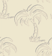
- Experiment with the sizes; make sure your name doesn't overlap the end of the tile, or it won't tile correctly. You can always undo your effect and try it again with different settings. For the palm background above, I used 112 for the texture size, 3 for the depth, and changed the light angle to 70.
- Click on the watermarked tiles (above, right) to see how they look as a background.
Drop me a line at JJJPEMom@aol.com if any of the steps are not well enough explained. I'll be glad to give one on one help.

Back to Main Page
Back to RaggBagg index

