

Ok, after exploring every bit of clip art you own and browsing through tons of free graphics online, you still haven't found the graphic you need. Then one day, voilá you suddenly find the perfect picture or design you need for your web page on the back of an old album cover, or maybe embedded in a larger illustration in a book or magazine. How do you extricate it?
*See copyright note at the end of tutorial for my views on what's safe to legally copy.
This is a tutorial on how to carve out a picture and clean it up -- using Paint Shop Pro. The tools and commands I use in my scan program as well as in Paint Shop Pro will be bolded in the rest of this tutorial, for easy reference. Don't let all the writing below intimidate you; most of this tutorial is likely to be a repetition of things you already know. Most people won't be familiar with every aspect of Paint Shop Pro used here, so I went into some detail for clarity. Just skip the parts you already know. You can copy this to a word processor and edit out what you don't need if you wish.
The tutorial is based on the assumption that you have a scanner and at least a rudimentary notion of how to use it. Ideally, you have a color scanner, but you can always scan in black and white and either color or tint it later if necessary.
The basic steps we'll cover will be:
 | This is an illustration of my scanner setup. In this example, I have already selected the settings (on the left side) and done a prescan of the trivet/tile I'll be copying. The pre-scan is done to make sure your object isn't crooked, that it all fits onto the plate, and that your resolution is sufficient to get a good copy. The dotted lines show where I would position the lines if I wanted a picture of the whole tile. I can further pull in the lines to scan only the part I'm going to work with. After the lines are positioned correctly, I'll do the actual scan. |
My first step was to open the program to scan the picture with. Paint Shop Pro has scanning ability, but it doesn't handle large files well, and if you scan in color at anything above 100% resolution, the files get superhuge very quickly, which takes a long time to process. Any photo imaging program that you may have will usually be sophisticated enough to allow scanning; if Acquire is one of your choices under File, then you can scan. I use iPhotoPlus. I opened the program, selected Acquire (misspelled Agquire in my program -- eeesh)! then made my choices after the scanner setup came on. For my trivet, I set it to Paper Size=custom; Color; Resolution=200%. Then I hit pre-scan. For the first scan in a series, I always allow the scanner to warm up; on subsequent scans I hit the skip button.
After pre-scanning, there's a dotted line around the entire area. Move the mouse to where the dotted lines are, and when your pointer turns to a double arrow, grab the outline (you grab each side separately) and bring it in to the area around where you want to scan. Do all four sides if appropriate. The less area you scan needlessly, the less time you'll spend waiting. The second illustration shows the part of the trivet I would actually scan to do my project (If I weren't also illustrating the different steps of the scanning procedure). Now hit the scan button, and click on skip for the warmup. When the scan is finished, click on close.
 Now you can get an idea of how good the scan came out. If the colors look a little ragged, look to see what size the picture is; you'll probably see the size listed as 1/4 or 1/8. If so, don't worry, you'll get a lot of smoothing when you reduce the picture. I generally do an edit/copy at this point, then go to PSP and do edit/paste as new image. The first step in PSP is to reduce the graphic to a workable size. As you can see by the title bar on the right, my graphic is initially at a 1/4 ratio. I reduced my graphic to 33% of its size image/resize, then clicked on view/normal viewing to see its actual size. It's large enough to work with and small enough to fit in the PSP window, so this will be our working copy. You should save the picture now in case you mess it up later and want to start over without having to rescan the original or leave your other program open. If you're doing flesh tones always save in jpeg or jpg format. This graphic has a fairly clear range of colors with little toning, so I saved it in gif. I prefer saving in gif if I can because I can make the background color transparent later if it suits my project. You'll need to be working with 24 bit color to do some of the following steps, so after you save it, go to the color command at the top and choose increase colors to 16 million.
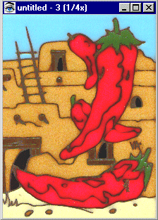
Now choose the outline tool from the tool bar (at the left on my program) and select the rectangle variation. Start in the left corner of the section containing the bottom chile, and extend it to the bottom right corner. When the moving dotted line (the marching ants) is completely around the chili, select image/crop to selection.
 Now set your background color to white (click on the background color tile on the right margin and select white/ok. White is not used in the picture, so as I cut away the excess, I'll be able to tell if the picture is clean. Use the background color that will contrast best with your subject. Below the rectangular selector tool, there is a freehand selector tool. Choose that tool and under Controls, set it for smart edge. If you don't see your control window, run your mouse over the icons at the top of the program; the one that looks like a cassette is the Control setting (you'll see the name pop up as you run the mouse over it).
  Set the crosshairs right on the outside of the chili.
Click once (left click) to set the first stop. Following the outline, pull the line a little way and click again to set the next stop. You'll see a thin line following the line of the graphic as you set each stop. 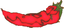 When you get all the way around the chili and your last stop has been set next to your first one, double click. Now you should see the marching ants again around the graphic. Once again choose Image/crop to selection.
The next step will be to clean it up; it looks a little raggedy. I made it a little more raggedy than usual so we could get into this step. If you're working with a graphic the size we are, you could view it at double or triple size and be able to outline it much more precisely. The only requirement is that the whole graphic be able to fit in the window, because you can't lift your mouse away from the line once you start.
Now you'll want to enlarge sections at a time to work on them. Let's clean up the green cap at the top of the chili. 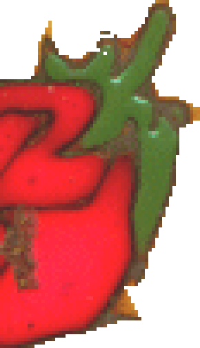 Using the magnifying glass on the left tool bar, click on the section you want to enlarge several times until it looks workable. You can move the sides around the graphic to expose just that area you will be working on. (If you want to see the entire graphic again, right click with the magnifier to reduce the size of the graphic, (or click on the minus sign at the right of the keyboard) then select Window/fit to image from the text bar at the top).
The chili cap on the right has been enlarged to 5 times its usual size. As you can see, the individual pixels are now viewable and can be easily manipulated. Using the eye dropper on the left, click on the white part of the picture to set your foreground color to white, then click on the paint brush tool, set the texture to none and the brush size to about 2 or three. As you work around the cap, you may have to change the brush size to 1 to fit in some of the smaller areas. If you get a section looking like you want, alternate the brushing with another technique. The reason is that if you do the entire job by brush and make a drastic mistake halfway through (or ...perish the thought; almost at the end), you can't undo the one brush stroke. If you hit Undo, it will undo all the work you have done.
Usually I will work on the outside for a while with the brush, then use the Clone or the Retouch tool (toolbar on the left). To use the clone brush, click on the tool then set controls to clone mode=non-aligned; paper texture=none; sample merged=your preference (I leave it unchecked but you might find it helpful to see your work change on the full graphic as you work on the pieces of it); brush tip =n (this will vary depending on what you are working on). I used 6 for the section around the notch at the top of the chili. I right click on an area I want to repeat; in this instance I need to finish the pattern that would occur at the break in the chili. I right click on a section of pattern that has the right shade and direction, then I move the mouse to the section where I want to copy it. I left clicked three times along the gap to "drop" the cloned section and finish the pattern. Notice that as you move the mouse, the x marking the spot of the original cloned section also moves, so you aren't just copying one isolated piece of the pattern, but a continuous section.
  This makes a more realistic pattern than copying and pasting one section to another, but keep your cloned areas small or the discrepancies between sections become noticeable. After cloning the pieces in, I had a couple of white spots left. I made the clone tool smaller and picked up a piece of red that would blend well into those two spots and filled them. I used the same technique to finish the edge above the notch. If you prefer, you can select a color with the dropper tool and paint in your own lines, but you won't be able to get good color blending, which on most pictures is very noticeable.
The same principle applies to the clone brush as to the paintbrush; you need to vary the techniques, otherwise if you have to undo a step, you'll undo all your work. Each time you use one of these tools, PSP considers it a "step" even if you lift the tool from the graphic a dozen times. When you use the retouch tool, each type of setting you use will count as a different step, so you can push, then smooth, then burn, and if you hit undo only what you burned would be undone.
If your cap and notch are filled in and smooth now, go to another section and cut away the background and then make your line around the chili look even by cloning from a good section to a raggedy section. The retouch tool is a good tool to use at various phases; for this type of project I mostly use the settings soften and push as the retouch mode. Using Push will take one section of pixels and extend them wherever you want in order to make a better blend. Soften will blur the colors into each other; good for clouds and sky and water, but use sparingly where you have a noticeable pattern or it will look like your picture is smudged. It works best in small increments.
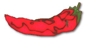
The left illustration below is the chili all cleaned up. Since I saved it as a gif, I can make the background transparent and use it as is (right llustration below), or I can do further editing, like adding text to make the banner at the top.


You can open the graphic again to do other editing later; you should give it a different name if you do anything to it so that you have the clean copy to use in different combinations. If you want to give the graphic a shadow, for instance, color the background the same as your background on your page before you do the shadowing, because the shadow will incorporate the shading of its background into itself. In the example below, I made a shadow with the background still white; when I make the background transparent and place it on this page - UGH. That's why people who offer graphics on the web often tell you what shading you can use the graphic on. Of course, you don't need to bother making the graphic transparent if you're putting it on a solid color background; just pour the color into the white around the picture you just cleaned up, and put it on the page. If you have embossed or patterned backgrounds though, try to match the closest color before doing cutting and shading, then make the background transparent.
Questions? Problems? Did I leave out a vital step? Email me at JJJPEMom@aol.com. I'll respond as quickly as possible.
Updated: September 3, 2001

*Be careful what you copy. Copyrights protect most published material. Unfortunately, it's unlikely that most of us are either professional artists or photographers, and even if we were, we would not necessarily have access to the subjects. Use your judgment; if you are using part of a photo or an illustration for a purpose not in competition with the original artist, I think it unlikely you would be harassed for using it. I see a lot of photos and parts of photos of popular rock stars on web sites, for instance. They are usually on "fan" sites that are non-commercial in nature. I'm not a lawyer, so if you feel uncomfortable about using a picture, write to the artist/photographer for permission to use it, or find something else. (Or be prepared to remove it from your site if required). I definitely wouldn't use any scanned material on commercial pages without permission from the artist.
