- Start a new file. Give yourself plenty of space to start with; you can always make it smaller later. I used 400 x 400, 16 million colors, with a white background. (Use a background color different from the colors in your graphic).
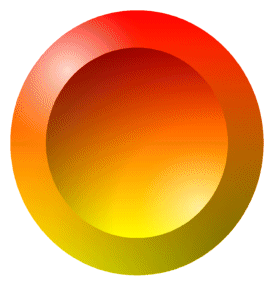 Click on the preset shapes button; then scroll down until you find a shape you like. Check retain style and create as vector. Here's the shape I chose. Click on the preset shapes button; then scroll down until you find a shape you like. Check retain style and create as vector. Here's the shape I chose.
- Use the handles to stretch the shape as big as you want (your graphic doesn't necessarily have to fit inside the shape), then select Layers/Convert to Raster Layer To name the layer, right click on the layer (on the layer palette) and choose rename. Naming layers makes them easier to manage.
 The shape is on a layer by itself. You can recolor it (I used Colors/Colorize with hue set at 88 and saturation set at 242), add textures, or whatever you want. To choose portions of it, click on the background then choose Selections/Invert Selection. Then go to Selections/Modify/Contract. You can type in whatever amount you want to contract; I used 30. Then you can change the selected portion to another color or add a texture or play around with Blade-Pro or other plug-in filters. The shape is on a layer by itself. You can recolor it (I used Colors/Colorize with hue set at 88 and saturation set at 242), add textures, or whatever you want. To choose portions of it, click on the background then choose Selections/Invert Selection. Then go to Selections/Modify/Contract. You can type in whatever amount you want to contract; I used 30. Then you can change the selected portion to another color or add a texture or play around with Blade-Pro or other plug-in filters.
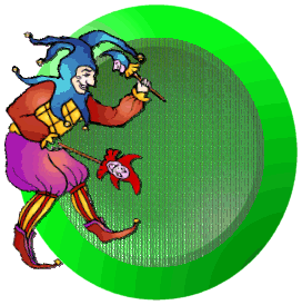 Choose a graphic that pertains to your site (make sure you increase the colors to 16 million if it isn't already. Choose a graphic that pertains to your site (make sure you increase the colors to 16 million if it isn't already.  Click at the top of your project to activate, then right click and choose paste as new layer. You can recolor your new layer, rotate it, resize it and move it wherever you want it. If your graphic had a background, click on the background with the magic wand and press the delete key to get rid of it. Click at the top of your project to activate, then right click and choose paste as new layer. You can recolor your new layer, rotate it, resize it and move it wherever you want it. If your graphic had a background, click on the background with the magic wand and press the delete key to get rid of it.
- At this point you should probably save your project if you haven't already. Choose Save As, give it a name, and scroll down to psp. Saving it as PSP will keep the layers separate in case you lose your work and need to come back to it. Now add another layer. This will be your text layer. You can add text directly to this layer or you can make a shape to form your text around. For simplicity sake, we'll add text to this layer. If you want to know how to shape text to a curve, e-mail me at raggbaggrealm@aol.com and I'll walk you through it. I used four extra layers and several more steps to do the curved text on my own logo at the top of this page.
- Click on the text button and choose your font and your size; check vector and antialias. I selected size 26, Burton's Nightmare, checked null for the stroke (click on small triangle to choose the style, null is the circle with a slash through it)and white for the fill. You can choose any color or texture you want for the fill, but selecting white makes it easy to apply Blade-Pro effects if that's what you want to do. The small square in the vectored text is for rotating the text; run your pointer over the text until you see two little arrows, then click and rotate your text until it's positioned like you want.
 Now go to Layers/Convert to Raster Layer. Choose the Selection tool/Rectangle and draw a rectangle around the text. Click on one of the letters; this should select the whole text. Apply whatever colors you want; or if you have Blade-Pro you can choose one of the presets. Now go to Layers/Convert to Raster Layer. Choose the Selection tool/Rectangle and draw a rectangle around the text. Click on one of the letters; this should select the whole text. Apply whatever colors you want; or if you have Blade-Pro you can choose one of the presets. 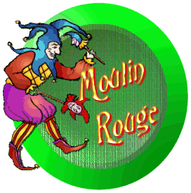 Under effects do 3d effects and add a drop shadow. Use a contrasting color for the shadow to add depth, or black to pop it out of its background. If you chose a lighter color for the inside of your shape, you can also do a cutout to etch the text into the background (add a layer with letters still selected, make the opacity 100 and the blur very low; you'll want to move this layer behind your graphic if you do this. To move a layer just click on the layer and drag it). Here are two variations on the text. Under effects do 3d effects and add a drop shadow. Use a contrasting color for the shadow to add depth, or black to pop it out of its background. If you chose a lighter color for the inside of your shape, you can also do a cutout to etch the text into the background (add a layer with letters still selected, make the opacity 100 and the blur very low; you'll want to move this layer behind your graphic if you do this. To move a layer just click on the layer and drag it). Here are two variations on the text.
- Continue to add layers if you want to add more text or graphics. Putting each piece on its own layer enables you to manipulate it without affecting anything else. When everything is the way you want it, choose save (remember you're still saving as a psp file here). Now right-click on the graphic and choose copy merged. Then paste as a new graphic (you'll be saving this one later as a gif). Saving the original with all its layers means you'll be able to change any of the original elements of the logo if you wish to later.
- Right click on the background of the new graphic with the dropper tool to set the background color. (**To save as a tube, follow steps by asterisks below). Choose Colors/Set Palette Transparency, click ok. In the next pop up window, select the second button (it should be showing the color you set as background) and click ok. Now click on the background again and choose Selections/Invert, then go to Image/Crop to Selection. SAVE again.
** If you want to save the logo as a tube, select the background, then Selections/Invert, then Copy, then Paste as New Image. The graphic will be on a transparent background. Choose File, Export, Picture Tube. Give the tube a name and click ok.
|

 Designing a logo can be fairly easy. Use your shapes tool to set up a 3d base for the logo, add a layer of text, a layer or two with graphics, position everything the way you want it then merge the layers and make your background color transparent. You can even make your logo into a tube so you'll have it available to incorporate into other graphics.