I get a lot of requests for 3d Text Banners; this version is one that is extremely simple, requires no filters, no plug-ins, not even layers (although once you are comfortable with this technique you can try using layers to build a deeper 3d base).
The basic technique is to select a fairly large font, write your text in a dark color and shadow it, then use the same size font, same text, but in a lighter color, and set it on top of the other text, offsetting a little to the right. This you cutout with white, and you're done!
Here are the steps in more detail: please note that if I indicate a tool, it will be one of the icons; when you move the mouse over an icon, the name of the tool will appear. If I give the instruction in the format of Selections/Select None, click on the text headings at the top of the page; they have drop-down menus with various options.
Also, most of the illustrations have been reduced in size so the page can load faster and to manage the space better. Click on any graphic to see it in full size so you can look at the settings or the placement of certain elements.
Open a new file, about 600x150 (pixels). Make sure to select the image type as 16.7 million colors. You can make this background white or black for now; you'll be changing it in the next step if you're going to put it on a colored background.
Next, select the color for the (web page) background the text will be on. You'll be doing a shadow, and shadows incorporate the background color, so it will look sloppy if you create the text on a white background and then put the text on a colored page. If your web page is white and you chose white as your background color in the first step, you can skip this step.
If the web page or button you're going to put the text on is patterned or colored, open it, click on the color (the predominant color if there is more than one) with the dropper tool to set your color. Select this as your background color for the new file. If you don't have a swatch of color to click on, copy the color as closely as possible by eye, or if your web background color has a number, plug that into the HTML code box in the color palette, and say ok. Now use the paint bucket to pour the color into your background.
Now reset your palette color for the text; (below the palette on the right panel). The top box is your foreground color, the box behind it is the background color. The arrows connecting them are used to switch background and foreground colors. Select the colors you want to use for the text. Click on the top box to select your first color; this should be a dark shade. (The top box will always be the one that determines the color of your current text). Now click on the back box and choose a contrasting or lighter color for the other layer, you can click on the arrow later to swap background and foreground colors. The colors I've used are #493777 for the base and #B0A2DA for the lighter shade.
Select the text tool, position it over the center of your space, and left click. Now you'll see the dialogue box for text. Select a fairly thick font (or click here to download jellybean, the font used for the example), make sure antialias, center and floating are checked. The size should be fairly large if this is to be a banner, anywhere from 36 to 72 (the example is size 72). For a button, experiment with sizes 18 and below. Write out your text and click ok. If your size is off, or you don't like the way the font looks, just select 'undo' under Edit and try again. Change the font or the size and click ok again until you like the result. I've made the sample banner smaller here so the page will load more quickly, click on it to see the sample full-sized.
Select Image/Effects/Drop Shadow. The settings will be black for the color, Opacity=70, Blur=3.9, vertical offset=3 and horizontal offset=2. Lower the blur if you're working on much smaller text. Use Selections/Select None to de-select the text.
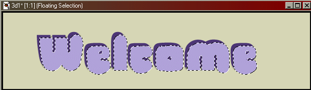
Now click on the arrows between the boxes on the colorpanel to switch your colors. Select the font tool again, position it over the banner and left click with the mouse. Leave all your settings exactly the same and click ok. Now position the lighter text directly over the darker text, then edge it over to the right and slightly up or down, so that you can see some of the previous color below it. As long as the moving dashes (called the "Marching Ants") are still around the text, you can move it around and try different effects. If you should accidentally de-select the text, go to Edit/Undo.
When you have the text placed where you like it, the next step will be to do a cutout effect on it. Keep the text selected, go to Image/Effects/Cutout. The settings are Color=white; Opacity=42; Blur=5.5; Vertical and Horizontal offsets are both 3. When working on small text, reduce the blur and make the vertical and horizontal offsets 1. Use Selections/Select None to de-select the text.
Reduce the extra space around the text. Use the selection tool and 'draw' a line of marching ants around the text. To do this you need to click on a corner to the top and left of the text and pull to the opposite corner with the mouse. See example above.
Now click on Image/Crop to Selection. Cut down as close to the lettering as you can to minimize the total space. The smaller the banner, the less time it will take to load, and the easier it is to manipulate your text and other graphics under/around it. If your page is a solid color, your banner is finished! Now save it; File: Save As. For type, you should save it as a gif.
If your banner is going to be on a pattern, you'll want to make the banner's background transparent. Using the dropper tool, right click on the background; then select Colors/Set Palette Transparency. Answer yes to reduce colors and layers. Click on ok to accept the default settings. Another box will come up; click the second option: set transparency to current background color. If you want to test the transparency, select Colors/View Palette Transparency. Click on File/Save.
Questions? Problems? Did I leave out a vital step? Email me at JJJPEMom@aol.com. I'll respond as quickly as possible.


 Open a new file, about 600x150 (pixels). Make sure to select the image type as 16.7 million colors. You can make this background white or black for now; you'll be changing it in the next step if you're going to put it on a colored background.
 Next, select the color for the (web page) background the text will be on. You'll be doing a shadow, and shadows incorporate the background color, so it will look sloppy if you create the text on a white background and then put the text on a colored page. If your web page is white and you chose white as your background color in the first step, you can skip this step.
 If you don't have a swatch of color to click on, copy the color as closely as possible by eye, or if your web background color has a number, plug that into the HTML code box in the color palette, and say ok. Now use the paint bucket to pour the color into your background.