|
Realism through damage. |
Let's face it, If you are looking fore realism in your interface or graphic, it can't be perfect and scratch-free. You've got to rough it up a little to give it that realistic look. |
![]()
 |
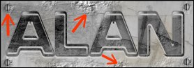
This is a good example of realism through damage. Each arrow is pointing to an area purposely damaged, giving it that realistic effect. |
![]()
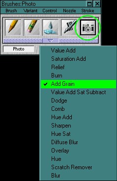 |
Use the "Add Grain" brush from the photo Icon. To
get to the photo icon go to "window's" then to "shortcut to new
brushes"
That's the paper (texture) I'm going to use. Most programs provide this texture. |
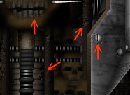
| Remember to choose spots where the damage will not interfere or take attention away from the image. Good places to add rust are usually edges and around screws. |
![]()
| That's just an example of what one brush stroke looks like with the "Add grain" brush. |
![]()
|
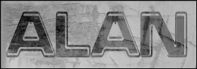
This is the image we'll start out with. It looks ok, but we'll try to make it look a little more realistic by adding grain. |
|
There's the same image after adding some shade to it. (For more info see my shading tutorial. |
|
Here you see I added grain to it, along with a little bit of brown airbrush. Adding grain to area's around screws also gives it a nice effect, but don't over do the grain or it will take away attention from the image. |
|
That's the final image, adding grain to your interfaces and other graphics gives it a realistic effect. But If your going for a professional look then be careful while adding it. |
Hope that helps! |
![]()
![]()