
The louder the background {meaning brighter} the harder to get a readable page. If you make your own backgrounds then FADE IT! Do not have it so loud you have to squint. I my self have been guilty of doing that. I created something I liked so much that I just didn't want to fade it. I ended up not using it because I couldn't bring myself to fade it. When i tried using it the text bounced off it like nobodies business and it made me sick to my stomach.
Also the wilder the background the harder to read. If your BG is sooooo crazy then your viewer will find themselves just looking at the background and not reading your page. I know I've found myself doing that at times.
To put the background on your page place BACKGROUND="imagefileurl" in your body tag.
So say your image is dogtoy.jpg. the tag would be BACKGROUND="http://www.domain.com/dogtag.jpg even with a background image keep BGCOLOR in the tag. The color will load up before the background image. Another thing you have to be warned of is load time. Don't use real big files for your BG.
Senerio time. You're making your page. You found this awesome photograph you want to use. So you upload to your page and put it at the background without anything done to it. DON'T DO THAT!!!!! Never put a picture of someone as a background without doing something to it. Fade it if you do anything. When you put a background up to where the sides don't line up you'll get lines in your background. What I commonly do if i can't get the sides to line up and get rid of those lines I just put a soft color border around it. It looks better then those annoying lines because its on purpose. I use Adobe Photoshop to make my images and I have a Filter called Seamless weilder. Sometimes that works absolute WONDERS. Others it just doesn't help.
As with the colors there is another thing you need to know but I'm going to mention that with the graphics in general since it ties in with them.
Now I'll show you some samples of Backgrounds do's and dont's. These aren't the best samples of what I mean but hopefully they'll get the point across.
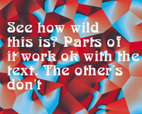
Thats a sample of a wild background. Its very active. Parts of it look nice and work out but for the most part its no fun.

Thats what happens when you take a picture to use as a background and do nothing to it. I didn't bother putting text on it since no matter what color I tried it wasn't very readable. If you want to use a picture as a background DO SOMETHING to it! I'm stressing it again and again DON"T put a picture as a background as it is UNLESS its already been altered to work as a BG. In most cases it hasn't though.

This is definatly not the best example of a bright background but it works. Its also a bit wild. Keep away from this as much as possible. Again fade it if you REALLY wish to use it

See how the colors don't line up? Thats what happens with a background most of the time. if the left and the right sides, the top and the bottom, line up you'll have no problem.

This still isn't that light but its lighter then the rest. Backgrounds, in my opinon, shouldn't be anything more then light. I suppose if it fits your page's personality you can use it as wild but keep it light. FADE IT FADE IT FADE IT!!!!
Like with the background colors you have to be carefull about similar colors. If you have a background with blue in it. Stay away from the blue and red texts. Those often don't work. If you have purple stray from the purple text... etc. Thats really all I can say about backgrounds at this point. To me the most important aspect for a background is readability. If you have such a nutty background you can't read it and fading it doesn't help DON'T use it. I get aggrivated when I go to a page with such a bright background its distracting.
Good luck and be careful!
