Bigger is Better
Other teams just took their primary logo, or part of it, and enlarged it (cause everything in the future is bigger, natch):

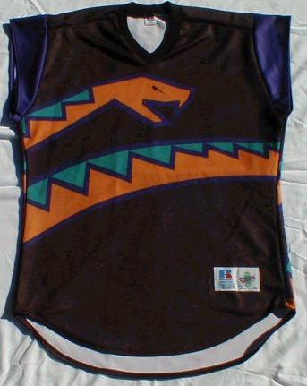
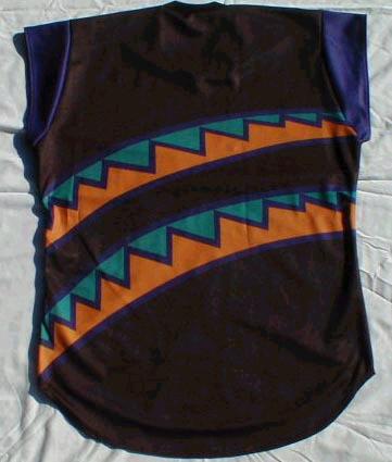
The DBacks actually created a wraparound:
It's nice to know that the Cards will still be wearing their classic jersey, although in a bionic form:

A Horse of a Different Color
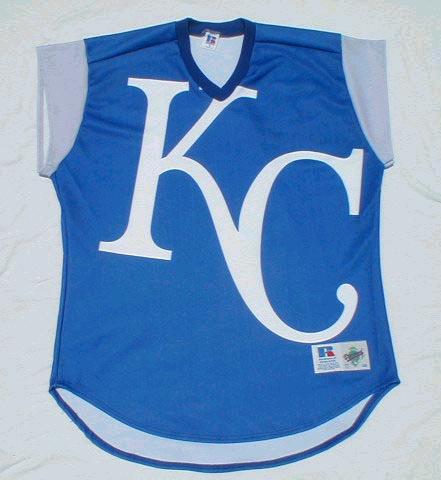
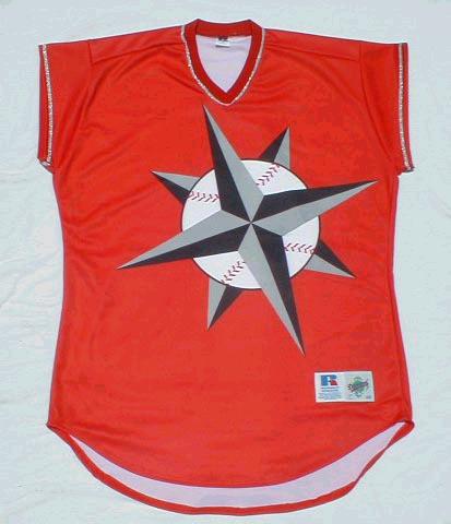
On the other hand, some played with team colors (red Mariners? Sure, why not? It's the future, after all):
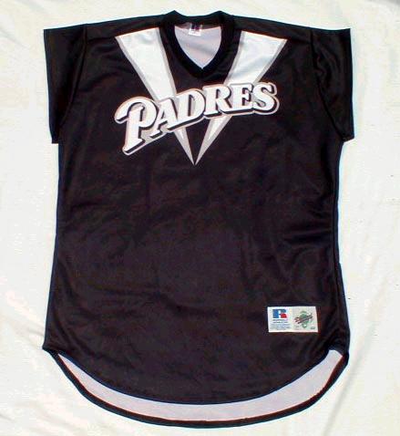
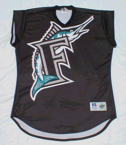
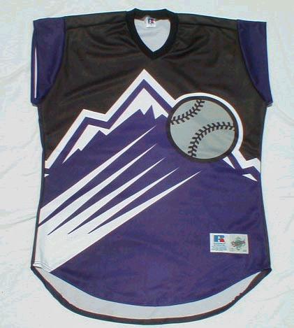
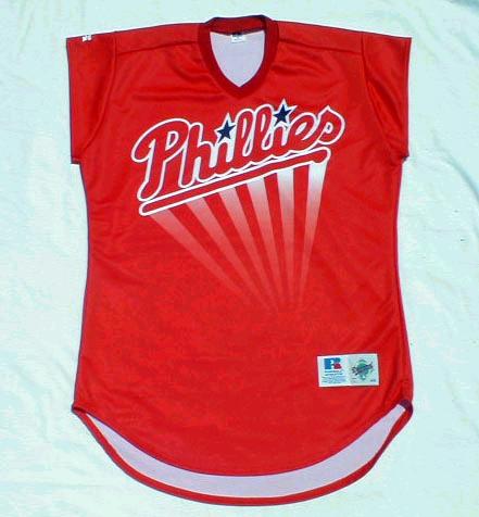
That Padres jersey looks remarkably like the 2002 Nike World Cup soccer jerseys. It's a little like the Phillies jersey (because the future is undoubtably turbocharged):
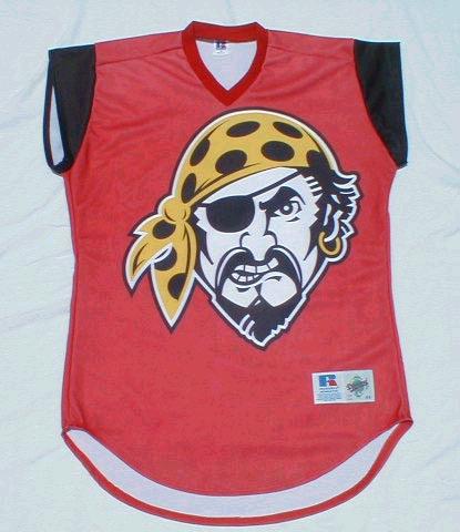
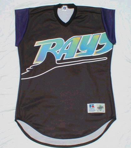
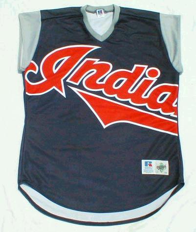
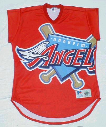
Everything Old is New Again
Only three teams created new logos for the event. First was the "Mercury Mets," (sadly, not pictured) who postulated a move to the first planet from the sun (could this be the first time a team has actually asked its fans to cheer a move from their town?) The Brewers and the Twins revived old logos from the past, with a new twist on each. The Twins have since returned to this classic logo, and one can only hope that the Brewers follow suit.
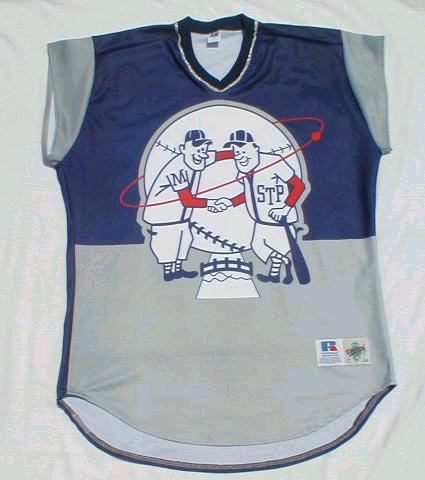
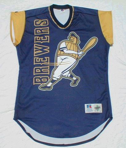
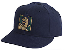
The Beer Barrel Man also graced the Brewers' caps that day: