|
|
|
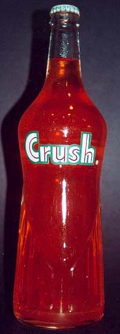
Fig 8 |
by
: Michael Rosman
About twenty years ago, after redecorating my basement with barn wood, I thought - wouldn't it be nice to display some nice old metal advertising signs - particularly soft drinks, which I adored. Out I went to the flea market and picked up sign after sign, after sign. My wife finally drew the line and advised me to get rid of some of those signs.
|
|
|
Fig 8 |
Of course I
heeded her suggestion, and literally gave away sign after sign - but loving the
color Orange, and the flavor Orange, I made the decision to keep my signs which
advertised Orange flavored soft drinks.
Over time the
number of signs increased. Then I met a fellow collector, specializing in milk
bottles and soda bottles. He taught me the subtle differences in bottles,
suggesting that it might be great to find the bottle which matched the one on
the sign - and then of course, all the variations of such bottles.
That's where
the trouble began, and now my basement is too small. My wife won't let me move
into her office, or into our bedroom. My Orange only collection presently
consists of just under 600 bottles (135 Orange Crush)
and 175 signs, boxes, openers, push bars and push plates, clocks,
thermometers etc. etc -representing presently 182 different brands.
Of all this,
Orange Crush is only one brand!! It
is probably the classic orange drink - the company which veered only
occasionally to other flavors, but remains best known for its Orange.
The classic
glass bottles in which Orange Crush was sold, is a story in itself. Little, if
anything is written or catalogued. These beautiful glass bottles belong to
several eras, which overlap somewhat.
i) 1910-1920
The Ward's Orange Crush era.
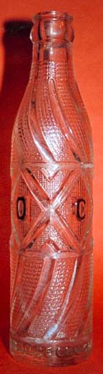
N.C. Ward, of San Francisco, a chemist, was the founder of Orange Crush and these bottles are still available, although rare and costly - glass with paper labels, and the clear ribbed variety, including not only orange, but also lime and lemon flavors.
ii) 1920 - mid1960's The 'Krinkly' clear bottle
era
This is the
era of the 'Krinkly' bottle or the 'Ribbed' bottle, originally clear in color. This bottle came in different designs, contents, cities etc., and was the
original Orange Crush bottle with which we first became familiar. These clear
bottles were fully embossed, with front and back diamond patterns.
iii) mid-1940's - mid-1970's
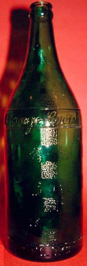
The 'Krinkly' AMBER era
This is the period during which the 'Amber' or 'Brown' krinkly or ribbed bottle was introduced. It is this distinctive dark brown colored bottle with which most collectors - and non-collectors, are familiar.
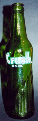
* This 'krinkly' bottle was also produced, in the same period, to a lesser degree in emerald green color, with a similar purpose of protecting the contents from environmental deterioration. This bottle, in one style only, is much less common, more valuable, and fully embossed, with different wording in the diamonds, front and back.
iv)
mid-1950's - late 1960's
The 'Diamond' pattern era
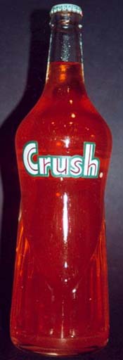
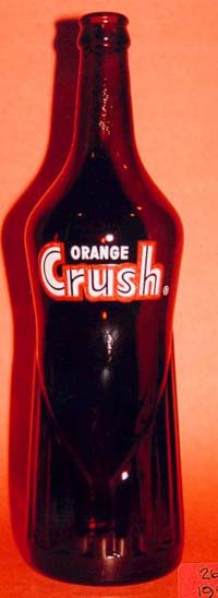
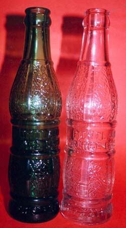
During this period, came the introduction of the "Mae West" bottle, which is also referred to as the "Diamond" or "Draped" pattern in the Orange Crush market. This bottle, in clear, brown (amber) and the rare green, had many variations - content, color of ACL, neck ACLs, which go on and on. [examples, see Fig 9].
 |
 |
 |
| 26oz (Clear) | 26oz (Amber) | 10oz (Green) |
|
Fig 9 |
||
|
(*Click all thumbnails to view the full images for more detail.) |
||
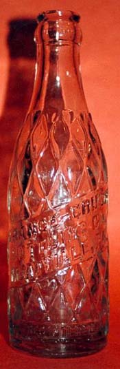
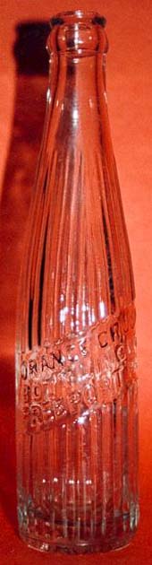
v) embossed (non-krinkly)
Throughout
the period from 1920 to the mid-1960's many independent Orange Crush bottlers
produced bottles, with design, dates, contents, addresses - all individually
characteristic, and often related to their geographic area. These bottles were
almost always clear or green. Some had paper labels, but most were embossed.
 |
 |
 |
 |
 |
 |
| Fig 10 | |||||
Amber ‘krinkly’ bottles may be differentiated into several styles according to the pattern and color of the diamond patterned ACL on both the front and back of the bottles. The brown, or amber, was introduced as a special new technique to protect the product inside from deterioration of ultra-violet light.
There are many distinguishing features of the amber bottles which help to classify, categorize and separate these for the ardent collector. I have tried to indicate some of these differences - perhaps missing a few, but here goes.
|
|
|
|
| Fig 11 | Fig 12 | Fig 13 |
The bottle shape itself
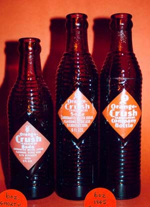
1) squat - this bottle is slightly shorter (7 1/2" or 19 cm) - 6oz. [Fig 11]
2) 'regular' - slightly taller (7 3/4" or 19.5 cm) - the standard - 7oz
3) tall, very, thin - (8 3/4" or 22 cm) - 6oz [Fig 12]
4) tall, 'regular' width - (8 1/4" or 21 cm) - 7oz. Canadian only
5)
tall, 'regular' width - (9 1 /4" or 23.5 cm) - 8oz. and 10 oz
[Fig
13]
6) tallest, widest, rare 30-ouncen (11 1/2" or 29 cm)
The shorter, wider (fatter) bottle were produced only in the 6 oz. and the 7 oz. This bottle is 2 1/4" (15.5 cm) wide, whereas the thinner bottles are 2" (15 cm).
|
|
|
|
||
| Fig 14 | Fig 15 | Fig 16 |
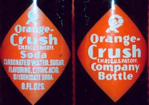
The diamond, front ACL
1)
diamond orange ACL with white
lettering [Fig 14]
2) diamond orange ACL with
amber lettering
[Fig 15]
3) diamond, fully embossed [Fig 16]
The pattern on the front ACL differs not only in the coloring of the lettering, either white or amber, but also the wording.
All have 'Orange -Crush' in the diamond, below the Crushy figure.
 |
 |
 |
 |
| Fig 17 | Fig 18 | Fig 19 | |
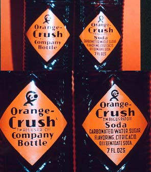
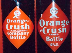
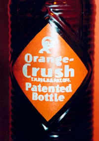
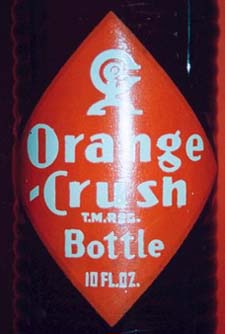
However, there are two possibilities [Fig 17] for the wording below that -
1) 'Orange-Crush Bottle' - no volume of contents (except the Canadian 10 oz.) + the trade mark
2) 'Orange-Crush Soda' - ingredients (carbonated water, sugar, flavoring, citric acid, 0.1% benzoate soda) + the trade mark + volume of contents
3) "Orange-Crush" very rare ACL with white writing, stating 'Patented Bottle'
I have not figured out or been informed of any system to this difference in the content of the wording of the front ACL. There is no pattern in association with the Crushy symbol, the content volume, the bottle shape, etc.
On Canadian Orange Crush 7 oz. bottles, the ACL simply stated 'Orange-Crush' with T.M. Reg - no Crushy, no ounces, no contents, etc. [Fig 18]
On Canadian Orange Crush 10 oz. bottles, the ACL does state 'Orange-Crush Bottle' below the Crushy figure and with 10 oz. [see Fig 19]
The trade mark
1) T.M. Reg. U.S. Pat. Off
2) T.M. Reg - appears only on Canadian produced bottles
This is the distinguishing feature between bottles produced in the US and those produced in Canada. It is present on all 'krinkly' bottles [see Fig 20 below]
|
|
||||
| Fig 20 | Fig 21 |
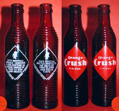
The 'Crushy' figure [Fig 21]
1) arms outstretched - pie eye, mouth
2) arms outstretched - pie eye, no mouth
3) arms outstretched - semi-lunar eye, mouth
4) arm over head - crushing orange between hands
5)
arm over head - no orange between hands - Canadian only
Mr. Crushy appears on all amber 'krinkly' bottles, with variations as to whether his arms are outstretched or his arm is over his head, squeezing an orange between his hands. There are variations in the presence or absence of a mouth, whether his eye is semi-lunar or full pie shaped.
One thing which is constant in the amber bottles produced in the US is that Crushy is always on the front ACL, always has an orange between his hands when one arm is over his head, and is always facing right.
With the Canadian bottles (7 oz. and 30 oz.), the Crushy figure is always on the back ACL, arms out and always facing left. [see Fig 22]
|
|
|
| Fig 22 | Fig 23 |
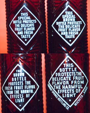
The diamond, back ACL [Fig 23]
The typical diamond shaped ACL describing the purpose of the dark-colored bottles appears on all 'krinkly' bottles. Throughout the era of the amber bottles, there have been four styles to this description -
1. 'this special bottle protects' ....
2. 'this special brown bottle protects' ....
3. 'the brown bottle protects' .... rare, on 6 oz and 30 oz bottles only
4. 'this bottle protects' .... rare, on some 6 oz, 8 oz and 10 oz
The wording of #3 and #4 above, is rare and does not appear on all bottles. The wording on the 6 oz bottle is so rare that it makes this bottle very valuable to collectors. This wording does not appear on all 6 oz bottles.
There are, as well, differences in wording in the lower portion of the diamond ACL on the back of the krinkly amber bottles - fours styles to this description -
1. 'protects
the delicate fruit flavor and fresh taste'
.....appears on some
6 oz, on all 7 oz, on all 7 and 8 oz fully embossed, 7
and 8 oz orange ACL with amber lettering, and the Canadian 30 oz
2. 'protects
the fresh fruit flavor from the harmful effects of light'
.....appears on some 6oz, on
all 8 and 10 oz orange ACL with white lettering
3. 'protects
the delicate fruit flavor from the harmful effects of light'
....appears on some 6oz, on all 8 and 10 oz. orange ACL with white
lettering
4. 'protects
the fresh fruit juice from the harmful effects of light'
....appears only on the American 30 oz
|
|
| Fig 24 |
Again with
respect to Canadian 7oz bottles, the back ACL may be in English or French [Fig
24], but in this era, not bilingual. The bilingual bottles appeared in the era
of the 'diamond' pattern of the mid-1950's onward.
As mentioned previously, with the Canadian bottles (7 oz and the rare 30 oz), the back ACL always has a picture of Crushy, above the print, arms outstretched, and always facing LEFT. The American Crushy with arms outstretched, on the front ACL, always faces right.
Finally, on
the back ACL, some have print below the diamond and some do not.
This print might indicate either -
1) Orange-Crush Limited, or some other local bottling company name, and the content volume, or
2) the geographical location of the bottling plant, or
3) both 1 and 2
The bottle Base
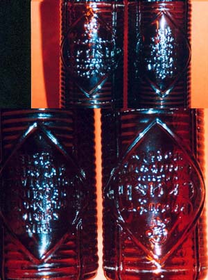
This part of the organization, or classification of the amber bottles make little sense, and is very difficult to use. Bottles were produced in many locals, by different companies, each using their identifying symbols.
It appears
after looking at the bases of many bottles, the leading producers, but not the
only producers were -
1) Knox Glass Company
2) Owens-Illinois Glass
Company
3) Duraglas (a division of
Owens-Illinois)
4) Dominion Glass Company (Canada)
The base of
the bottle may have any or all of the following -
1) manufacturer's symbol
2) content (oz)
3) city of production
4) a grouping of numbers, eg.
6240
5) nothing
And so I come to the end of my expose on the Amber 'Krinkly' bottles of Orange Crush. This era (mid-1940 - 1960's) is to myself, the period with which we all bond when mention is made of Orange Crush - the recall of reaching into those ice filled coolers and pulling out a brown bottle of delicious orange drink with our friends, at the local grocery store, on our way home from school, to do our homework - ugh!!
Hopefully
this writing will help fellow collectors to put some rhyme or reason into the
organization of these wonderful bottles, representing a past era in the history
of a classic Orange drink.
Michael
Rosman is a collector of Orange flavored soft drink bottles and signs.
He can be contacted at - mrosman@sympatico.ca
|