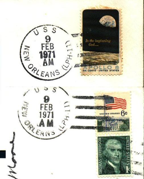
I've also found a similar variation with Apollo 14 USS New Orleans postmarks.

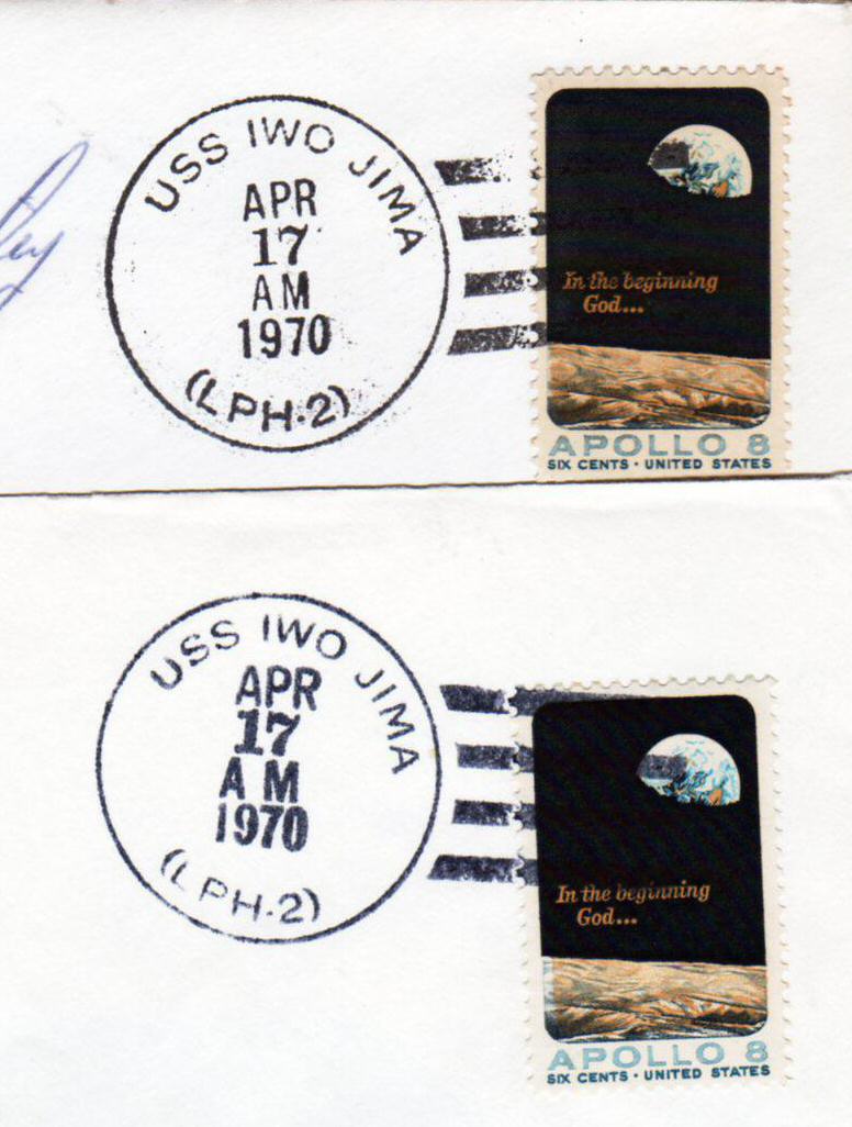
(Click image for a larger version of the postmarks)
While an initial view tends to indicate ink density variations, I believe
a closer look shows distinct font variations. In particular, compare the AM in each postmark and particular the
spacing between the A and the M. Does this show that two different postmarkers were used?
I would appreciate any feedback on these covers. Direct comments to the Webmaster.

This page © Dr Ross J Smith
This page is maintained by the Webmaster
Last modified on 30 March 2010