
OTHERKON GOLD 2002
Animal Designs


 Project Requirements
Four-color poster, 16x20". The name of the event and all vital information (place, date, location, etc.) should be displayed; alternately, the viewer may be directed to a place where they will be able to gather the needed information.
Client Name and Description
OtherKon Gold--a yearly convention geared towards providing a gathering opportunity and positive press for Otherkin and therianthropes. As the only convention of its size and focus on the continent, it is considered to be for people across all of America. Anyone who would like to learn more about these subcultures is invited to attend, so the convention is intended to be friendly towards those who do not identify themselves as being in the named communities.
Client's Objective
Primary objective is to alert all 'Kin and therians nationwide to the existence of the event. Secondary objective is to intrigue individuals who are curious about alternative beliefs or think that they may belong to one of these groups, and encourage them to attend as well. Tertiary objective is to make mainstream society aware that these groups exist and are organized enough to have a large convention of their own. These posters will be hung in community centers that get the most traffic possible, especially in the student centers of colleges.
Target Audience
Primary audience is Otherkin and therians of either gender, from teenage years upwards. Secondary audience is openminded, accepting individuals who are curious about alternative beliefs and would like to learn about these subcultures. This latter audience can be of either gender and any age from teenage upwards.
How My Solution Works
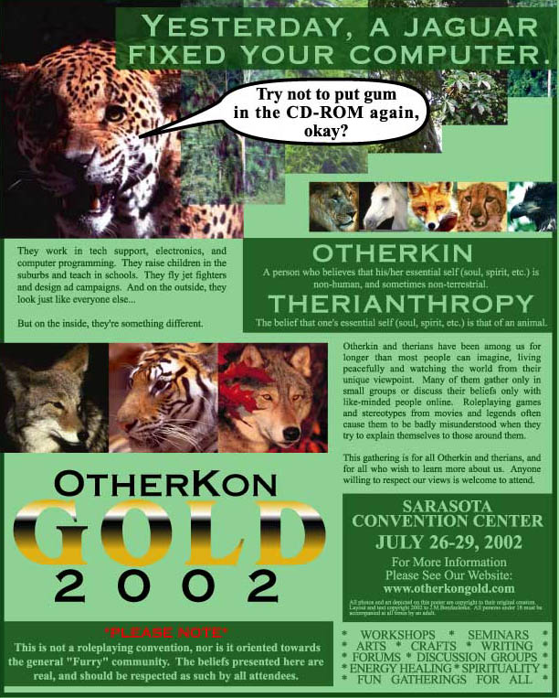
My initial concept was the poster on the right; shortly after it was completed, I decided that it was a bit too flyer-like in the volume of info that it presented. The left-hand design was therefore created as a more teaser-like compliment to the other. The intent with the pair of posters is to hang up the left-hand one first to pique interest, then hang the right-hand design much closer to the actual event date to give more information to casual readers.
The first design was built simply to be a striking visual--the headline and speech bubble are strange enough to cause curiosity in the viewer, while the differing opacities of the images produce an interesting layered effect. Their stepped positioning serves to bring the eye quickly to the center of the page, where it then drops down to the OtherKon type logo. The information provided in the box below is just enough to maintain curiosity (it consists of definitions of words important to the convention's purpose and the disclaimer regarding the serious nature of the topic material). The website URL is then displayed boldly at the very bottom, showing the viewer where to go for details such as date, time, etc.
The same headline and speech bubble are used for the same effect in the second design; the stepped arraingement of pictures at the top serves more to create interesting negative space around the rectangular line of smaller pictures--in this case, the stepped images also serve to pull attention down to the beginning of the lesser explanitory text. Because so much information was presented in this version, I arrainged it according to importance by putting the more important text inside dark boxes. The boxes with the vital location and time info and the disclaimer are located right next to the text logo so that the important details can be picked up quickly without having to look too far away from the name of the convention. The less-important text that describes the Kin and therian situation is flowed around the box defining the terms, while the other block of lesser text (which describes the activities that will be available at the con) is set between the disclaimer and location/time so that all the hard facts about where the event will be and what will be there are set in one easily-accessed area of the poster.
This particular poster pair was designed to represent therianthropes in particular. Therefore, when choosing images for the second design (the image for the first one was picked due to its striking effect), I wanted to try and represent the major categories of the therian population so as to identify the poster better with the ones who might be viewing it. The major groups that I've been able to pick out are wolves, big cats, and coyotes; lesser groups that can still be found with relative frequency are birds, foxes, and horses. I chose the jaguar for the top image because it not only represented one of the larger therian groups, but the position of its mouth was perfect for my needs. :) I also tried to represent the wolf, coyote, and large cat groups in the lower horizontal arraingement, as it was larger and closer to the logo. The smaller bar of images was built to show more of the same, with added images of a bird, horse, and fox.
The green color scheme used in both posters was chosen because it seemed the most obvious color to use to represent animals living in the wild places of Earth. The font used for "OtherKon" and "2002" was selected because it was a suitably bold serif style that reminded me of letters carved in stone from old civilizations; the font for "Gold" reminded me of the fonts normally used for dramatic effect on the covers of novels. The effect that I was going for was something strong and adventurous, but not modern.
Programs Used
Illustrator 9.0, Photoshop 6.0 (for rasterizing backgrounds and picture arraingements).
|
|
|
|
|
All site graphics and designs on these pages are copyright 2002 to J.M.Bondzeleske (ebondrake at hotmail-dot-com) and may not be reproduced or distributed without my consent. However, I do not claim ownership of photos or placed art used in parts of these designs, unless stated otherwise--they were collected via clip art and Internet searches.
