The Scriptorium
(By Iarlaith ni Fiomallain as appeared in the May 1990 Bolt)
![]()
The Scriptorium
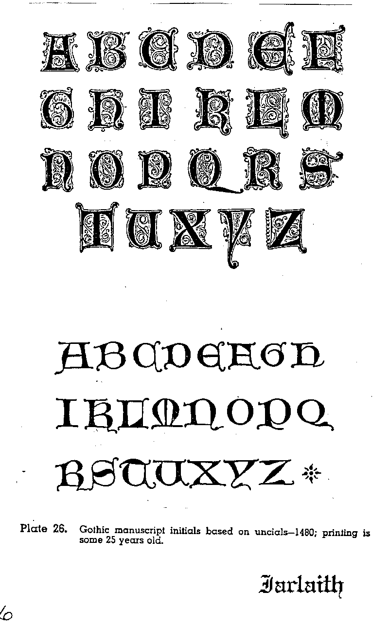
"Rubication" means painting red. Actually, rubicated initials were blue as often as as they were red. Therefore if you want your manuscript to have an authentic appearance, you will be using red and blue colors, almost exclusively, for rubication.
Unlike calligraphy, there is no strict rule relating pen nib size to letter size. However, since you will want to be able to fit your rubication initials within the line spacing of the text, your maximum pen size should be no larger than the pen nib you are using for your written text.
Rubicated initials in period texts are usually accompanied by doodled filigree background. If the letter is red, the filigree is blue and vise-verse. Occasionally, the letter is drawn with gold ink and surrounded by black filigree.
The filigree may be severely geometric, consisting of parallel lines and dots and tiny circles,or luxuriantly foliage-like, or any combination or intermediate. Just be consistent within a given manuscript.
Rubicated initials are chiefly used within the text of a manuscript. They are used as the initial letters of very important words, such as the name of God, or the name of the King, the award recipient, the award, the Kingdom, etc. Gold rubicated initials should be saved for words of cosmic importance.
When you are calliging a text and come to a word whose initial letter will be rubicated, lightly pencil in a little box of appropriate size (usually 3 - 4 line-widths square) and keep on writing. Come back later to do the rubication and the filigree.
Some reference books are:
The Book of Hours, John Harthan (1977), Thomas Y. Crowell Company. Excerpts from book of hours of various nationalities and styles from 1325 to 1546.
Decorative Alphabets and Initials, Alexander Nesbitt (1959), Dover. Shows evolution of decorative initials from the 8th century to the present.
Writing, Illuminating and Lettering, Edward Johnston (1903), Dover. An excellent work on all principles of calligraphy.
None of these are in the Rimsholt library but I have a copy of Johnston's work in my own personal library that folks are welcome to look at.

Page last updated 12/15/99