Site hosted by Angelfire.com: Build your free website today!

Kay M. Randall's Art Page

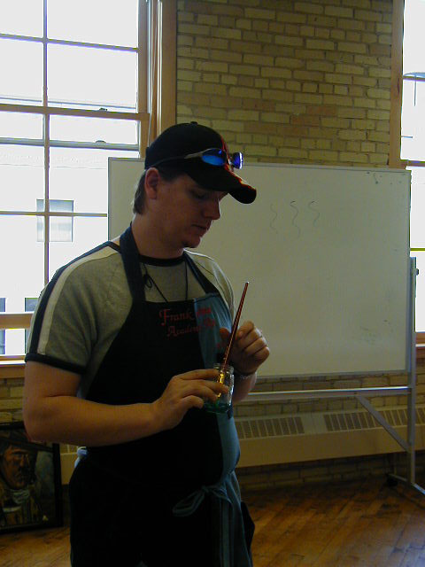
Four years ago had you told me that I would become an artist I would have laughed at you. I had never had an interest or an aptitude for art of any kind. But over the last four years I have learned to draw and paint using the techniques of the Renaissance masters. It all began with a class that I took through Moorhead Community Education. I was fascinated by the following class description:

Classical Realism Part 1: Drawing

Create an oil painting in the tradition of the old masters in the first of this three part series. No experience in art is needed for impressive results in class, and experienced artists are welcome to try a method from a new perspective. Join instructor, Frank Tebay, who has more than seven years of training from Frank Covino, a master painter and educator. Learn the techniques and history of Italian Renaissance painting while immersing yourself in the creative process. You will be guided step-by-step, from understanding the importance of a grid and controlled palette, to underpainting and glazing methods. Bring two photos to the first class (two 8x 10 copies; one in color and one in black and white). Images of old masters' paintings are encouraged. Fee includes supplies. Co-sponsored with Plains Art Museum. . . 

Covino's Academic Approach to Portraiture


I was completely intrigued by the description of this class and I couldn't wait to get started.  What I learned very quickly is that Covino's method is ingenious in both it's simplicity and academic approach. Frank Covino believes and has proven in his classes, as well as those taught by his students (i.e.. my teacher, Frank Tebay) that inexperienced artists with "little artistic talent" can be taught to both draw and paint. I know because I am one of those students!

I intend the following to be an general overview of his process not an in-depth analysis of every aspect of it.  The reason that I am outlining Frank Covino's method is to give you an idea of how I was taught this academic approach to drawing and painting.  It is important to me that anyone who views this web site know that should you decide that you would like to learn this approach, whatever your skill level, that you can produce similar or possibly far better results than those I have obtained. 

Frank Covino developed his approach after conducting research into the methods used by the Renaissance Masters to teach their students both how to draw and paint. He focused particular attention on the methods of Leonardo da Vinci.

Leonardo da Vinci, in his translated notes, tells of a suggestion to his students on how to make accurate linear measurement of lengths, widths, angles, and intervals. He used a giant graph, an empty frame over which he strung twelve equidistant horizontal strings and twelve equidistant vertical strings. Leonardo placed this graph upright between the model and the artist's line of vision. The student's canvas was also graphed, scaled in direct ratio to the master graph. A piece of wax was placed on any given wire on the large graph, so that the artist might line up the form accurately when he returned to each new painting session. This simple graph, or scaling device, is an effective way of studying a model in order to make a correctly proportioned drawing. . . If you use photographs of the model or scene you want to paint, you can employ a variation of the da Vinci device. Placed under acetate or glass, the photograph can be squared off in proportions that are in scale to the size of the squares on a pregraphed canvas.  The Fine Art of Portraiture the academic approach, Frank Covino pgs. 24-27 (1970).
To understand Frank Covino's Academic Approach better I will take you step by step through the procedure that he uses.  I will be using William A. Bouguereau's "The Prayer" to demonstrate the majority of the process.  I have chosen this painting because it is one in which I have photographed in most of the steps of the process.  As of this writing I have not yet completed the color painting.  So while you wait for my completed version of the Bouguereau to be posted I have provided you with other paintings which I have in various stages at this point.  You will also notice that I give you the Italian or French words for various terms throughout this web site, I do this because that is the manner in which I was taught, and also because the Renaissance Masters were from these countries and because I think that it adds a bit of the rich heritage passed down in this tradition.

To begin this process both a color and a black and white photo of Bouguereau's "The Prayer" shown below:

  Color Photo of Bouguereau's "The Prayer"                            Black and White of Bouguereau's "The Prayer"


Step 1. How to Create a Line Drawing


Graphed image after Bouguereau's The Prayer
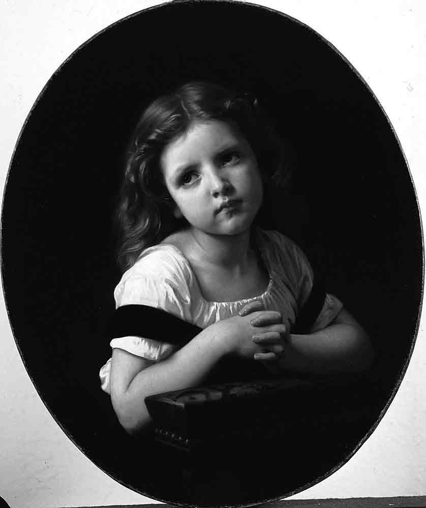
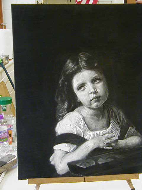
I created this line drawing by taking a black and white copy of William A. Bouguereau's "The Prayer" and placing it under an acetate graph drawn with a red Twin Tip marker (using the ultra fine end).  The acetate graph was half the size of the drawing done on the gessoed* board. On a separate piece of acetate which I secured to the graph with tape I then traced with a black Twin Tip marker (using the ultra fine end) the contour of the form and all the important features, including lines which depict the shadows I saw on the original. When I began transferring the drawing from the acetate to the board I felt that all of the important features of the little girl were close enough to the graph lines that no further additional lines were necessary to properly depict her features. However, that will not always be the case. If further lines are necessary a third color of marker is used to draw oblique lines where the features of the face are not close enough to a graph lines. These oblique lines may be created by drawing a line from any point where two red graph lines cross or from any terminal point of the red graph lines at the borders of the rectangle. The oblique lines will be then transferred to the gessoed board as well prior to starting the line drawing.  Frank has further refined his system by asking that students use red conte' pencil to create the graph and a blue conte' pencil for oblique lines (other, more waxy, pencils should not be used because they may create problems with the painting itself).  By using the same colors to create the graph and oblique lines any confusion during the drawing process may be minimized.  Once all the graph and additional lines are in place then the transfer of the line drawing itself can begin using either a charcoal pencil or vine charcoal. The key to transferring the line drawing is to try not to think about what is being drawn (i.e. "I've never been able to draw noses!") and think only about the lines of the form in relation to the graph lines in each box.  By drawing slowly, moving from box to box, drawing only the lines seen until each box is completed the drawing takes shape more accurately.  However, to check accuracy use either a ruler while drawing, to check each box as it is drawn, by turning the board and acetate graph upside down checking to see that both the board and acetate look the same from every angle; or by holding the drawing up to a mirror. Any necessary corrections can be made with a kneaded eraser or by lightly scraping with an X-acto knife.  For a more detailed explanation see Controlled Painting, Frank Covino pgs... 52-58 (1982).  Once the line drawing has been completed India Ink** should be used to draw a small brush over each of the lines of the drawing.  India Ink may also be drawn on with a brush into any areas of the drawing which would be black.  The only areas which are black are those areas which do not reflect light. Normally this includes the pupil's of the eye, the line in the center of the mouth and the nostril.  The Bouguereau has two other areas which are black--the strap of the jumper is Black Velvet which means that the area nearest the viewer will be black and finally the area under the hands and arms is also black.  While the background may appear to be black it is actually a Value 1. Frank Covino using Faber-Castelle Pitt Artist pens.

Above Frank Covino demonstrates the use of Faber-Castell Pitt Artist Pens in Gray which is used in the same manner as India Ink.


*Frank Covino's gesso is made with acrylic matte medium, plaster of paris and marble dust which makes it incredibly strong and durable.  It is then applied with a roller.  Finally, gessoed board is sanded to prepare it for paint.

Step 2:  How to Create a Valued Form


Value refers to the lightness or darkness of a hue. . . Value may be considered a vertical measurement
on a scale that has white at the top and black at the bottom.  To produce a three-dimensional illusion,
a correct analysis and reproduction of values is the first important step.  Values are the foundation of a painting, while color is a facade.  The Fine Art of Portraiture the academic approach, Frank Covino
pg. 43 (1970).


After Bouguereau's The Prayer
Most of us can clearly see the very dark areas and the very light areas in this drawing but to learn to differentiate the values in between can be trickier.  Some people are born with the natural gift to differentiate all of these values but each of us has some level of this ability, it just takes time, patience, as well as, trial and error to learn to see like a "gifted" artist.  Frank Covino through his research found that Leonardo DaVinci developed a system of "mixing ten vessels of dark to light gray tones to treat the color of pigment."  Controlled Painting, Frank Covino pg. 10 (1982).  From this discovery Frank Covino has developed a method where white is considered 100% of light and black is considered 0%.  The nine values in between represent the gray scale which are the values that can be seen in the drawing above.  By dividing the scale of grays in such a manner between black and white into equidistant steps there is a constant standard for value identification. One which gives both the student and teacher a meaningful way in which specific advise can be given.  Instead of stating that something is "too dark" or "too light" a student can be told that his value is "three values too light" or that the "shadow on the face is two values too dark".

India Ink is black so if the value of the lines are left black they may eventually show through both the verdaccio and the color painting.  To diminish the risk of this happening the India Ink must be diluted to a value 5.  This is done by using gesso applied with a brush.  As the gesso is applied to the India Ink which allows for the gesso to be tinted or valued by the ink.  The gesso can then be used to create the values in the form as seen in the black and white picture that is being used.   Gesso may also be used as well to add volume to the form as seen in the picture below (i.e. the form and shape of the breasts).  Whether or not a complete value study may be rendered with just the amount of India Ink on the board will vary.  However, if necessary charcoal or vine charcoal may be used to complete the value study.  Once the value study is completed
three to five coats of Fixative and then three to five coats of Damar Retouch Varnish should be applied (spray both products vertically and horizontally as well).  This is very important because if a mistake is made at the verdaccio stage which requires the use of turpenoid Damar Retouch Varnish will protect the value study from harm.  Damar Retouch Varnish will need to be applied after any of the three methods of completing the value study discussed here.

Lea after Bouguereau's Evening Mood.  Prepared for Frank Covino class in Baudette, MN 2008.

Even if another method of completing the value study is being used and India Ink is not being used (Frank Covino highly recommends using India Ink as a method of not losing the lines drawn in charcoal).  Gesso should be painted on in certain light and raised areas:
   
Soften all gesso edges by wiping with finger.  If edges have not been softened then sand the gesso to bevel the edges, then wet the gesso with finger.  Lines may be scratched into hair with an X-acto knife. 

The second method of valuing the form is by using charcoal pencils or vine charcoal.  Again the reproduction of the values that are seen in the black and white photograph is the goal.  With a charcoal pencil the darkest areas are in essence colored in.  Then a tortillion or blending stump is used to burnish (to rub) the charcoal into the board.  The amount of charcoal on the blending stump determines how the blending stump will be used.  A dirty blending stump is used for darker areas, while a less dirty stump is used for intermediate areas and a clean stump would be used for the lightest areas.  It is very important to complete the background first because the appearance of the values in the foreground may have to be altered if the background is not completed first.  Any value will look darker when against a light or white background.  Remember to use Damar Retouch Varnish upon completion of the value study. 
Once the background has been completed move on to the clothing and then the skin.  This information applies equally to both verdaccio, as well as, opaque color painting. 

Frank Covino's Controlled Pallette
Frank Covino's Controlled Palette shows us the gray scale.
    
Value 1 is 90% black and 10% white; 
Value 2 is 80% black and 20% white;  

Value 3 is 70% black and 30% white;

etc.


The final method of valuing the form is using tinted gesso.  Tinted gesso is made by using three ingredients:  1/4 of a cup acrylic medium and 1/2 cup plaster of paris which is  mixed together and then placed in nine small containers.  To that mixture is added the amount of India Ink (it must be both permanent and waterproof) which is necessary to create each value of the nine values shown on Covino's palette.  It may be necessary to add a bit more gesso mixed with plaster of paris into the container should the India Ink make the gesso in the container too runny.  Once you are satisfied with each value then it is time to paint the values on the form.  Once the value study is complete Damar Retouch Varnish should be sprayed using three to five coats (spraying needs to be both vertical and horizontal) over the entire picture.  This is very important because if a mistake is made at either the verdaccio or color stage which requires the use of turpenoid to make a correction, the Damar Retouch Varnish will protect the value study from harm. 
Step 3:  Underpainting (Soto  de  Pinto)
a. Verdaccio
Verdaccio of Bouguereau's "The Prayer"

As stated above the word value refers to the degree of lightness or darkness, chiaroscuro in Italian.  The Renaissance Masters began their paintings with an underpainting in chiaroscuro.  Underpaintings can be executed in brown which are called bruno in Italian, or gray which are called grisailles French.  En grisaille may be used for flesh and was favored by the French masters such as Ingres (See Jean-Auguste Ingres L'Odalique en Graisalle).  However, Frank Covino prefers it for still life renderings, skyscapes, seascapes, etc.  Verdaccio is preferred for the painting of flesh.  Once the underpainting is glazed (using a small amount of paint in medium) or opaque paint was applied after it had been modified so that the colored paint matched the value found in the verdaccio.  To facilitate the process of identifying and reproducing chiaroscuro Frank Covino devised the controlled palette which consists of nine gray strips representing the percentages of light from black which is zero and white which is ten.  See Controlled Painting, Frank Covino pg. 83 (1982).

A portrait painters job is to create the illusion of depth on a two-dimensional surface.  To be successful technical tricks, schemata, passed on by the great Masters need to be used, the most notable of which is the creation of realistic flesh by employing the half-tone separation between light and dark.  Where light and dark meet on a painting an area of the verdaccio should be visible through the color application.  See Controlled Painting, Frank Covino pgs. 90-92. (1982).

Verdaccio means "greenish first" in Italian.  To mix the gray-green tone of the verdaccio darken Chromium Oxice Green with Mars Black until it becomes a second value (darker than value 3, lighter than value 1; this is done by taking a small amount of the value 2 mixture and placing it on the value 1 and value 3 strips on the Covino Controlled Palette).  Once a true value 2 mixture has been mixed this is the base color from which all other values are made.  To create values 3 through 9 add flake white to the base color.  Compare each mixture with its value on the Controlled Palette again making sure that each value is darker than the next lightest value, yet lighter than the next darker value.  To create the first value add more Mars Black to the base color.  See Controlled Painting, Frank Covino pg. 92 (1982).

Values 1 through 5 are scumbled (a small amount of paint is applied and scrubbed into the board.  Values 6 through 9 applied in thicker layers of paint to build volume and is stated as "The higher the value, thicker the paint . . . "  See Controlled Painting, Frank Covino pgs. 96 (1982).  The more paint used in the lighter areas the more opacity it has.  This is important because the thicker paint will allow light to bounce, as well as, because light value paint becomes transparent over time due to the effects of light.

Follow the form of the face to sculpt and create interest, as well as, to make it look more realistic.   Examples would be:

  1. The upper lid between the crease and the eye should be painted with small vertical strokes while the lower lid should be painted in one horizontal stroke. 
  2. The bridge of the nose should be painted with small horizontal strokes.  While the sides of the nose may be done in longer vertical strokes that may be partially wiped away where recessional.
  3. The lower lip is recessional thus the lips cannot be painted using the same values.  Again short horizontal strokes may be used.
The best advice is to keep in mind the sculptural form of the object being painted.  This will allow the object to be rendered more accurately and realistically.

It is advisable that the verdaccio is painted by primarily referencing the black and white photograph, however, should any question arise as to the true value represented the color photo may also be referenced.  It is also extremely important that as an area is painted no values are skipped.  So where a value 1 is next to a value 7, value 1 is painted, then value 2, then value 3, then value 4, and so on until value 7 is reached, even if that means that the application of each value is narrow.  Why?  Because when a high value color is mixed with a low value color all that is created is "mud".  By moving from dark to light in gradual increments the result is an application of paint which has a subtle, gradual transition which is exactly what a portrait artist wishes to achieve.  To achieve that end though no sharp edges can be seen in the portrait.  The edges every line of separation between colors must be softened so that they appear more realistic.  Controlled Painting, Frank Covino pgs. 93-94 (1982).

This can be accomplished by either:
  1. By painting with a bristle brush and overlapping the values while painting so that the values are blended together.
  2. Using a flat sable brush (which is wide enough to overlap the values being blended) lightly drag it down the line that separates the values from each other.
  3. Using a flat sable brush as above except in this instance using a lightly applied zig zag motion to blend the values.

The information in 1. was given during a class with Frank Covino in Baudette, MN in 2008.  For the information in 2. and 3.  See Controlled Painting, Frank Covino pg. 93 (1982).

Corrections should be made to dark tones or where the value difference is dramatic (i.e. a painted value 3 should be a value 6).  Corrections are made to avoid pentimente which means the sins of the past catching up with you.  A good example of pentimente is a painting by Valesquez who did not scrape of two of the original four legs of a horse when he decided to change the position of those two legs, so over time as the paint has faded all six legs are now visible.   Make corrections by using an X-acto knife.  Care must be taken not to scratch too deeply because some of the gesso may be chipped off.  Should this happen it is imperative that the gesso be replaced because if it is not replaced the oil in the paint may cause harm to the board underneath.  Depending upon the size of the gesso that has been chipped away either a brush or the pointed end of the brush may be used to replace the gesso.  After waiting for the gesso to dry, usually 10 minutes, the gesso should be lightly sanded with sandpaper or a small area may be sanded with an emery board.  See Controlled Painting, Frank Covino pg. 88 (1982).

As a final note, no high oil medium should be used in the underpainting process.  So instead Frank Covino advises that Liquin be used as a medium for underpainting because it is quick drying and will help the paint dry from the bottom to the top.  Also, paint considered medium, high or very high oil absorption may be used in underpainting only when mixed at least 50-50 with a low oil absorption paint.  Both Chromium Oxide Green and Flake White** are low oil absorption paints; Mars black is a high oil absorption paint but because it is mixed with one or more of the other two paints at a more than 50-50 ration the mixed paint will still dry from the bottom to the top.  This rule is important to follow because if a less oily color is placed on top of a color into which a "fat" oil has been mixed, the paint on top may dry first.  When the paint beneath it dries it will contract, causing cracks and fissures in the leaner superimposed surface ruining the painting.  See Controlled Painting, Frank Covino pg. 86 (1982). 

Following the completion of the verdaccio and after it has had time to dry completely three to five coats (the application needs to be both vertical and horizontal)  of Damar Retouch Varnish should be applied.  This is very important because if a mistake is made at color stage which requires the use of turpenoid Damar Retouch Varnish will protect the verdaccio from harm.

*An important note about the use of Liquin--Liquin causes paint to dry at least one value lighter so if when painting is begun for the day the verdaccio is dry; it should be sprayed with Damar Retouch Varnish.  However, Damar Retouch Varnish is only used during the verdaccio stage because it will cause color painting to yellow over time. 
**Other low oil absorption paints are:  MG White, Venetian Red, Chremnitz White (substitute for Flake White), Zinc White and Zinc and/or Lemon Yellow.  Controlled Painting, Frank Covino pg. 86 (1982).

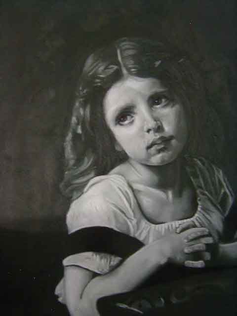
  b.  Rub-out Technique

Rub Out Technique 1Rub Out Technique 2

The Rub-out technique is begun in one of two ways:
  1. By using a low oil absorption oil color as a ground to change the color of the gessoed board.  For example in the above photos of a landscape which I did, to mimic the sun, I used lemon yellow mixed with linseed oil to cover the gessoed board.  Once the lemon yellow had dried completely I rubbed the gessoed board with a rag that was dipped in linseed oil and then using a brush I added a mixture of Venetian Red and Mars Black.
  2. By rubbing the gessoed board with a rag that has been dipped in either turpentine or linseed oil (new students should use linseed oil as it increases how long the paint will remain wet.  The gessoed board should be damp, not wet.  At this point the surface is covered with the value of paint as dark as one of the darker values of the subject.
If linseed oil is used anywhere from from three to four weeks of drying time will be necessary before color may be imposed to avoid cracking.  See Controlled Painting, Frank Covino pg. 96 (1982).

In the example above after the lemon yellow had dried and prior to putting on the Venetian Red and Mars Black I used charcoal to establish the graph and India Ink to establish my line drawing.  Frank Covino suggests that when using a graphed that the lines for the graph be determined by using a ruler with a pair of 3/4 inch brad nails tapped in every five inches and exposed by 1/4 of an inch on the other side of the ruler, this then can be used to help measure for the graph with much less smearing.  Then once the measurements have been made an eraser may be used to score the lines into the wet paint.  The sketch may then be established by using a small pointed sable brush and raw umber or by scratching it in with a palette knife.  See Controlled Painting, Frank Covino pg. 96 (1982).

Once a sketch has been established, begin to create the values by rubbing out the illuminated areas with a dry lint-free cloth stretched over a finger.  The harder you press, the lighter the value, gentle taps produce medium values.  If you have any values darker than the original tone they may be painted in with a sable brush, very light areas may be produced using a rag soaked in turpentine.  Should the underpainting be dry before you see an area which needs to be lightened then use either sandpaper, or a palette knife to scratch in the correct value.  See Controlled Painting, Frank Covino pgs. 96-100 (1982).
Step 4:  Color


The ten basic color hues are the color of light itself as seen through a prism, in essence the colors of the rainbow.  These ten colors are: yellow, green, blue-green, blue, purple-blue, purple, red-purple, red and yellow-red.  Every color falls into one of these categories, or it may fall between two colors.  An object may be more yellow than yellow-red, but not quite yellow, thus, it w would be classified as yellow/yellow-red.  The Fine Art of Portraiture the academic approach, Frank Covino pgs. 24-27 (1970).  If purple appears at one end of the rainbow and red-purple at the other, it is logical to place the two ends of the rainbow side by side to create a color wheel.  Albert Munsell's color wheel which was created more than half a century ago is both logical and scientific.  Hue refers only to the name of the color, but there is far more to color than that.  See Controlled Painting, Frank Covino pg. 107 (1982).

The second part of color is value which is its lightness or darkness.  By relating the color itself to the scale of gray values (as shown on the Controlled Palette) Munsell attributed a number to each hue to indicate exactly how light or dark it is.  Thus yellow (commercial name Cadmium Yellow Light) is as light as a ninth value gray, so it is 90% light.  Yellow-red (Burnt Umber) is as dark out of the tube as a value 1 gray, so it is 10% light.  Leonardo's system as described above was probably Munsell's inspiration for this system.  See Controlled Painting, Frank Covino pgs. 96-100 (1982).

The third part of color is called chroma which refers to its intensity or brilliance.  Chroma then refers to a color's specific brightness or dullness.  Frank Covino explains the importance of chroma this way:
 
If I wore a bright yellow scarf that is as light in value as a ninth value gray, and I walked away from you, the brilliance of the yellow would appear less intense (duller) as the distance between us became greater.  The scarf would not appear less yellow; the hue would remain the same.  If the light in the distance was intense, the scarf might even retain its ninth value status on a scale between black (zero, the absence of light) and white (ten, or one hundred percent of light).  The only difference is that the yellow appears less bright as it recedes; it becomes duller.  Controlled Painting, Frank Covino pg. 109 (1982).


Aerial perspective tells us that close objects appear brighter and distant objects appear duller.  Thus, an apple in your hand will appear brighter than the same apple in someone else's hand fifty-five feet away from you.  See Controlled Painting, Frank Covino pg.  110 (1982).

Renaissance painters discovered that the gray-green tones of verdaccio underpaintings weakened the intensity of high chroma colors superimposed, if those bright hues were applied either thinly by glazing or the opaque color was partially wiped off.  From this the practice of mixing neutral gray in with colors to dull its brilliance before application in those areas of the painting requiring duller tones was established.  Neutral gray is made by mixing Ivory Black and Titanium White which creates a blue-gray.  To eliminate the blueness caused by the Ivory Black yellow tones must be added.  So Raw Umber is added at value 1, Raw Umber plus Raw Sienna for values 2 and 3, Raw Sienna for value 4, Raw Sienna and Yellow Ochre for value 5, Yellow Ochre for value 6-9.  The neutral gray pigment added to the color was matched with the value of the color itself.  So for instance, cadmium yellow a value 9 color would require a value 9 neutral gray to weaken its intensity (to make it duller).  Whereas, Burnt Umber a value 1 color would require a value 1 gray to dull it.  See Controlled Painting, Frank Covino pgs. 110-112 (1982).  For a complete discussion of the ten hues and the use of neutral gray to create color palettes see Controlled Painting, Frank Covino pgs. 112-118 (1982).  For a complete discussion of the Color Wheel's Color Schemes and Harmonic Relationships see Controlled Painting, Frank Covino pgs. 122 (1982).

The color of the lighting should also be used in all the colors that will be used in a painting.  By use of a particular color to establish a time of day outdoors, or the type of lighting used indoors, all of the colors in the painting are unified.  Using the Controlled Color Palette, the light source color is added in the row of neutral grays.  Since all of the colors on the palette will be modified by the use of the neutral grays, each color will receive the color of the light as well.  Indoors there are only two types of lighting which should be used, incandescent and candlelight or firelight.  Outdoors there are many types of lighting that must be considered.  Controlled Painting, Frank Covino pgs. 132-134 (1982). 

Color paint is applied in the same manner as was discussed above in the verdaccio section.  Please refer to the information given above. 

Paint should be partially removed from the following areas to allow the verdaccio to show through.

  1. Areas that should recede (i.e. between the eyebrows)..
  2. Half-tone areas, areas that separate the illuminated portion of the form from the shadowed portion.
  3. At shadows edge (cast shadows).
  4. To show reflected light in cast shadows.
  5. On the area between the eyelid and the eyebrow.
The above information applies particularly to flesh because flesh painted without the gray-green undertone showing through looks wooden.  It is important for me to point out that Frank Covino has developed three flesh palettes for use on his color palette.  These three palettes can be altered to suit anyone's flesh color.  I am not including this information as it comes in the form of hand-outs from his classes which should be obtained by either Frank Covino himself or one of the students who now teach his method.  A discussion of an older version of his flesh palettes is found in The Fine Art of Portraiture the academic approach, Frank Covino pgs. 162-165 (1970).

Glazing is the use of medium with a small amount of paint crushed carefully on the side of the jar so that all the paint is mixed evenly through the paint.  Frank Covino has his own medium formula which is:  5 parts Damar Varnish, 5 parts Rectified Turpentine, 3 parts Stand Oil and 1 part Venice Turpentine.  Controlled Painting, Frank Covino pg. 137 (1982).  Glazes may be applied directly over the verdaccio or over opaque color paint applications.  It is possible to do as many as three glazes in one area on a painting at a time.  How many glazes does it take to complete a painting?  The Renaissance Masters stated that 40 to 100 glazes may be applied to a painting.  Below are two photos.  The first shows the picture prior to the application of glaze and the second was taken after glazes had been applied. 

Mitch in Cowboy Hat  Mitch's picture after glazing.
To me this is the most magical portion of this process.  The flesh comes to life and the colors of everything else are just made more beautiful.  It is with glaze that anything may be changed as you will see in some of my other art work below.

Once the painting and glazing have been completed to the artist's satisfaction it must be allowed to dry for 8 to 12 months.  At this point three coats of Damar Varnish are applied.  However, Damar Varnish may only be applied on days that are dry and clear to prevent a phenomenon known as clouding.


Frank Tebay
Frank Tebay
To the left you see a picture of Frank Tebay.  Earlier I explained that the first class I took in Fargo, ND was with Frank Tebay.  I would really like to thank Frank for everything.  I know that I can't begin to thank him enough for all the classes I attended and the patience he showed me during the time that he lived in the Fargo-Moorhead area.  He is both a talented artist and teacher.  Always willing to take the time needed with his students.  Without him I'm certain that my art would not have begun, let alone evolved into what it's become over the last four years.  Further, I'd like to thank Tina Tebay, as well as, Asher and Ruthie for allowing Frank's students to come to your home and disrupt your life.

; If you are interested in taking a class with Frank and live near the Denver, Colorado area please contact me at kmrandall64@hotmail.com and I will contact him for you. 


Frank Covino Anita, Frank C. & Me

Frank Covino pictured left with Anita B. (left) and me (right) from the Covino Class in Baudette, MN 2008. 

Frank Covino taught Frank Tebay how to draw and paint in the manner of the Renaissance Masters using Covino's Academic Approach which I have discussed above at length.  From the very first class with Frank Tebay I heard that Frank Covino is both a Master Painter and a Master Educator.  In 2000 The Artist Magazine named Frank Covino's Workshops one of the top five workshops in the country.  I had the privilege of being able to attend his Baudette, MN workshop in 2008 and I would gladly recommend his class to anyone who wishes to learn to draw and paint or wishes to learn more about drawing and painting.  He is an amazingly gifted artist and teacher.  I brought my charcoal of "The Prayer" by Bouguereau and Asher's portrait in color.  Frank Covino helped to correct both pieces and also helped to glaze Asher's painting.  Also, if you are interested in taking a class with Frank Covino, please visit his web site for more information at www.portrait-art.com.


I would also like to offer a special "Thank you" to Becky T.  I appreciate all you've done for me.


For further information: I have posted photos at http://renaissanceart2.spaces.live.com/photos/cns!D1855AFD17AFB4F3!243/, There you'll find my art in a file with the same title. Frank Tebay's art work, as well as, that of his student's can be found in a file titled Frank. Frank Covino's student's work can be found in a file titled Frank Covino.