Al logos were created in Photoshop, Freehand, and/or QuarkXpress. They were done for myself or other businesses. As you can tell, I love designing logos. :)


On the left, is my personal logo. The black shape that wraps around the circle is an abstracted "rc." It reminds me of the moon, an image I have grown to like. It is also reminicent of a cat's eye. I have a fondness for cats, too, as you have seen in other areas of this site. The right image is Sierra Torrin's logo. I wanted her to be a part of me - the new moon - and show some of her personality, too. I used a Medieval-looking font (Edda Caps) for the S and T and used muted tones for the colors. I also like the moon for Sierra because the original character is a ranger, a warrior of the forest.


My husband’s personal logo began as the wolf and moon. It has evolved into the abstract "JDS."
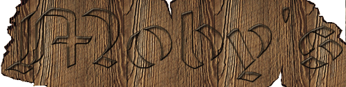

This is for Moby's, a nice seafood restaurant, based around the theme of the deep ocean, and of course, a bit of Herman Melville's Moby Dick. My husband designed the restaurant's interior, and I designed the logo to his specifications. My husband also designed the interior of this concert hall/restaurant he called Icehouse. This was for his thesis project. We wanted the logo to reflect the industrial/gothic feel of the interior. The metallic look is achieved with the help of the underside of a metal stapler.
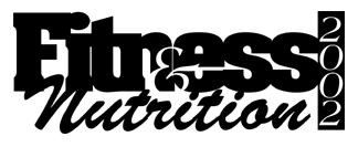

I created the logos for the Suburban News Publications' special sections "Fitness and Nutrition 2002" and the "Mother's Day Gift Guide" for 2002. Both were created in Freehand 8 and used in page designs put together in QuarkXpress. I also designed pages for these sections.
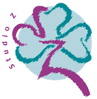

I designed these two logos my senior year at CCAD. I worked with the clients on both logos. Studio Z (on the left) is an art supply store/gallery that shows student and local artists' work. It is located in old Dublin, and the woman who owns the store is Irish. I wanted to use the shamrock in a new and different way, and showing it as a sketch would stand out. I also created a web site design and several ads for Studio Z. Cat Welfare is a shelter for cats only located on Indianola Boulevard in downtown Columbus. I merged a graphic cat and the "@" symbol to show their loyalty to the felines.
Concrete Openings is a local trade magazine for concrete and equipment contractors. I designed several images for their members graph, including orange barrels and traffic cones, before the owner of the magazine decided on the saw blades.

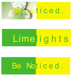
I created these two logos on my own. The SR426 logo was based on a fictional local band named State Route 426 (4/26 being my birthday). "426" is also a top-of-the-line hemi engine, so the effects given to the hard-edged lines and type work well either way one may interpret the logo. Limelights was created from an old tie-dyed day-glo green shirt my sister owned many years ago. I decided this shirt was designed by a company called Limelights, and a logo was born. There was a lot of thought put into the images I used for other parts of this project and for the tag, shown with the teddy bear. I also came up with their tag line, "Get Noticed." This is geared for girls from 9-12.

I designed this logo for Emerald City Coaching, a small business specializing in career coaching. The image of a path was very important, and getting to that desired place, "the Emerald City." The owner's first initial is "S," so that allowed me to use a styilized "S" as the path.
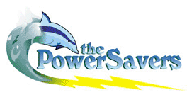
Through jhWebWorks, I was told to create a logo for The Power Savers. The owner is a speaker about how to save power, mostly to children. He needed a kid-friendly logo that could also be professional with businesses and schools. One of his characters is a dolphin, which I decided should definitly be a main part of his logo.

I submitted a logo for Little Bear Village and Golf Club. Although it wasn't selected, the owner decided I received "honorable mention." Mine and others that got that distinction are posted at: littlebearvillage.com under the logo design contest.
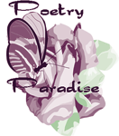
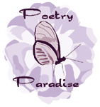

Through jhWebworks, I was asked to do a logo design for Poetry In Paradise, a bath/body-type shop owned by a Japanese man. I was given the royal purple color to work with and told he wanted a butterfly on a rose. He also requested that the "In" be an "N" incorporated into the butterfly. I found images of Japanese roses to make the logo image more personal and submitted the first two designs and another version of the third. In fact, he wanted the "N" to have butterfly wings. The third image is what I submitted to jhWebworks and Poetry In Paradise.